Everything you need to know about Pantone
The Pantone color model, developed by the American company Pantone, is considered a reference catalog with a rich palette of various shades. Having a lot of catalogs, it is designed for different printing conditions. The material in this article will help the reader understand what Pantone is, why its fan is needed and how to use it.
What it is?
It is customary to understand Pantone as a kind of system that allows you to choose the desired tone from a huge catalog system. It is a popular color model all over the world that is considered versatile and suitable for any kind of activity. In essence, it is a universally used standardized system of identification and color selection, or a generally accepted color standard for the whole world.
History of appearance
The color palette appeared when public printing began to switch to color. At this time, there was an urgent need to select a high-quality palette, but there was no single standard for the production of goods according to new criteria. Complicating matters was the fact that printers were scattered throughout the world. The Pantone company has developed a single palette, assigning a specific code code to each color of a huge system. It consisted of Latin letters and numbers, thanks to which the same color could be used anywhere in the world.
Any color of the system was created by mixing several shades, it was assigned a specific number, according to the established classification.
This made it possible to order printing printing without fear of distorting the final product. Each Pantone shade could be created using a specified ratio of CMYK base colors in order to obtain a specific halftone.
The relevance and such importance of getting the exact shade was fundamental to the corporate identity of any company. The customer could choose a specific tone of printing from the catalog, without fear that the performer would understand the color in his own way. In other words, the advent of Pantone made life easier for many. Today, typography requires layouts in this system.
What is it needed for?
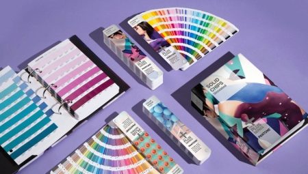
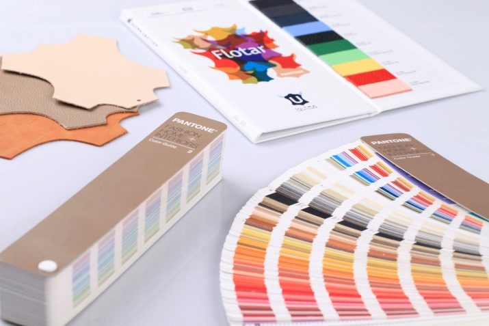
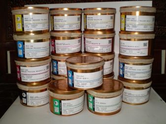
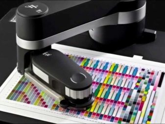
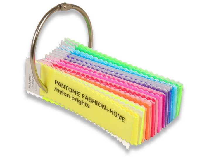
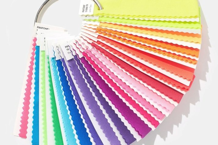
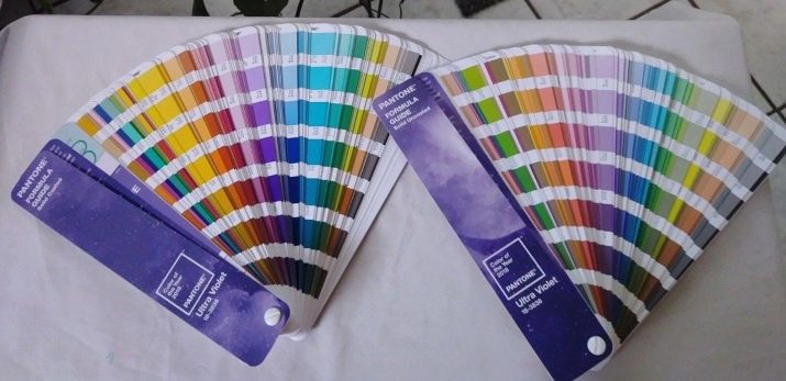
These are catalogs of various colors for orientation in the CMYK system. The system has not only a classification, but also special reference books called fans. Depending on what they are for, the manufacturer may offer them for various materials, for example, textiles, plastic, paper. For paper, reference books are divided into their subspecies: for offset, coated, coated-matte, and also glossy.
However, the information is not limited only to fans, it can also be presented in electronic form. This is handy for designers who can export it to various programs.
One of the key features of the Pantone color system is the fact that it allows printing with fluorescent and metallized inks.
In view of this, the print design often acquires brightness and seems unusual.
The Pantone color palette is rich in shades that are reproduced through process colors. The use of such a palette is convenient for the development of print design, because when printing on dies, there will be no different shades... Moreover, you can achieve the desired color not in several, but in one run. This fact speaks of the savings that are relevant when ordering printing.
The Pantone system can be used not only in printing: it is applicable in interior design, clothing, as well as the manufacture of plastic products that are dyed while they are in bulk.
A system of digital identification of shades for printing with mixed and process inks is used. The reference colors are numbered in the fan-fold book.
It is also noteworthy that the samples can be very different, but the manufacturer insists that the fan be updated every year. According to him, colors wear out and fade over the course of a year, and therefore become inaccurate. Since August 2007, Pantone has been acquired by X-Rite, a manufacturer of hardware and software for color management.
Color palette
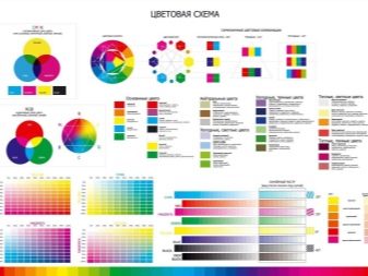
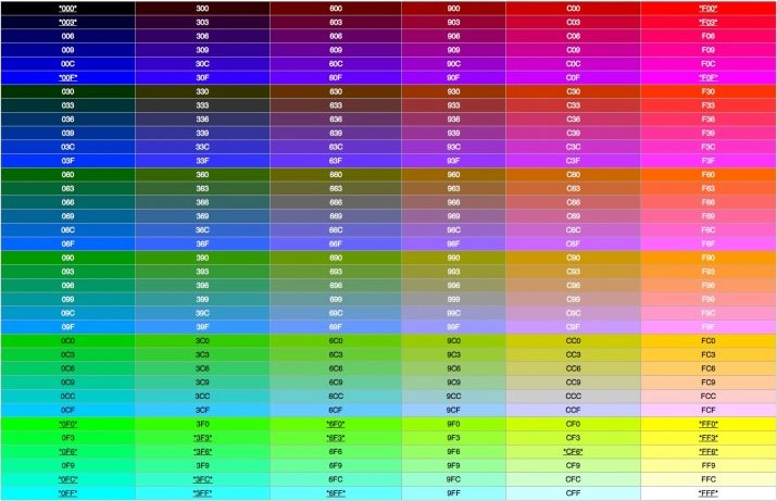
The representation of colors in the Pantone table can be different. For example, it can be a code consisting of three pairs of hexadecimal digits, in which each pair has its own color value. In addition, colors can be classified using keywords (say, green, black, rose). If the browser does not understand a certain word, the range of tones is reduced, choosing only the basic ones that are understandable for all browsers.
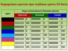
RGB format implies the use of numbers from 0 to 255, which mean the total amount of a particular color in the resulting color.
The RGBa format differs from the previous format. It consists in the fact that the last value determines the transparency level or alpha channel. It is set by a fractional value from 0 to 1.
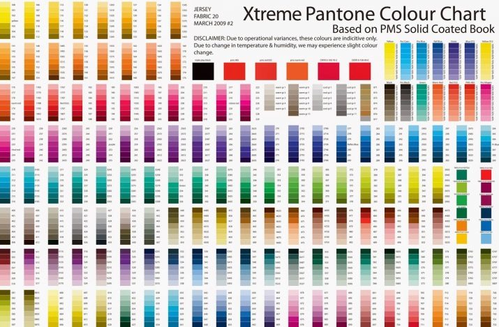
The palette includes over 8000 different color shades. In this case, one source color can have a different degree of saturation and differ in temperature. It can be cold or warm, bright, dull, bleached. Panton is especially important for printing, where even a slight change in color can ruin the whole work.
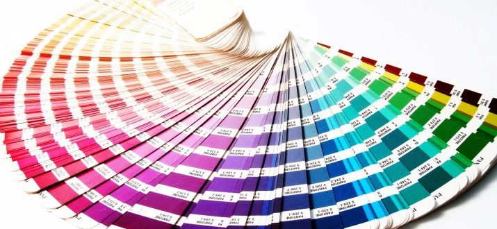
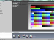
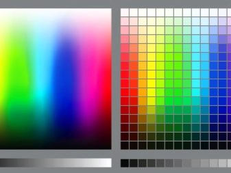
The mysterious table or the so-called catalog is presented in the form of longitudinal sheets of paper, painted in specific colors.
As a rule, their sequence is based on the principle of proximity to each other.
This is very convenient for the user, since he has the ability to select a specific tone of a certain color, having in front of him all the necessary shades in one place. No matter how many of them there are, this does not interfere with perception, but helps to reduce the time spent on choosing the right shade.
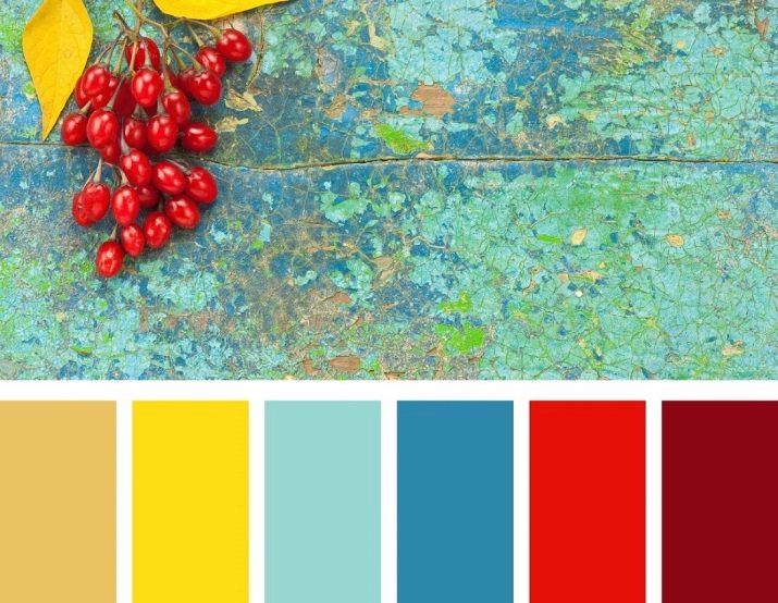
The taxonomy is such that the leaf is divided into zones of the same color, which change the degree of saturation, starting with a dark tone and ending with bleached.A conventional fan formed by pantone flowers can start with yellow, followed by ocher, then orange, coral, pink, lilac, violet. So it can go on until it is almost black.
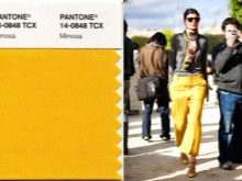
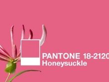
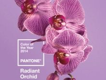
Each year, the company nominates a color for the first place, considering it the favorite of the entire palette. At the same time, the color is not chosen at random: company representatives monitor the state of the planet in the field of economics, ecology, psychology and society. Based on the data they receive, they associate a specific color with them. For example, sky blue was chosen as the color of the millennium in 1999, and purple became the best color of the year a few years later (in 2005). After another 4 years, “mimosa” won, two years later - “honeysuckle”, in 2014 the victory went to the shade “shining orchid”.
The institute, which is engaged in experimental work with color, is confident that it has an impact on various spheres of life: not only fashion or printing, but also advertising, cinema, graphic, landscape design and other industries.
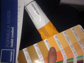
The original color will not be the same on different materials. It depends on the print material: for example, if the paper is uncoated, matte, the color is not as bright as on glossy paper.
Due to this feature, fan layouts are printed in two versions - coated and uncoated.
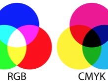
As for the translation of RGB and CMYK, then these color spaces are tied to a specific printing technique. RGB corresponds to the colors of the diodes on the monitor screen, CMYK - to the shades of ink used in a particular printer or other type of printing equipment. However, colors never translate perfectly into one another. They are strictly linked to a specific creation technique and are practically unsuitable for working with mixed paints.
Features of use
The Pantone shade calibrator allows you to select the desired color, eliminating minor inaccuracies and differences in tonality. Any design or layout is based on the current color, nominated for the first place in a given year. This can be the color of the font in print headings, any geometric shape in graphic design, an interior element or a piece of clothing, as well as an interface element, font, highlighting significant information in an article.

The Pantone palette is convenient not only for the ease of selection of the desired color.
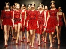
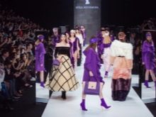
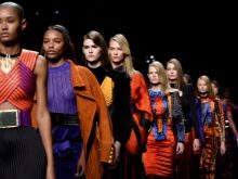
In addition, it allows you to focus on ready-made clear colors, if you need to choose a harmonious companion for a specific shade. It is not difficult to determine this, besides, you can also navigate by the colors on the catwalk - they are always a kind of indicator of the latest color trends that will be used in all branches of design.
For example, this season the focus is on color instilling confidence, energy and vitality. Today there is no clear division into masculine and feminine, which speaks of gender independence. It is important that the current palette speaks of strengthening in society, this is expression, dynamics and energy.
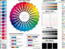
The combination of color shades can be complementary, in which contrasts stand opposite each other in Itten's color wheel.
This gives a special energy, allows you to achieve unique combinations by varying the saturation of the two companions. The triadic combination model is based on the triangle principle, while the colors that are on its conditional vertices are selected. The combination turns out to be unusual, but not devoid of harmony, even if muted shades are chosen for the design.
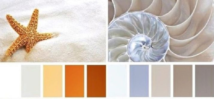
In addition, the combination can be similar, in which two or three shades are used, located side by side on the color wheel. The separate-complementary combination is based on a different principle. In this case, the ideal companions for a particular color are adjacent tones to the one that is located exactly opposite the given color.
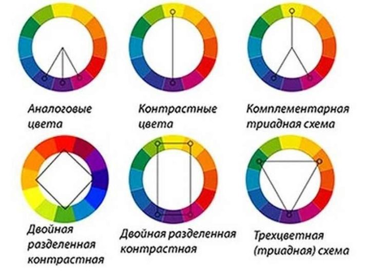
This combination allows for a less intense contrast, but very harmonious.
If these schemes seem complicated to the layman, you can pay attention to the compatibility of individual shades, for example:
- White the color is universal and goes well with all shades of the color palette;
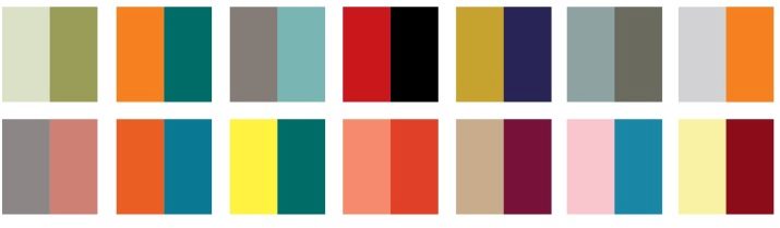
- beige looks harmoniously together with blue, brownish, emerald, wine and neutral tones (black, gray, silver);
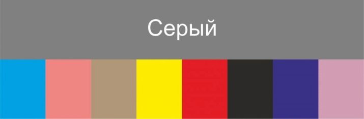
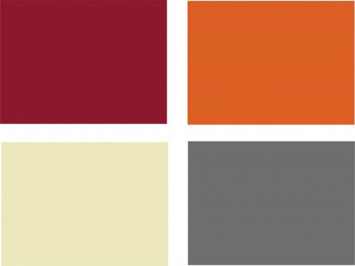
- Gray acquires an emotional color when it is complemented with sand, woody, purple, burgundy, pink or blue;
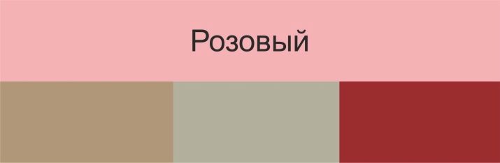
- pink the color makes a harmonious duet together with mint, white, olive shades, as well as a neutral gray tone;
- turquoise can be decorated with a shade of fuchsia, cherry red, brownish, cream, deep purple;
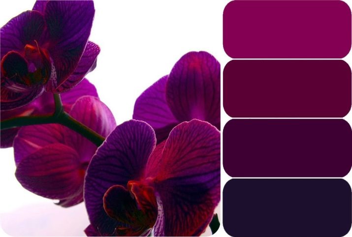
- purple looks quite harmonious if you combine it with orange, pinkish, olive, gray or white;
- light green the color is in harmony with gray, brown, orange, sunny brown;
- Orange can be combined with red, blue, mint, as well as white or black.
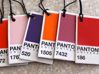
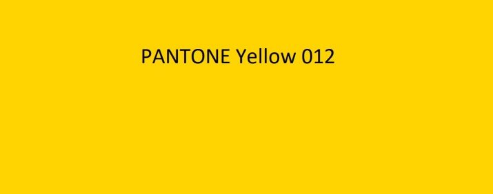
It is not difficult to determine the number of the desired color: as a rule, it is signed with a personal pantone code or has an HTML code. For example, next to the desired shade of yellow may be the inscription "PANTONE Yellow 012" or the code "# FFD200".
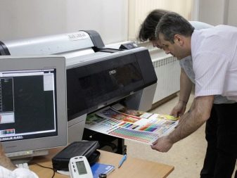
If the shade needs to be determined in the printing house, choosing the desired option is even easier: just use the existing catalog. As for the electronic version, there may be discrepancies in semitones, which is explained by the backlight of the monitor. If the customer doubts the accuracy of the tones, he can take his own palette and look at a sample of the color produced by checking the shades.
Watch a video on the topic.


