All about Itten's color wheel
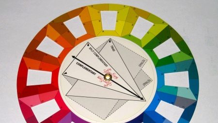
We are surrounded by a colored world, which, upon closer inspection, is mostly painted in only three basic tones - blue, yellow and red, in various combinations and combinations, giving dozens of shades familiar to everyone. It is precisely this feature that artists feel especially keenly. It is not surprising that Itten's color wheel, known to designers, fashion designers, stylists and painters, was also invented by a creative and enthusiastic person.
However, knowledge of the principles of combining shades will be useful to absolutely everyone. After all, color harmonies, the palette of which is so diverse, are really capable of working wonders.
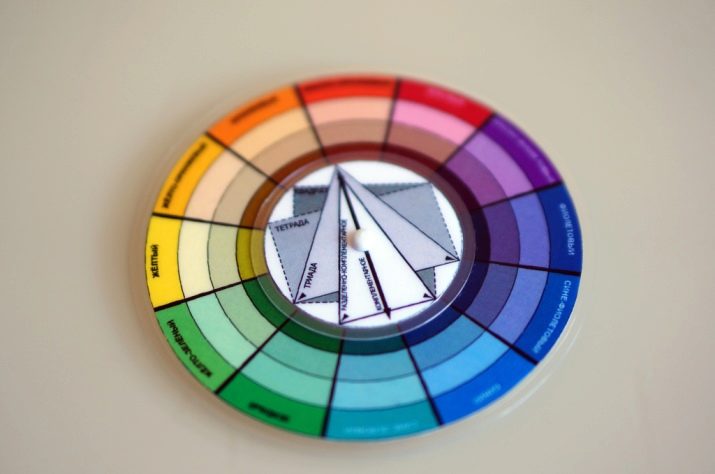
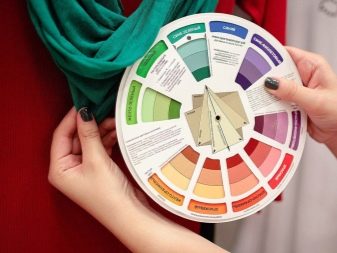
In make-up and the choice of clothes, in determining the color type and many other things, the basic criterion for selection most often becomes precisely the appeal to Itten's circle. How to draw it, how to use it? What is the correct color combination for a particular occasion? This simple yet powerful colorist tool can be created in just a few minutes. But the benefits from its use can be felt for a long time.
History
The very concept of "color wheel" was used in the 17th century. With its help, a certain rule of mnemonics was developed, which made it possible to form and fix the basic principles of mixing and combining colors.
There are several options for color circles, but the most famous of them today was created by the Swiss painter, teacher, author of the Bauhaus training course of the first half of the 20th century, Johannes Itten. It was he who created the work called "The Art of Color", in which he outlined the basic principles of the formation of such combinations.
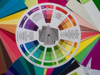
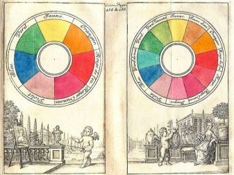
The original purpose of this tool was to simplify the search for the optimal coloristic solution in painting.
In fact, all the existing knowledge and principles were simply put by Itten and his predecessors within the framework of an understandable scheme in use, which could be applied by a person with initial knowledge in painting.
Peculiarities
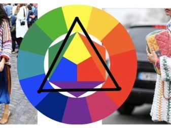
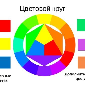
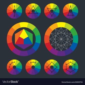
Itten's circle, strictly speaking, is a graphical representation of such a thing as color harmony. The model uses the following construction principles:
- three basic colors - blue, yellow, red, they form an equilateral triangle;
- 12 colors in a circle;
- a hexagon connecting opposite tones (colors of the second order, except for the basic ones);
- division into two halves - into warm and cold tones;
- the colors that go beyond the hexagon are formed by a combination of the surrounding shades.
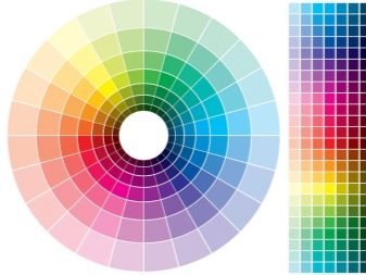
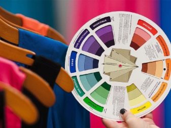
The mixing principles are pretty simple. The diagram clearly shows how Itten's twelve-part circle forms new tones. Green is formed using yellow and blue. It is one of the second order colors. These also include orange and purple. A distinctive feature of these three components of the circle is the impossibility of highlighting the prevailing color in mixing two basic tones.
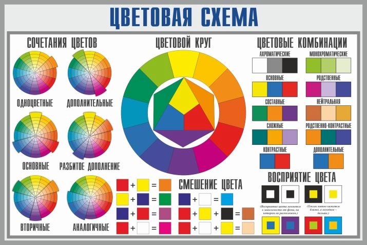
The resulting hexagon fits into a common double circle. Those tones that do not fall on the vertices of the hexagon belong to the shades of the third order. This includes 6 elements:
- yellow-green;
- blue-green;
- blue-violet;
- red-violet;
- yellow-orange;
- red-orange.
All of them are located between the base colors, filling the space. By adding monochrome gamut, you can expand this spectrum without going beyond the basic coloristic principles.
How do I draw a circle?
The construction of the color wheel can be left to the mercy of the computer. But the transfer of shades in this case will be noticeably less realistic. Experts recommend not to save time and create it by hand, using paints and a sheet of Whatman paper. The first step is to create the outline of the triangle - it should be equilateral, with the apex on which the yellow color is located. The bottom left corner will be blue, the right one will be red.
Having determined the vertices of the triangle, they are used as points to draw the contours of the circle. Along them, the inner figure is completed to the hexagon, determining the location of the additional colors of the second order (orange, green, purple). Outside the already drawn radius, a second one is built, at some distance, with the center at the same point. The resulting line is divided into 12 equal parts.
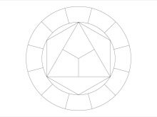
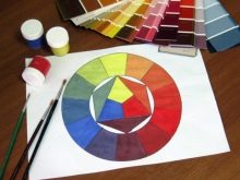
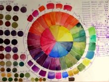
First of all, in the formed sectors, the basic tones are painted over, then the additional ones. The gaps remaining between them are filled with shades of the third order.
How to use?
Itten's color wheel - a real salvation for designers, stylists, and just people interested in fashion in everything - from interior decoration to the choice of wardrobe items. Finding the most complimentary combination with it will not be difficult. In addition, the color wheel quite clearly forms classic combinations - win-win solutions that allow you to achieve harmony and balance. What techniques are usually used in working with the development of Johannes Itten?
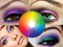

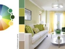
Combination of opposite tones
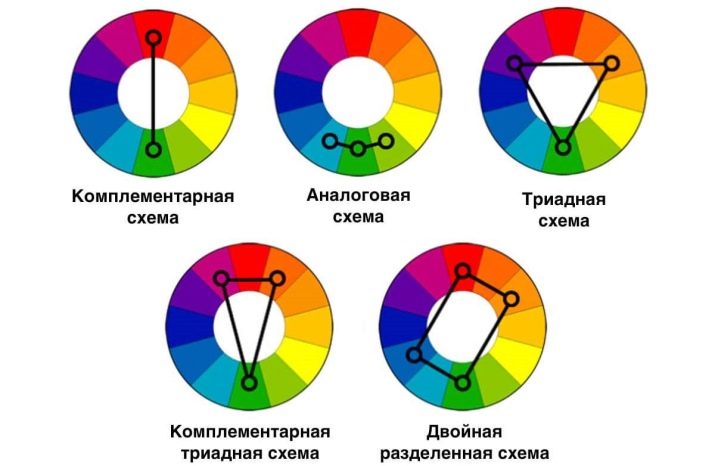
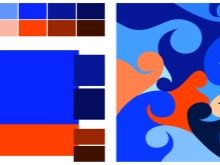
It is enough to look at the diagram and it becomes clear that the simplest combinations in the circle form tones located on its opposite sides. They are always as contrasting as possible. But it is precisely such combinations that look very bright and expressive - they are also called complementary. Examples include yellow and magenta, orange and blue.

The combination of related couples
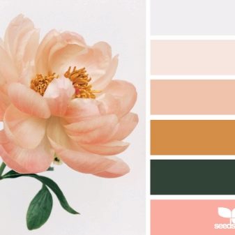
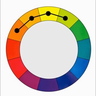
Contrast is not a requirement for using a color wheel.On the contrary, you can combine the closest - the neighboring colors of the circle - and get a harmonious combination with minimal contrast. It is enough to study the entire palette to be convinced of this.
Combining three colors
In the case of Itten's circle, shades equidistant from each other are placed in the triangle of such a combination. There are the following options for the formation of harmonious combinations.
- Classic... Using an isosceles triangle. It combines the very same yellow, blue and red - the basic tones. But if you shift the design, you can find a much more original combination. The main rule is to highlight one main accent, without this the image will look too catchy.
- Contrasting. A sharp triangle with a wide side covering only three colors is used here (in the classic - five). The combinations are sharper and more interesting.
- Analog. Here, the construction is made without forming a triangle, from three adjacent shades. The similarity of the color scheme makes such a selection of shades the most complimentary for any type of appearance.
Four-color combinations
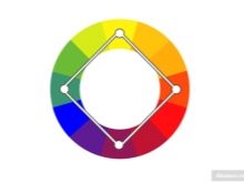
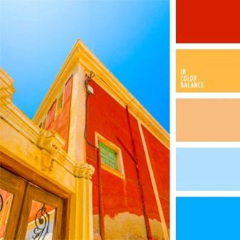
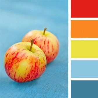
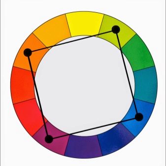
The quadrilateral inscribed in Itten's circle demonstrates how four tones can be combined in clothes at once. The locations of its corners are the points that determine the successful combination of colors. As a rule, the final solution turns out to be quite bright, but you can balance it by focusing on the red-green range of shades.
Hexagonal combinations
An even more difficult solution is the hexagon. The multifaceted figure "works" quite simply, allowing you to create a variety of combinations without too bright contrasts between them. This solution is especially often used by interior designers. But in the selection of clothes or a palette of colors for makeup, it will be quite useful.
Of course, Itten's proposed color scheme cannot be called an absolute solution for all occasions. But when it comes to combining clean and complex tones, it is absolutely irreplaceable. In addition, by adding black, gray and white shades to a single gamut, you can expand its range almost infinitely, and the principles of the basic scheme will still work flawlessly.
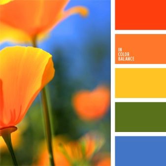
For information on how to combine colors in the interior, see the next video.


