All about corporate identity
In any field of activity, there are a huge number of companies, each of which is looking for a way to stand out from the rest. Most of these businesses are replete with bright pictures, loud slogans and special offers, but as a result they look the same and boring. Only a few manufacturers achieve that their logo becomes recognizable all over the world, and all thanks to a well-developed corporate identity.
What is it and why is it needed?
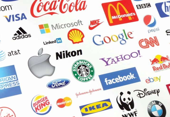
To understand the meaning of the definition of "corporate identity", it is necessary to recall any well-known trademark, for example, Coca-Cola, Adidas or Foxtrot. When you mention these names, a certain color, logo, melody or author's font immediately appears in your head - these are the elements that make up the style of the organization.


The history of the emergence of each company begins with the creation of a certain image that makes the brand recognizable among competitors.

The corporate identity is a special expression of the individual qualities of the company, conveyed through colors, sounds, text and simplified symbolic figures. The purpose of all these elements is to unite the goods or services of the firm by one common association with the manufacturer. The use of stylistics affects the image of the enterprise as a whole, because the design concerns any, even the most insignificant detail.
Nowadays, the concept of "corporate identity" is responsible for three main functions of enterprise development: identifying, image and differentiating. Let's consider each definition in more detail.
- Identifying function. An enterprise that adheres to a certain style of decoration of goods and premises will stand out from its competitors.It will be easier for customers to remember the relationship between a product and a manufacturer when they have a common logo, color or font. The popularity of a product will grow faster if customers can quickly identify it among other similar products. To understand the importance of the distinctive features of a product, it is enough to remember any annoying commercial. For advertising to work, it must include a description of a special feature of the product, by which it can be easily found on the shelves of stores or Internet sites.
- Image function. The reputation of the company plays an important role in promoting the business, the corporate identity helps to create and maintain an original and recognizable image of the company that attracts customers. When a company is perceived positively by people, then the trust in its products also grows significantly. Very often a trademark is for the target audience a sign of high quality or a certain pricing policy that distinguishes products from similar products.
- Differentiating function. Compliance with a specific design distinguishes the company's products and advertisements from competitors. Nowadays, there is a huge number of similar manufacturers offering a huge number of similar products. Branding helps clients find familiar traits in this abundance and greatly simplifies the search process.
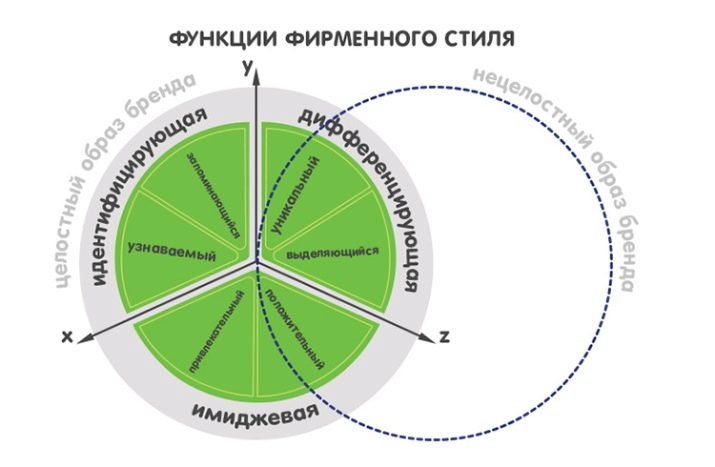
The description of the functions of the corporate identity partially answers the question of what tasks it performs and why it is needed. First of all, the design worked out to the smallest detail distinguishes the company from a huge number of competitors. Individual style features add prestige to the company and create a special character that is remembered by customers.
Easy product recognition is also a very important factor in helping to build a reputation and increase sales. Nevertheless, you can place style elements not only in the workroom or on a product - you can also depict a trademark, slogan or logo on clothes, creating a uniform.
Clothes with distinctive signs help the employees of the company to quickly integrate into the team, feel the corporate spirit, and also feel like an important part of a huge mechanism.

Customers show more confidence in products that they know at least a little - somewhere we met a logo, heard a sonorous slogan or remembered the characteristic features of products from advertising. When the style of the enterprise reaches a certain level, you can start saving on advertising, because design itself becomes the best advertisement.
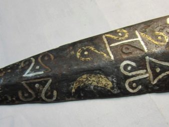
The significance of FS was known even in ancient times. - Symbols responsible for a certain style are found on many artifacts. Previously, in order to show the relation of a thing to a certain category, special insignia were depicted on it. Such ancient markings are found on weapons, household items, tattoos and burial sites.

Item overview
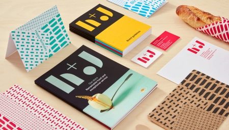
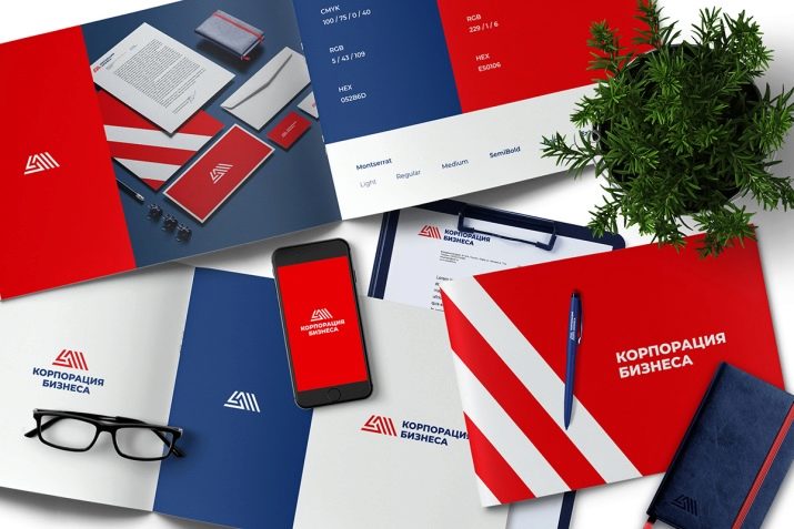
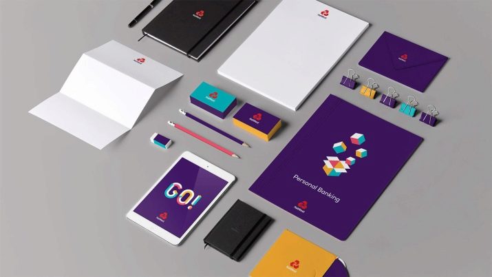
The corporate identity includes a whole list of elements, each of which performs a specific task.
Businesses often use only a fraction of these symbols, which leaves the company image unfinished.
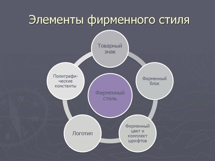
Among the elements that are included in the standard set of FS are not only logos, slogans and certain colors, but also a few other important details. The list of the main elements of the company's stylization includes: trademark, logo, slogan, colors, block and font. Let's take a closer look at each individual detail of the company's image.
Trademark
A service mark (trademark) is the main element of a corporate identity, which can be expressed in one or several ways.
People often confuse this part of the image with a logo, but the service mark has a deeper meaning.
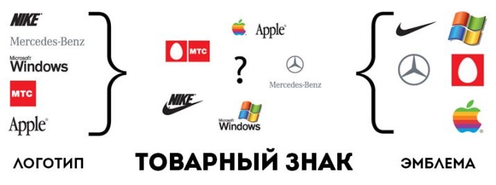
The main meaning of a trademark is the name of a company or a word mark, but it can also be a visual, three-dimensional and sound symbol.A token can also be composed of a value combination containing two or more service characters. Let's take a closer look at each type of trademark.
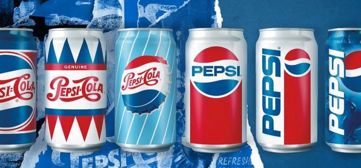
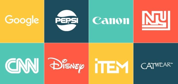
- Company name or word mark. When a business name is patented, it is protected from being used by competitors. A word mark can be registered in a regular font or in a stylized design. When a firm registers its name in a design typeface, it becomes a logo. The definition of the word "logo" is rather broad - it can be the full name of the company, for example, Google, Coca-Cola or Samsung, an abbreviated abbreviation (WB, MTC), as well as a product category or the name of a specific product (Pepsi, Fanta). The logo is the most popular type of trademark - 80% of entrepreneurs register it as a stylized company name.
- Visual sign. This type of symbol is an image, a drawing, or an emblem of an enterprise. You can patent a visual service mark using any image - it can be an animal, a person, objects of nature, simple or complex figures, abstraction, as well as an ornament or symbol. A patented pictorial mark may only be used by one company that registered it first.
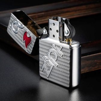
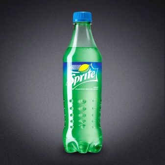
- Volumetric sign. This is a specific symbol made in three-dimensional form - it can be a shape or a combination of lines. The most popular bulk production is packaging. The original shape of a bottle, box, bag, bottle or the product itself (soap, candy) - all this is a three-dimensional sign. These symbols include the shape of the Zippo lighter (which even has the sound of opening the lid patented, not to mention the mechanism itself) or the shape of soda bottles (Coca-Cola, Fanta, Sprite).
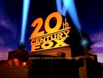
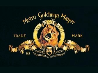
- Sound sign. This type of sign can be represented by a variety of sounds - melody, song, animal voice or noise. The sound sign is the theme song from the 20th Century Fox movie intro and the lion's roar in the Metro Golden Mayer intro. These companies have secured the right to use these sound marks through a patent, so no other company can legally use them in their works.
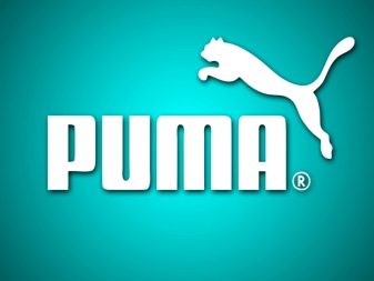
- Combination. The composition of the combined symbol includes various combinations of all the described signs. A well-known example of a combination that consists of a name and an image is the Puma service mark, which features an animal and the name of the company next to it.
When creating a corporate identity, many well-known companies are not limited to one symbol, most often the individuality of a company is expressed in a combination of several signs.
Logo
This is an original drawing or image that represents the essence of the company. The most common way to create a logo is to stylize the name of a business and add a visual component to it. Such a symbol is the face of the company - it is he who most often catches the eye of customers, so it must be very carefully worked out.
The logo is the basis for creating a corporate identity, from which the creation of an image begins, and only then the rest of the stylization components are worked out.
The company symbol should be as simple as possible, but at the same time, it should contain maximum information about the company.
At first, creating a logo does not seem such a difficult task, because any designer can depict the original symbol. However, not everyone can embody the whole essence of the company in a simple figure.
Sometimes it takes more than one day or even a week to create a suitable logo, it can take up to several months.
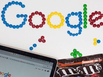
The logo performs several important tasks at once - it helps to remember the name of the company with the help of associations, tells people about the nature and reasons for the existence of the company, and also reveals the history of brand creation. For example, the Google logo is the modified English word "googol" for the number 1 followed by 100 zeros. This number is closely related to the essence of the company - it denotes high productivity and speed of information retrieval.

Tagline
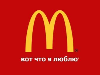
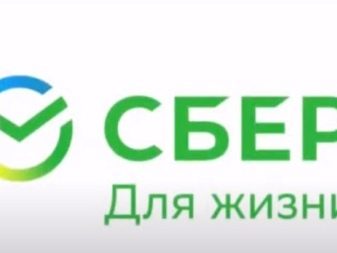
Creating a slogan is as difficult as making a logo. The slogan is the whole essence of the mission of the enterprise, enclosed in a few simple words that are understandable to every person. The slogan is the very annoying phrase that endlessly spins in my head after watching ads. - “This is what I love” from McDonald's, “Like no one else” from the manufacturer Mercedes-Benz, or “For life” from Sberbank.
A corporate slogan can be expressed not only as a simple phrase, but also as a company motto.
When a slogan is used frequently, it becomes part of the style of an enterprise and can also become part of a service mark. The crown phrase is both a visual and a sound sign, therefore it is of particular importance when creating a corporate identity. The slogan is a high concentration of the idea of an enterprise, the whole essence of its existence. A good slogan should emphasize a well-developed corporate style, be combined with its elements, it is also very important that it be short, sonorous and memorable.
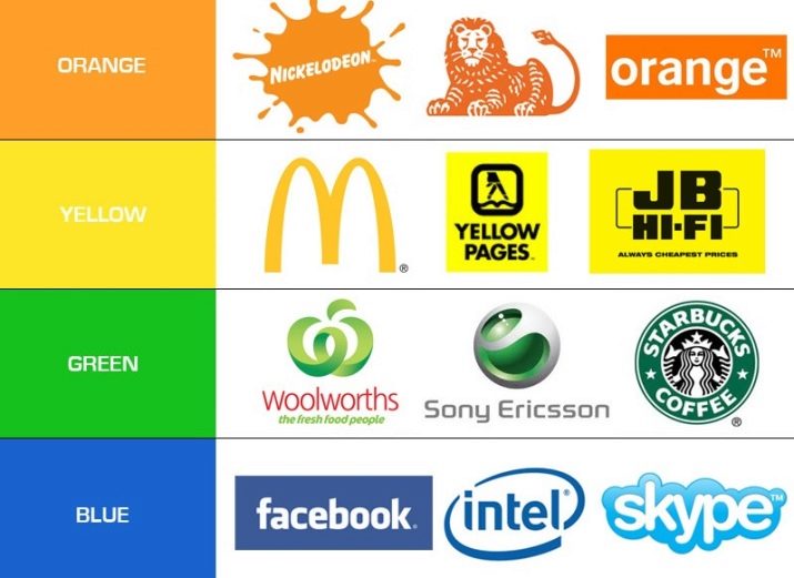
Colors
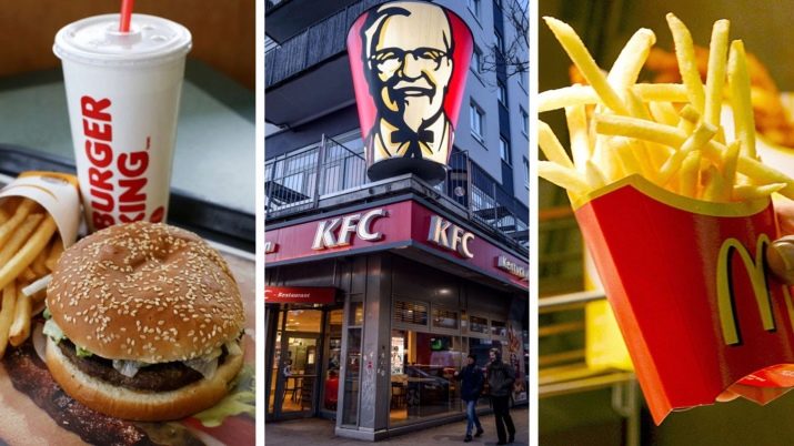
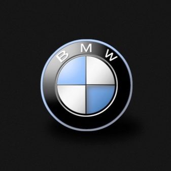
Sometimes the use of certain corporate colors leads to the fact that people begin to recognize them even in places where the company has not advertised. The successful use of color combinations helps customers remember a company and recognize its products among thousands of other names. There are many examples of successful color combinations associated with a particular brand: white and blue squares in a black circle on the BMW logo, black and yellow stripes on the Beeline emblem, or a yellow letter on a red background from the McDonalds restaurant chain.

Choosing a color is also a daunting task, as each shade evokes different associations among customers. To choose the right color scheme, you need to carefully study their impact on people or familiarize yourself with the color choices of successful businesses. For example, insurance and financial institutions strive to provide peace of mind to their customers, which is why they often choose soothing colors for their corporate identity, such as blue or green.
Color plays an important role in the registration of a trademark: if you patent it in a color version, then it will be protected only in this version.
The black and white character is protected in any color palette.
Block
A branding block is an important part of styling — it represents the standard use of a verbal and visual mark, or a combination of several other styling elements. This element can consist of the full name of the company, its details, logo, list of products or services, slogan and other decorative additions. The most popular part of the corporate block is the indication of the year of establishment of the enterprise, for example, Sberbank always leaves the postscript "Founded in 1841" in advertising.

The block is a convenient tool for processing business documents, office letterheads (in the form of a "header"), advertisements, business cards and packaging of goods. This part of the corporate identity consists of several separate parts that work well with each other, but can also be used individually.

Font
A well-chosen font is an important part of the corporate identity, which is used in all enterprise documentation. The style of spelling of words should be consistent with the general style of the company, correspond to its ideas and support the mission.
The shape of the letters and the thickness of the lines are also very important, because each difference evokes different associations in people. The flickering typeface is perceived as “childish” and therefore very suitable for children's goods stores.Also, the font can express "femininity", "masculinity", "lightness", "stylish", "conservative" or other meanings depending on the chosen design.
An important factor for choosing a font is readability, because if clients cannot read the name correctly, then the company will not gain popularity. The quality of reading the font depends on the individual stylistic elements, the size of the letters and the weight of the lines.
As a rule, the style of the company name is depicted in a well-readable stylized font, and the information about the products is in simpler, therefore, the company should have several fonts at its disposal.
Carriers
When you have familiarized yourself with all the elements of the corporate identity, you need to think about where they need to be placed. First of all, these are all items that are related to the activities of the enterprise: goods, letterheads, business cards, advertising, accounting supplies, banners, Internet sites.
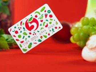
Remember the Pyaterochka chain of stores, a figure with a stylized green tail immediately appears in your head. The main colors of the company are well remembered by customers, because the founders of the company use them everywhere - on uniforms, signboards, in advertisements and in the interior decoration of stores.

We suggest considering a list of options for placing branded elements.
- Room decoration. This must be addressed in the first place, because in the future, all the details of the corporate identity will refer to the main room and the signboard.

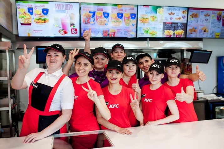
- A uniform. It can be both traditional clothing with a logo and the name of the company (overalls, T-shirt, vest, or all together), or individual items of clothing (cap, apron, kerchief).
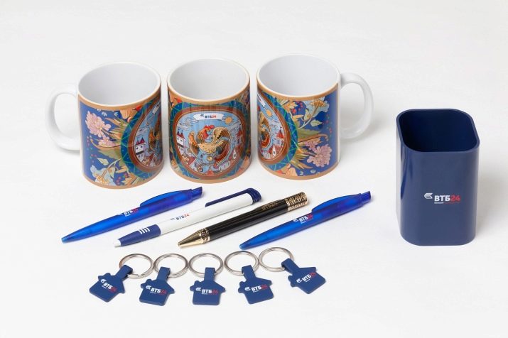
- Souvenirs. Stationery made in the corporate style will not only enhance the company's image in the eyes of customers, but also help employees feel part of the company's mission.
- Internet. The company's own website will make it easier for customers to find products, and additional social media pages or a YouTube channel will double the effect.


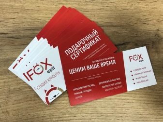
- Advertising. A business card, flyers, banners in corporate style will always be in front of the target audience.

Features of creation
To start promoting a brand, it is necessary to develop a corporate identity that will make the company recognizable and memorable. The entire project is divided into three stages of development: thinking through the details of the idea, bringing the style to life and maintaining the brand. Let's take a closer look at the rules for developing a corporate identity.
- Thinking over an idea. Before making a style, it is necessary for the company to create a specific mission or idea to which it aspires. For an enterprise that does not have a goal, it is very difficult to create a corporate identity, because all its elements will be a set of unrelated symbols. Experienced designers get to know the essence of a firm and then use associations to create interrelated style elements.
- The embodiment and fixation of the idea. At this stage of development, firms use different methods: they turn to advertisers, designers, website developers or private craftsmen. But in order for the end to justify the means, it is better to limit yourself to a minimum of developers, otherwise the style elements will not be homogeneous. If there is no choice and you have to turn to different designers in order to preserve the idea of stylistics, you need to create a brand book. This document contains a detailed description and depiction of style details.
- Preservation of FS. During the existence of large companies, their image can slightly change the design - this is not scary and can even arouse the interest of customers. But it also happens that over time the mission of the company changes, then you have to change the brand. The main thing when changing the corporate identity of a company is creating a good news feed and warning the target audience.

Examples of
To understand what a well-developed corporate identity looks like, it is enough to look at any successful brand.
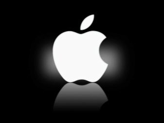
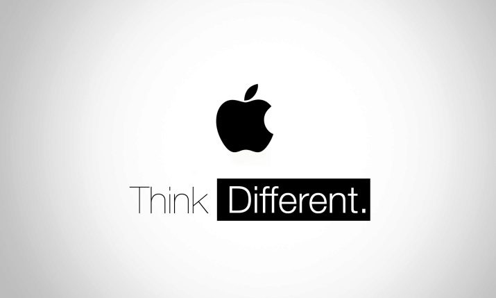
- Apple. “Our products make you special” - this slogan conveys the essence of the company and strengthens the emotional connection with customers.
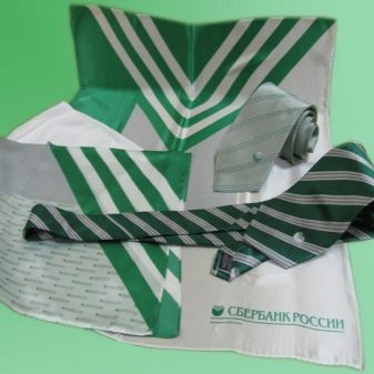
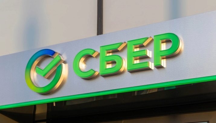
- "Sberbank". The light green tones of all the styling elements give the bank a reputation as a low-key and purposeful enterprise, capable of carrying enormous responsibility.
- Animal Planet. All the details of the corporate identity of the enterprise indicate the mission of bringing people closer to nature and the preservation of our planet.