Red bath: pros and cons, color combinations, examples
Bright colors are a "strong" and expressive design technique. You can also use it in the bathroom. However, you need to know how to do it correctly and what mistakes can be made.
The main subtleties and nuances
The design standards for living quarters and ancillary premises are steadily changing. What until recently seemed inconceivable as a radical blow to public taste has become a "normal" decorative experiment.
When decorating a bathroom in shades of red, one must remember that:
- the chosen color should be suitable for all residents of the house;
- a sharp emphasis on bright and saturated parts of the palette is inappropriate;
- at the same time, the use of relatively soft shades will add cheerfulness and vigor;
- the use of dissimilar shades and all kinds of textures helps to achieve the maximum variety in design;
- red is compatible with a wide variety of styles;
- excessive consumption can create a bad taste sensation.
It is advisable to "break up" bright colored fragments with less catchy inclusions.
Wherein you also need to take care of high-quality lighting... Lack of light makes the red bath look ominous and, more likely, scares, suppresses, rather than enhances vitality.
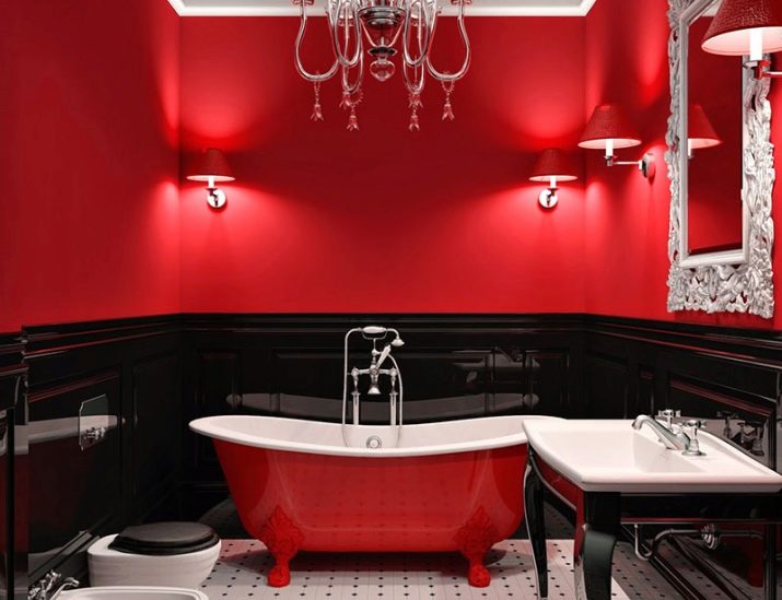
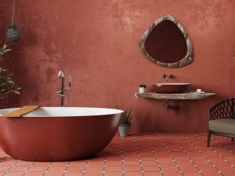
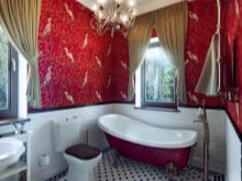
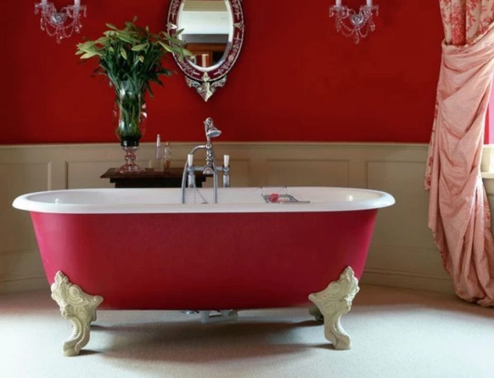
The classic option is considered red and white combination. But you don't need to focus on it - there are many other options that allow you to solve the set aesthetic problem.

Features, pros and cons
It is appropriate to use a red bath when the room should express:
- the most energetic attitude;
- striving for leadership;
- striving for new horizons and success.
Important: even if such motives are very important, it is necessary to dilute the rich red color with less emotional colors. Otherwise, a feeling of excessive aggression may arise.
A very expressive coloring is not suitable for those who are too hyperactive. People with a melancholic temperament, pronounced scarlet will psychologically oppress and cause incomprehensible irritation at the same time. The solution may be to use bright paint along with a lot of neutral tones, which will greatly improve the environment.
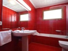
The undoubted advantages of the design of a room in a color from the red scale can be considered:
- festive and even solemn mood;
- stimulation of energy and activity;
- visual "warmth";
- excellent compatibility with gloss;
- easy entry into modern design styles;
- emphasized high cost and suitability in "lush" styles such as rococo and empire.
The fundamental “weakness” of red is the high risk of injecting too much of this paint. As a result, there will be a psychological imbalance. If the basic rules of combination with other tones are violated, part of the space may be visually absorbed. As a result, the room will be uncomfortable in appearance. Therefore, it is important now to consider what are the key norms of combination.
Combinations with other elements
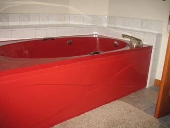
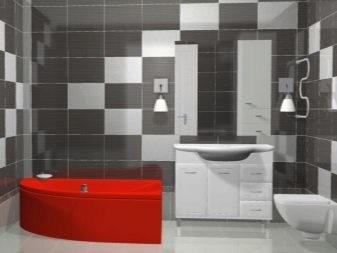
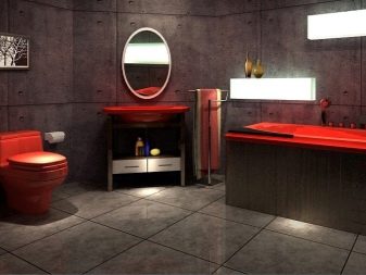
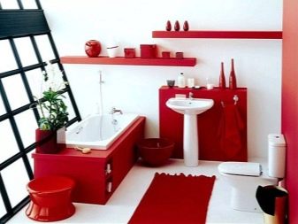
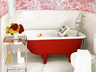
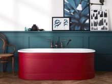
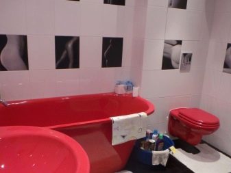
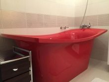
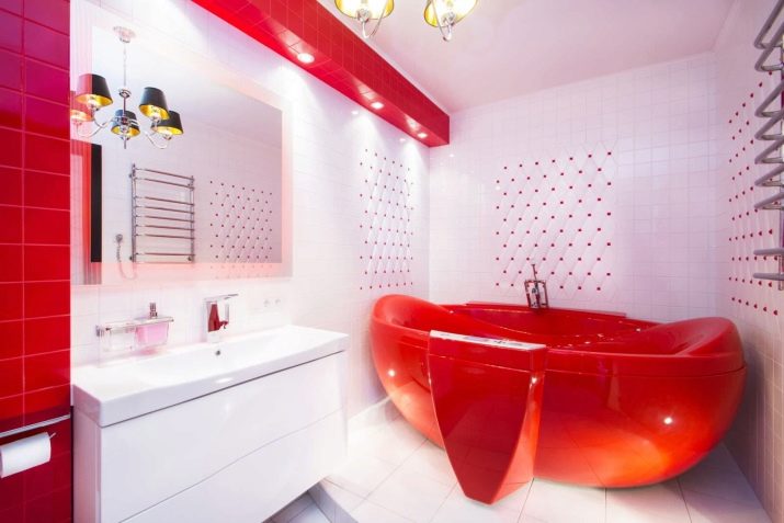
The first thing that comes to minds for both designers and ordinary consumers is that the red bathtub is surrounded by white trim. Then you can make the "wash bed" as saturated as you like - all the same, this brightness will be smoothed out by other details.
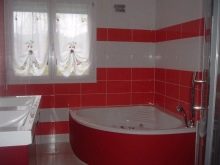
The use of small red accents in the design of the walls is allowed. If the room as a whole is small, you can use two colors in roughly the same proportions, but then a third color is needed to improve the balance.
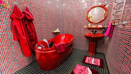
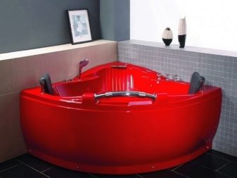
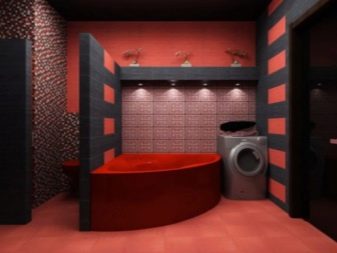
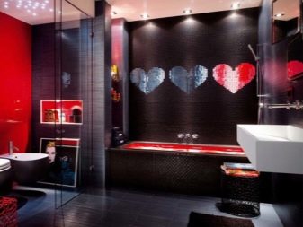
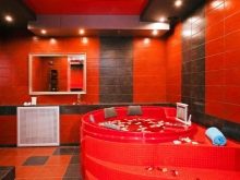
Sometimes it makes sense to invert the color scheme: then the red bath is placed in a black environment.
It looks catchy, impressive and chic at the same time. Important: this step is appropriate only in very good lighting conditions. Moreover, this duo must be applied skillfully and carefully. Sometimes only experienced qualified designers can do everything competently.
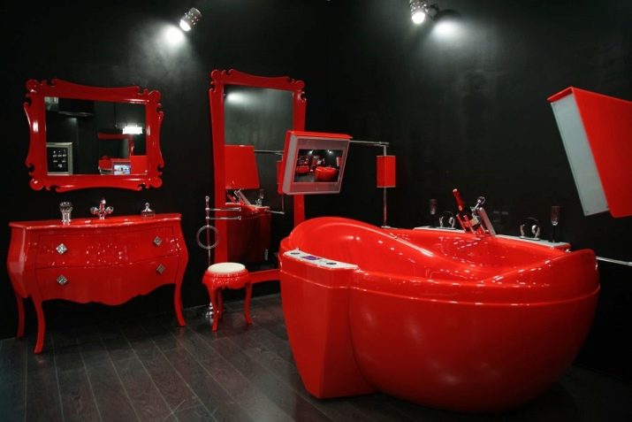
Recommendation: so that the interior does not look too gloomy and aggressive, you should go from red-black to black-red-white combination.
Even small white splashes will improve the perception of the composition. If you don't like such a radical combination, then you should consider the red-peach combination. It will be perceived much easier and fresher. Bringing dynamism to the room, this design option will also introduce a touch of calm and harmonious summer.
Additional information and practical examples
Many people are tormented by the question of whether it is generally possible to use a red bath in the interior. It is very easy to solve the problem - an elementary test will help:
- stand in the opening with their backs to the door;
- stretch their arms straight;
- turn their backs to any of the walls;
- extend their arms again.
If at least once your fingers have rested against the wall, an excess of red is unacceptable.
But you can still use a red bath if it is surrounded by white or any other discreet shade. To eliminate a mistake, you can do this: first, plan the entire room in white and only then add rich colors. This will allow you to feel the line beyond which their addition is impractical. To distinguish between different tones, it is worth using prints in the form of stripes.
Special problems arise when decorating a bathroom in Khrushchev. It is advisable to compensate for the use of a red bath (space absorbing) with local lights. They can be directed both at the "font" itself, and at other objects.
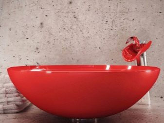
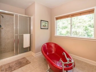
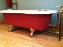
The material from which the bathtub should be made does not play a special role, and it is selected according to personal taste.
For your information: if space permits, it is worth experimenting with combinations of red and wine colors (or rather, numerous wine shades).
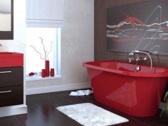
This photo clearly shows how to combine a red bathtub with white surfaces. A huge role is played by relatively modest inclusions of floral ornaments. The elegant textile decor complements the interior favorably.
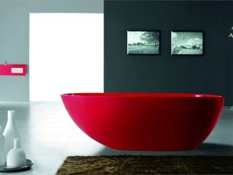
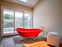
But you can act differently: for harmony, they use elements of the interior that are as rich as the bath itself. At the same time, the walls, floor and ceiling are snow-white (with the exception of rare inclusions).
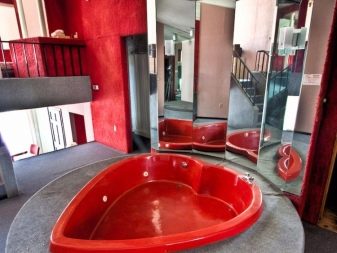
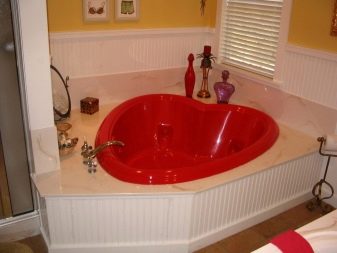
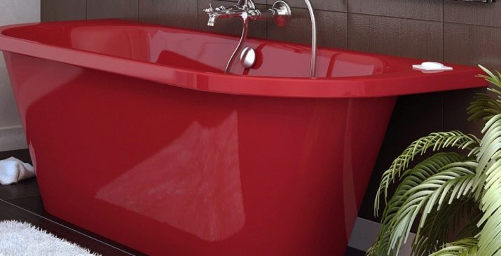
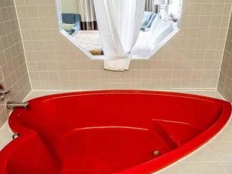
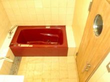
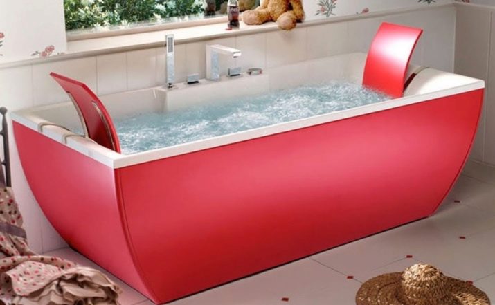
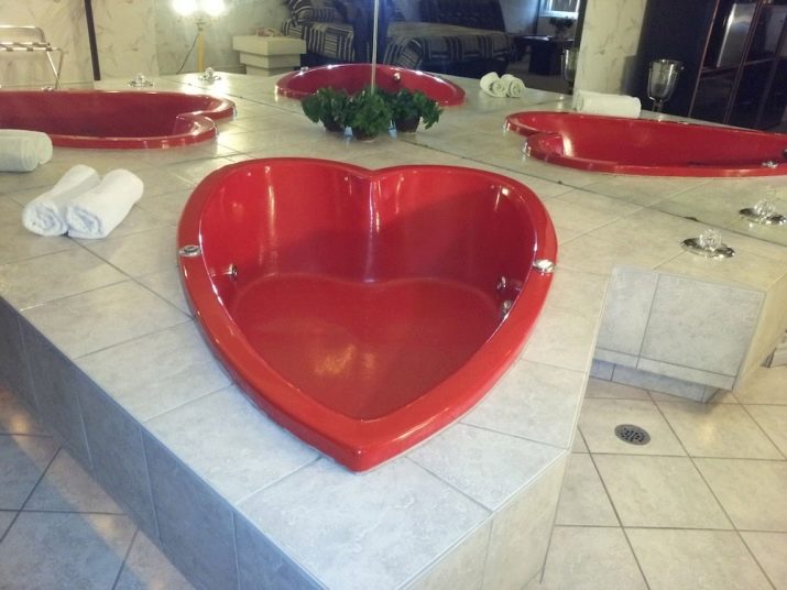
When choosing a geometric shape, you can only be guided by your own taste. So, the traditional solution is a rectangular or square red bathtub. A heart-shaped product looks more romantic.
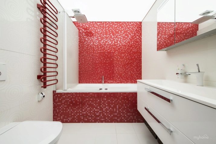
An alternative is this solution: the bathtub wall visible from the entrance is laid out with a red mosaic, in which slightly white notes are guessed... In the same way, they decorate the wall, to which the opposite side of the bath adjoins; all this is reflected in the mirrored wall cabinet, and the rest of the room is painted in impeccable white.
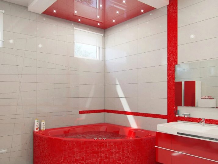
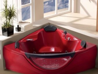
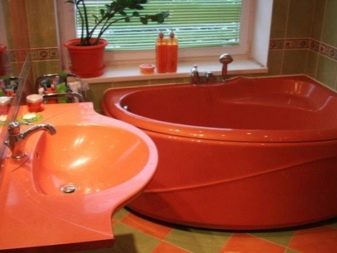
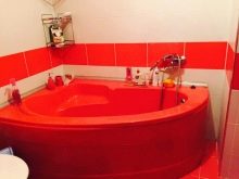
Fans of the original design will be delighted with this idea: use a red corner bath, which logically continues in coloristic terms with a bedside table and a strip on the wall. Above, the red ceiling is a reflection of the rich piece of plumbing.