Fashionable colors in clothes of the spring-summer season
Views
The color scheme of clothing has many characteristics, according to which colors are distributed and combined. One of the important components of color, necessary for the harmony of an image, is its temperature.
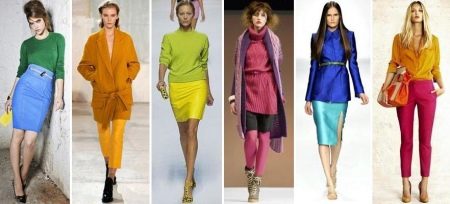
All colors and shades can be roughly divided into warm and cold. Like ice and fire, blue and orange are vivid representatives of cold and warm colors. It should be understood that not only colors can be classified as cold or warm, but the shade of any color belongs to one of the types, depending on which subtone it has - cold blue or warm orange.
When choosing clothes of cold or warm shades, you need to focus on your color type. So, girls of summer or winter color type, in whose appearance there is an icy tide, should choose clothes for their wardrobe from cold shades. For the spring and autumn color type, which is characterized by a golden tint in the hair or eyes, things of warm colors are the best fit.
In order to choose clothes, correctly determining the type of this or that shade, it is important to learn to distinguish between warm and cold tones.
Warm tones in clothes - all colors and shades with the presence of red-yellow or orange. The cool blue color will also become warmer when orange is added, this rule applies to all colors.
Cool shades in the wardrobe are all things that have an admixture of blue. Any color, even very warm yellow, becomes noticeably colder when blue is added. This focus does not work only with orange, which in any case will refer to warm shades.
However, even having clothes in the wardrobe of those colors that correspond to the color type, you may encounter difficulties and limitations in the choice of images. For such cases, every wardrobe must contain things of neutral or basic colors. Although such clothes are not full of colors, due to their versatility, they are combined with almost all other things of any color.
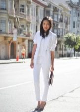
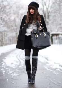
Neutral or base colors include all achromatic colors - black, white and gray, as well as dark blue and shades of beige and brown.
For cold shades in clothes and for the winter color type of girls, dark blue, white and black basic colors are the best fit.
Brown and beige, gray and dark blue colors will be a good solution for a summer color type.
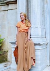
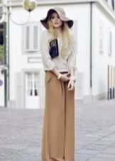
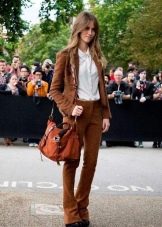
Beige and brown neutral wardrobe items in all sorts of color variations are perfectly suited to warm tones in clothes, as well as spring and autumn color types.
Now you can not only create a spectacular look in cold or warm colors, selected in accordance with the individual characteristics of your appearance, but also diversify your wardrobe with basic items of neutral colors.
Colors and their meanings
In addition to the fact that the color must be selected according to the color type, it is very important that the selected shades are to your liking. After all, everyone has favorite colors that match their character or aspirations. The chosen color solutions in clothes are a kind of signal for the people around them. It's not in vain that they say - they are greeted by their clothes. Therefore, the choice of color in clothes for a particular occasion should be treated responsibly, taking into account its meaning and perception for others.
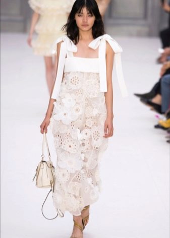
White color in clothes symbolizes purity and closeness to the ideal. No wonder the dress for the bride is traditionally white. People who choose white are neat and pedantic, decent and honest.
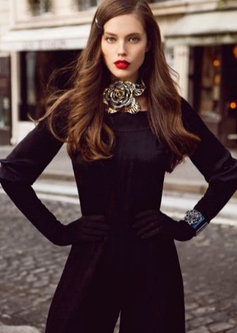
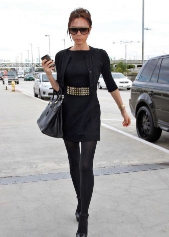
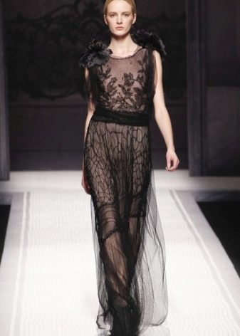
Another achromatic color - black, gives the image of restraint and elegance. However, the abuse of this color in the wardrobe can indicate a kind of mental crisis and even depression. Choosing black, you can mask not only the flaws in the figure, but also your emotions.

The base gray color helps to blend in with the crowd and go unnoticed. But due to its neutrality, it goes well with other colors and allows the image to sparkle with new colors.

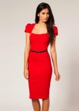
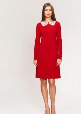
Red is one of the brightest colors in the wardrobe. He carries with him a tremendous vital energy. This energy can be directed both into a love channel - to express passion and attraction, and into a business one - to symbolize perseverance and struggle in achieving goals. The choice of red is the lot of passionate and enterprising people.

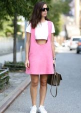
The choice of pink in clothes speaks of romance and sentimentality, sometimes even vulnerability of a person. Lovers of pink do not accept aggression, they are soft and kind. In "rose-colored glasses" the world around us seems comfortable and problem-free.
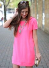
With the help of pink, you can easily defuse the situation, directing the situation to a peaceful channel.
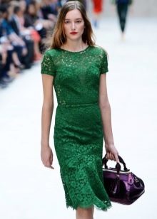
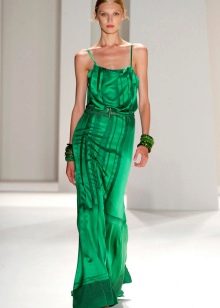
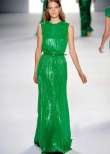
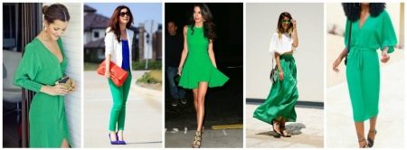
Green in clothes symbolizes self-confidence. This color in the wardrobe is chosen by people seeking universal recognition and sympathy. But at the same time, green is a stability that does not tolerate and avoids change.
For many, blue is associated with peace and constancy. Blue color in clothes allows you to relieve tension and achieve harmony. Expressive and nervous people tend to avoid blue in their wardrobe.
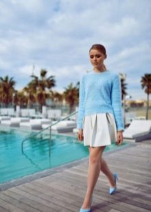
Shade of blue - blue also symbolizes calmness and tranquility... A great color for clothes on vacation, in which you can easily relax and abstract from problems.
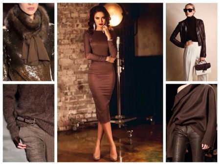
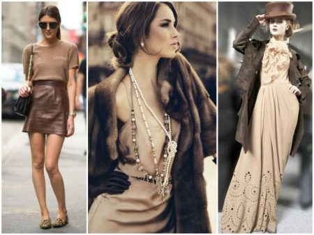
The brown color is rather conservative in color. Tribute to traditions, family foundations, the prevailing way of life - all this is appreciated and honored by lovers of brown.Therefore, young people who are in search of themselves and their life path usually do not choose this color for their wardrobe.
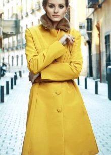
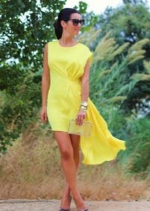
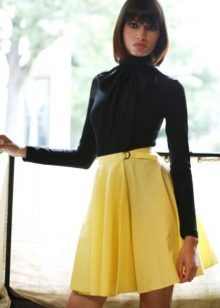
One of the lightest colors is yellow. He is usually chosen by positive people with an optimistic outlook on life who are used to being the center of attention. Yellow indicates a willingness to make contact and curiosity about everything around.
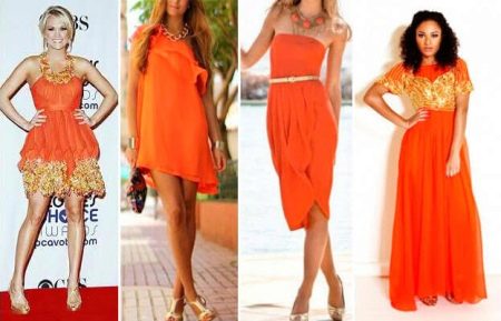
TThose who choose orange for their wardrobe strive for success. This color has a very strong energy, it helps to maximize the possibilities of a person.
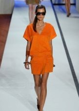
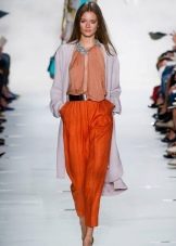
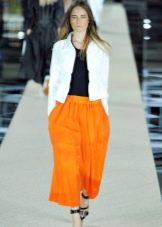
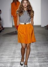
Orange helps to get rid of depression, relieve stress, gives strength and helps to find freedom.
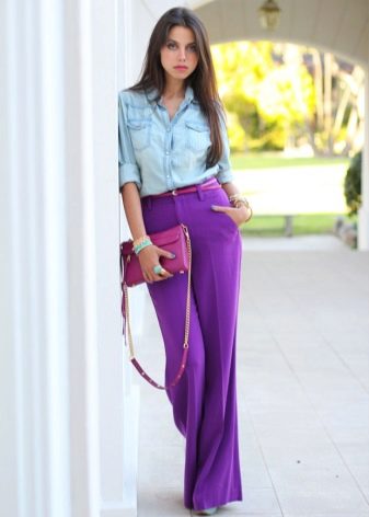
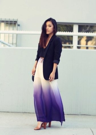
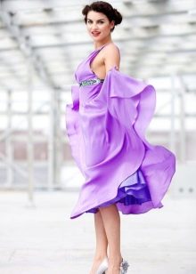
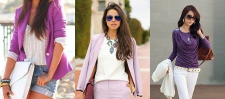
Purple symbolizes non-standard thinking. This color is chosen by creative people with a rich imagination who love to dream and fantasize.
All these meanings of a particular color must be treated with a degree of convention and remember that each of the listed colors has a huge number of shades that reveal the color in a new way and give a different emotional color to the female image.

Spring Pantone Trends
Every season, new shades and completely unexpected color schemes come into fashion. It is not random people who set the tone for the color scheme of the next season, but real experts in their field. Pantone Color Institute is a team of European experts in the field of color and color mixing, whose opinion is authoritative for many designers and fashion designers around the world.
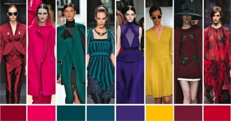
After analyzing current trends and trends in fashion, experts from the Pantone Color Institute proposed the top 10 current and fashionable shades that will set the tone for the spring-summer collections of the upcoming season. The color of mustard, shark skin and others, which are relevant in the fall-winter season, have been replaced by new ultra-fashionable and bright colors.
In a women's wardrobe, there can be both individual elements of clothing and bright prints of these colors in calmer colors - the use of any of their fashionable shades in clothing speaks of the sophistication of taste and adherence to fashion.
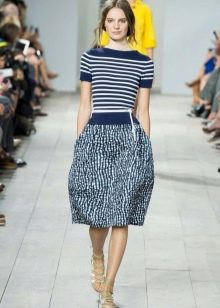
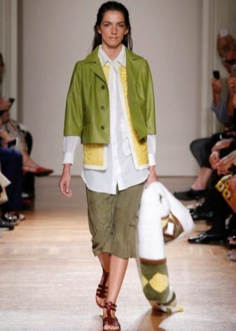
- Spring green. A juicy and rich light green shade of green resembles the appearance of the first green leaves in spring. This color adjusts to success and is intended to dilute the boring gray mass of everyday work. Experiments with light green in the collections of Michael Kors, Trina Turk and other designers have shown that this color works wonderfully with other blue and green tones from the Pantone fashion line.
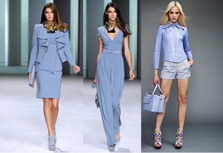
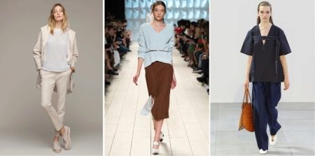
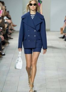
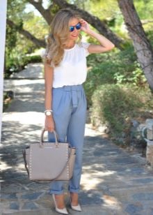
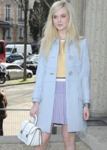
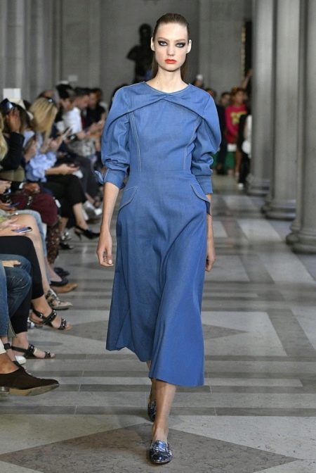
- Niagara. The ash blue color, named after the famous waterfall, is very reminiscent of the classic denim shades. This color is the most popular of all the trendy shades of the Pantone color range. Due to its versatility, clothes of this color can be easily combined with other colors, just like jeans.
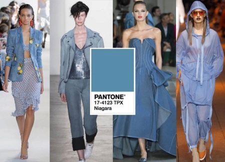
The simplicity and convenience of this color have pleased many designers who have successfully used it in their new collections. Carolina Herrera's festive outfits look chic in this color, while Zac Posen has translucent Niagara details adorning spring / summer looks.
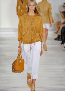
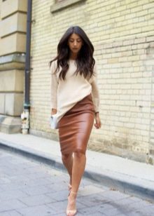
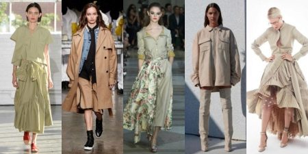
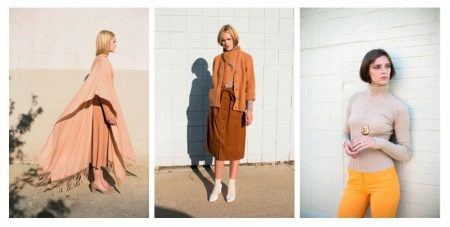
- Hazelnut. True hazelnut or hazelnut is much darker than the trendy neutral shade presented. This base shade of beige is a great alternative to darker blacks and blues for casual looks. The Hermes and Baja East collections showcase a variety of uses for this versatile shade.
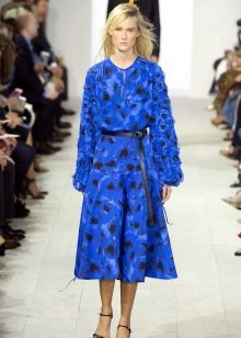
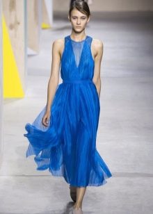
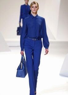
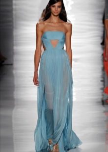
- Blue lapis lazuli. A deep and rich blue, reminiscent of the dark stormy sea on a rainy day, with hints of blueberry or plum, is popular in the spring / summer collections of fashion houses. The outfits of this blue shade will accentuate the graceful curves of the body, and at the same time will become a bright and stylish solution to the feminine image.
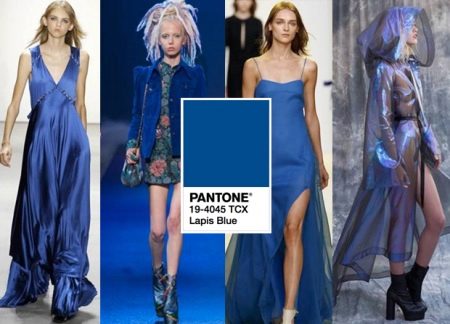
This mesmerizing blue in a trendy ultramarine hue works well with other Pantone trendy shades as well as base colors.

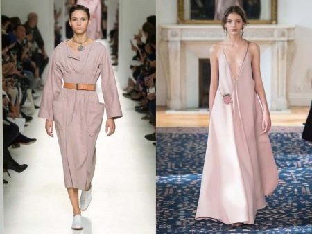
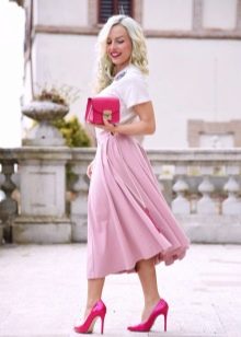
- Dogwood flower. The plant, after which this shade is named, blooms with dusty pink flowers, very delicate and sensitive. This color echoes the color of an old dry rose. Summer outfits made from light fabrics in this shade will be a great stylish solution for walking or the vacation season, and a pale pink coat or cardigan will make you stand out from the crowd this spring.
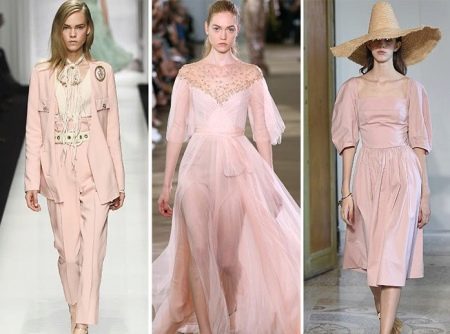
This color works well with other pastel colors such as Niagara or Island Paradise. Banana Republic actively uses this color in their collections.
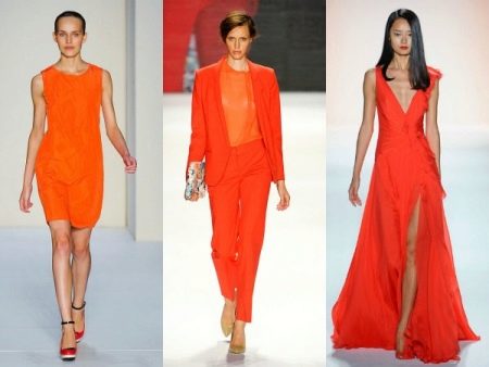
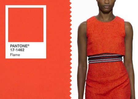
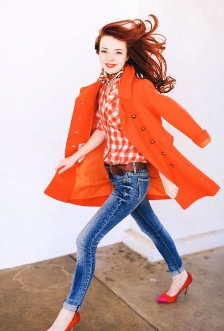
- Flame. The bright terracotta orange color does not blend easily with other colors as it is quite self-contained. Like a flame, this color has swept the fashion shows. Designers such as Gabriela Hearst, Tory Burch and others have embraced this expressive and energetic shade and have successfully added it to their collections. Spring looks in this color from casual loose-fitting clothes look juicy and catchy.
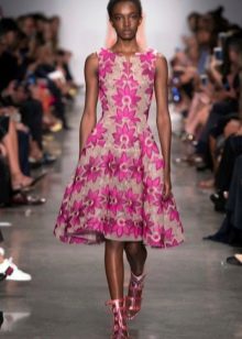
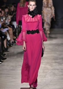
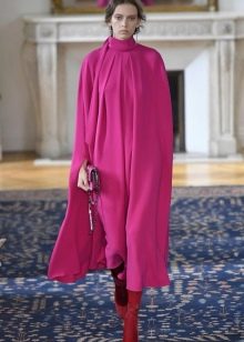
- Pink yarrow. Intense yet feminine pink with a carnation hue. The bright and bold color can be used in monochrome bows, it does not require addition.
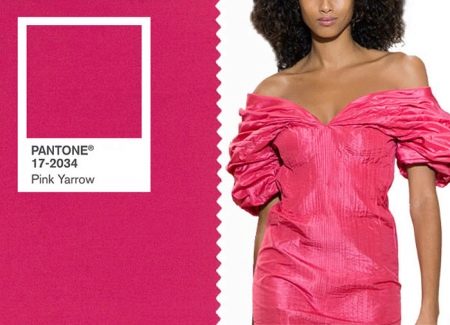
A rich pink hue is featured in the collections of Nanette Leopre and Roberto Cavalli.
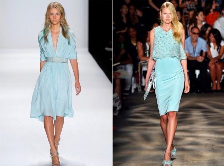
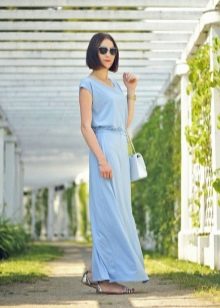
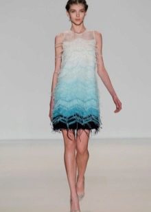
- Island paradise. The delicate and at the same time cold shade of blue with a turquoise tint is similar to the shade of an agave flower or a heavenly blue. Perfect for weightless summer chiffon dresses or a bright coat for a spring outing. Sensual ice with hints of aquamarine in this shade will add femininity and airiness to the image.
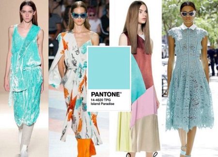
Trendy velvet dresses from Victoria Beckham, lace from Lela Rose in this color conquered even the most discerning connoisseurs of fashion.
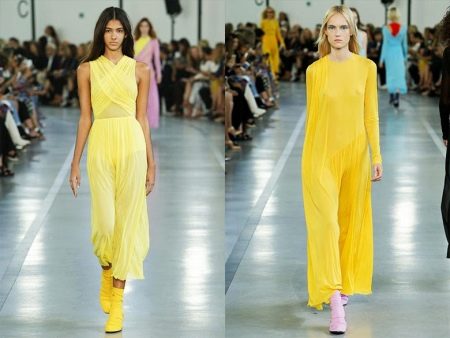
- Primrose. A very bright and rich shade of lemon yellow will energize and positive for the whole day. Bold and bold, this color goes well with blue and hazel shades. Having barely appeared on the catwalks of fashion houses, the lemon-yellow hue has gained popularity among connoisseurs of style and beauty.
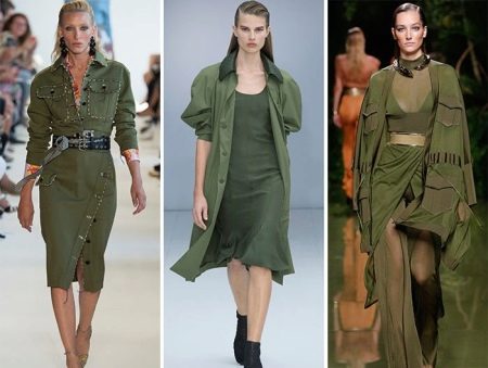
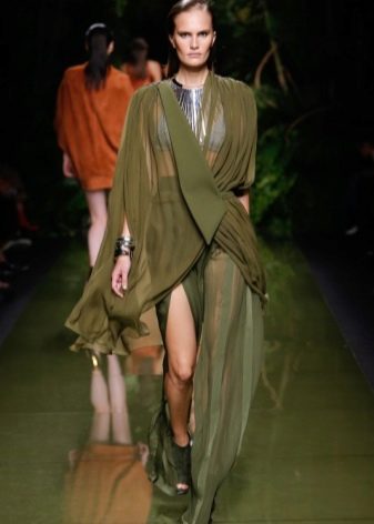
- Cabbage color. In fact, this color is more reminiscent of broccoli or even the usual khaki color. Camouflage motifs in military style, stylish solutions for safari and casual - in the most comfortable styles of clothing this shade of green is indispensable for the coming season.
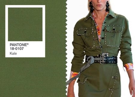
Collections DKNY, Balmain, Altuzarra presented interesting models in army color, relevant in the spring-summer season.
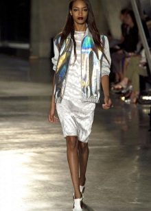
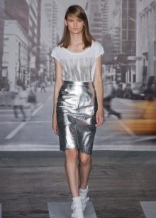
- In addition to the presented top 10 shades from color experts, designers add a few more colors that are also relevant for the upcoming season. The Versace and Carolina Herera collections suggest that metallic silver, reminiscent of foil, will be a great option for daring people.
- White Chloe outfits and elegant black Alberta Ferretti dresses remind you that classics are destined to be trendy forever.
In addition to the presented fashionable shades of pink from Pantone, other shades of this color will also be relevant. It can be a delicate color of a tea rose, and lilac-pink, and its smoky shade, and a delicate color of pink cherry - the fantasy of designers regarding this color has no boundaries in the spring-summer season.
Another hot color for the upcoming season will be red. Bright and juicy berry shades of raspberry and lingonberry, the color of a ripe tomato - rich red colors in the spring and summer wardrobe of extravagant ladies are recommended by leading fashion designers.
Although Pantone announced the trendy color of lilac in the fall-winter season, many designers are in no hurry to write off this shade. A lilac shade, possibly with amethyst notes, is relevant not only for spring and summer clothes, but also for stylish accessories, which, with the help of their saturation, are able to set the tone for the whole image.
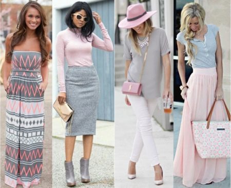
Clothing color compatibility
How stylish and successful this or that image will turn out depends largely on how well the shades are selected and how they are combined with each other.Competently combining different colors in an image is not an easy task, because this is a whole set of rules and principles. If the colors are not chosen correctly, it will be noticeable not only to knowledgeable people.
At a subconscious level, any person will have a feeling of some kind of imbalance associated with color perception. So, a few principles that will help you learn how to successfully select images for any occasion and look harmonious:
Combine neutral base colors with vibrant and saturated hues. This way of combining colors will always look great. However, do not overload the image with black, which is also the base color. For a more sophisticated look, use the rest of the neutral colors.
You can use several basic colors at once, for example, white and milky beige. Such an image will not look motley, even if more than three tones are used in combination with the base colors.
If the chosen image turned out to be too bright and needs to be muted, then you can add an element of clothing in the base color.
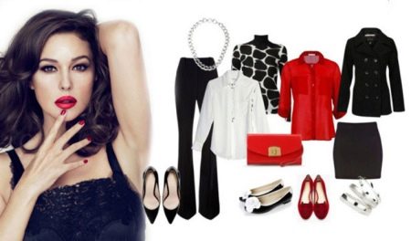
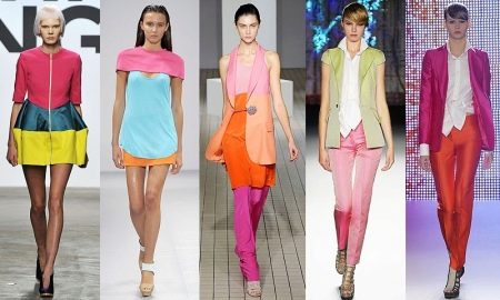
Use a combination of complimentary colors. This term refers to shades that are on different sides in the color spectrum. If you combine complementary colors in your image, you can achieve greater brightness and saturation of the selected colors. Usually, in this way, they add some kind of detail or accessory to a monochromatic outfit of a complementary shade.
The combination of these colors will also look stylish if one of them is bright and the other muted. As a rule, two bright complimentary colors in one look do not look so harmonious.
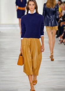
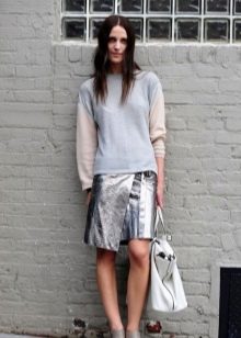
Use different shades of the selected color to create an image. This way of combining colors in clothes can be supplemented with neutral shades, which diversifies the color scheme of the image. For example, trendy cabbage color can be combined with pistachio, marengo or marsh, and hazelnut looks great with cocoa, cappuccino and even chocolate shade.
Compose your image using similar colors... Such colors are located side by side in the color spectrum, while the other is used to create one of the colors. For example, orange is obtained by mixing red and yellow. Therefore, red and yellow will be close colors for orange.

How to choose the right one?
There are many ways to determine the right colors for your wardrobe according to your appearance. Many people consider the most convenient and simple way to select the color scheme of clothing according to the color type of appearance.
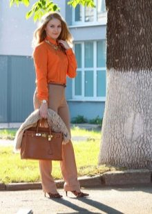
For fair-haired beauties with peach skin, belonging to the spring color type, refreshing warm tones are perfect. Red and orange shades, turning into coral and light rust color, salmon and apricot, as well as pastel colors such as camel, milky and ecru, green and yellow tones, turquoise and aquamarine - all these shades should be present in clothes of the spring color type.
For girls with light or ashy hair and pale pink or even pale skin, which are of the summer color type, the palette of colors for choosing clothes is quite wide. Melange, anthracite or graphite, as well as other gray shades, blue in all its manifestations, cherry or red wine color, cold shades of green - in clothes of these shades, representatives of the summer color type will be irresistible.
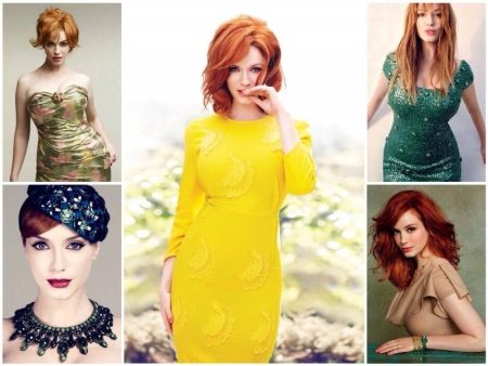
Red-haired girls with freckles and fair skin correspond to the autumn color type. The best color solutions for this color type will be soft gold shades, red-orange tones, olive or khaki, corn or mustard yellow, as well as various shades of brown and beige.
Contrasting winter color type - brunette or brown-haired woman with cold pale skin.Cool reds, pinks and purples, including cyclamen and cold orchid, dark eggplant or blackberry, summer-like gray tones up to black, and dark brown - all these tones will help to emphasize the coldness in the appearance of girls of this type.

Stylish looks
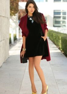
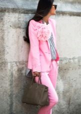
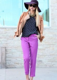
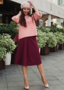
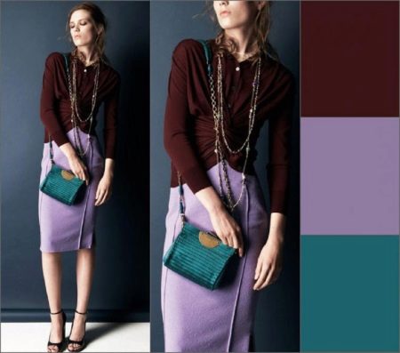
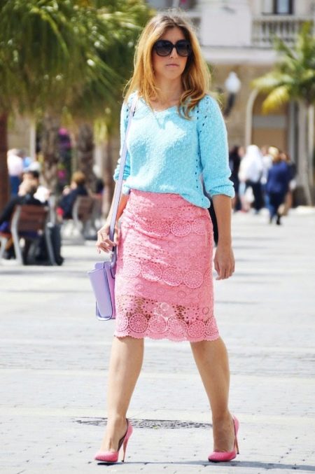
This image is composed using a combination of complimentary colors. Muted shades of blue in the sweater and lilac in the purse are well chosen and make the fashionable pink pencil skirt a bright accent of the whole look. In this outfit, you can go to the cinema or cafe on a warm summer evening.
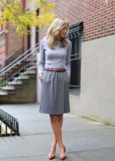
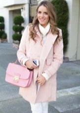
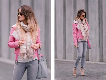
The combination of gray with pink is one of the winning colors for blonde girls. A gentle, casual look with a muted pink jacket and a voluminous stole, as if casually wound around the neck.
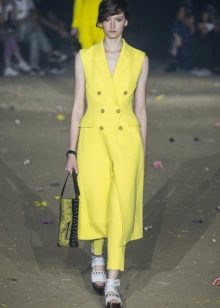
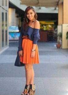
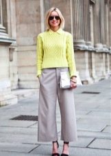
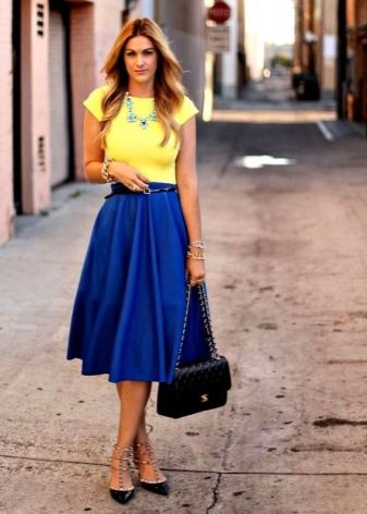
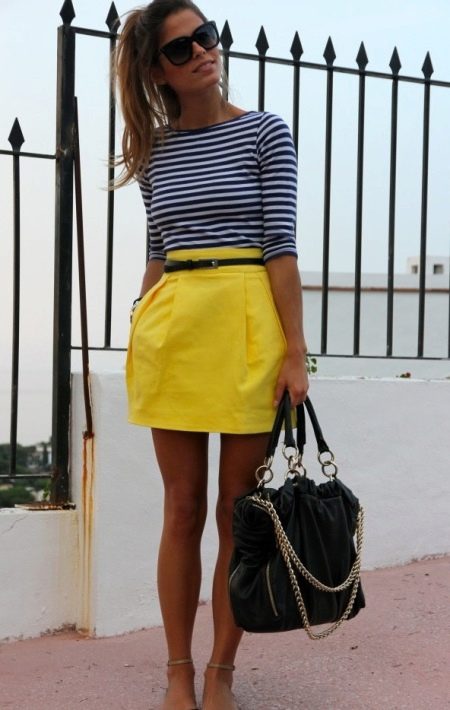
Combining a bright lemon shade of yellow, fashionable in the coming season, with basic gray things is a good solution to subdue the colors of yellow. You can even wear such a skirt with a gray striped turtleneck to work and bring everyone a sunny mood.
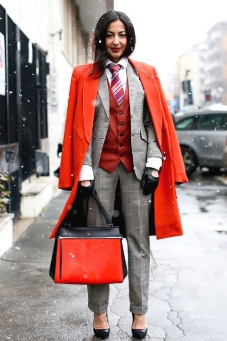
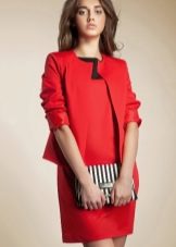
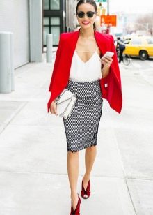
For more formal office outfits, you can choose an alternative in the form of a coat in an ultra-fashionable red shade - after all, in the office everyone takes off their outerwear, under which there will be an official formal suit in a cage in neutral gray tones.