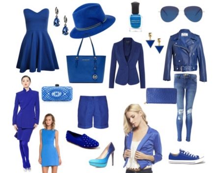
What is blue in clothes combined with?
What does blue mean and symbolize?
Blue symbolizes restraint, calmness, poise and self-confidence. Deep and rich shades of blue serve as an indication that a person is in harmony with the world around him, and his spiritual world is characterized by harmony. Dark shades are associated with rigor and stability, while light shades are associated with romance and spirituality.
Psychologically, blue is felt as a color associated with silence and tranquility, security, associated with calm waters, depth. Serves as a symbol of seriousness, concentration, loyalty, and also speaks of psychological susceptibility, a tendency to deep reflection and sensitivity to change.
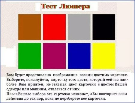
Psychologists use a special color test to determine a person's emotional state - the Luscher test. According to this test, the choice of blue indicates a physiological and psychological need for rest. Aversion to blue can indicate a tendency toward depression.
In ancient India, blue was considered the most appropriate color for meditation.
In clothes, blue is chosen if a person wants to inspire confidence in himself and make a serious impression, blue is associated with professionalism. It is not for nothing that this particular color is preferred for office wear and is chosen for uniforms.
People who prefer blue, love order, are dedicated to their work, they are distinguished by constancy, perseverance and perseverance. Blue is associated with loyalty to tradition.
Shades
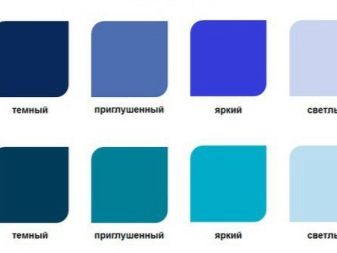
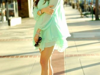
Pure blue is one of the primary colors. This means that it cannot be obtained by mixing other colors. This color is considered cold. However, among the shades of blue, there are also conventionally warm ones.Warmer shades in comparison with "pure" blue are obtained by adding additional tones - yellow.

Cold and warm shades of blue are conventionally distinguished.
Consider "cold" shades:
- azure,
- electrician,
- royal blue,
- bright blue,
- indigo,
- sapphire,
- cobalt,
- ultramarine,
- Navy blue.
"Warm" shades of blue are:
- cornflower,
- Prussian blue,
- turquoise,
- denim,
- "Moray eel",
- petrol,
- aquamarine.
How is it combined with other colors?
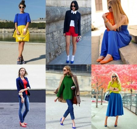
Vibrant blue hues go well with gray. The basic rule: the shade of blue should be saturated. Accessories of beige shades or white will be appropriate for this combination.
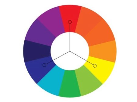
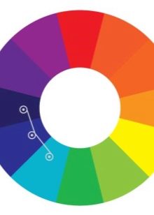
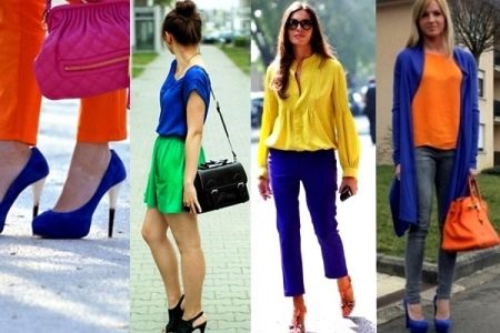
Blue, red and yellow are called primary colors. They are equally spaced from each other in the color wheel (meaning the color wheel, which is an indicator of the correct combination of colors). Blue, red and yellow make up the so-called triad. It is believed that the combination of process colors is a very noticeable and impressive combination. The best way to combine process colors is to add a small amount of one of them to the dominant process color in the outfit.
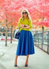
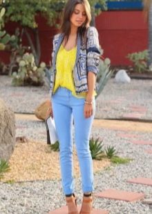
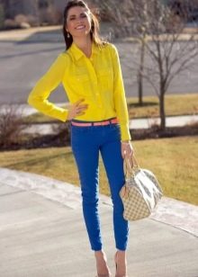
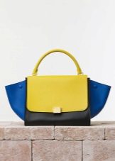
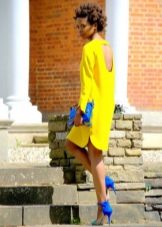
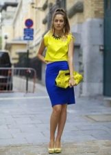
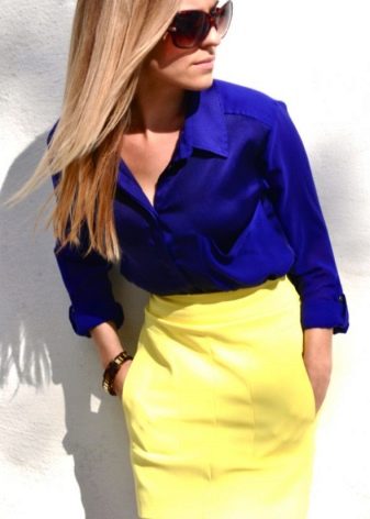
The duet of blue and yellow is a striking color pair. The choice of such a combination of colors in clothes and accessories, if they are taken in rich shades, implies ease and informality, suitable for relaxation and entertainment. Subdued, desaturated tones can be acceptable in the office and will help create an original and unique look.
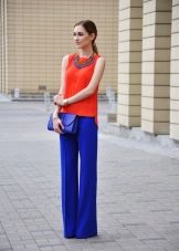
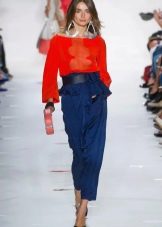
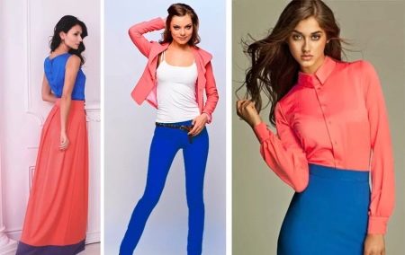
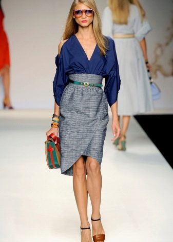
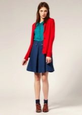
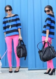
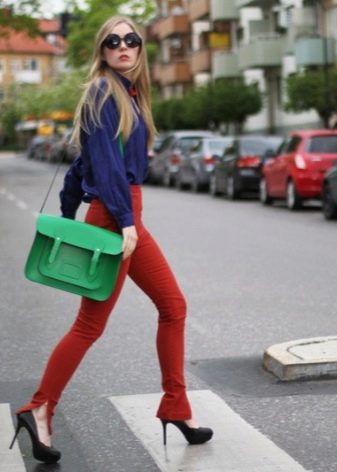
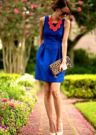
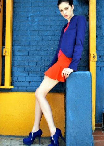
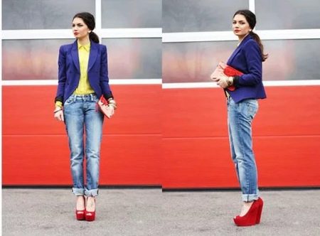
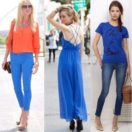
Blue and red are a bold and noticeable combination. It is important that there are not very many bright red in this ensemble; it will be most appropriate in accessories. Saturated and bright, close to pure colors, shades of blue and red in clothes together can look bold and defiant, and shades diluted and passing into neighboring colors - more peaceful.
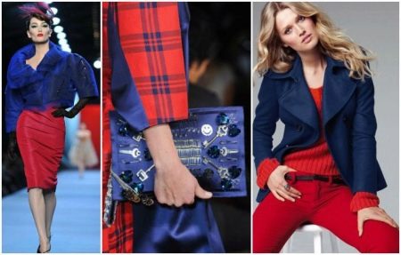
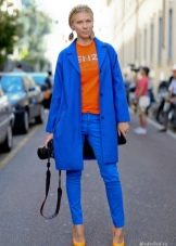
In clothing and accessories, a triad of primary colors (triple scheme) or a combination of two of them (blue plus red or yellow) is used to create retro looks in the style of the 50s or in the spirit of the disco style of the 80s and 90s. The combination of red and yellow with blue is often used in a sporty style. Primary colors create the brightest images.
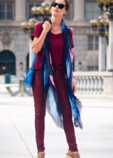
The combination of burgundy with blue will look much more relaxed.than a combination with blue and red, since burgundy in the color wheel is closer to blue than red.
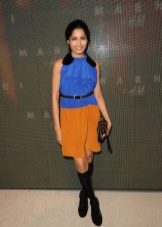
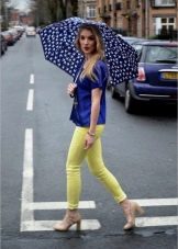
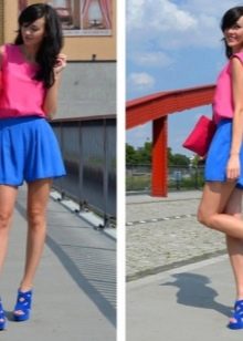
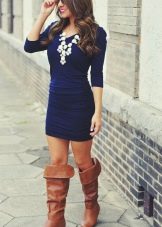
Using a combination of blue and pink, it is better to select the shades of these colors of approximately the same saturation. Only dark blue is combined with any shade of pink.
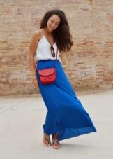
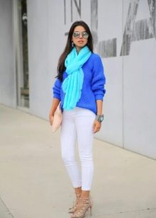
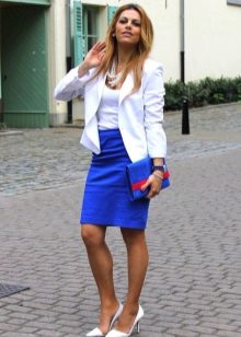
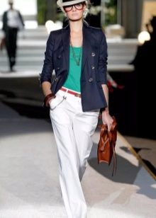
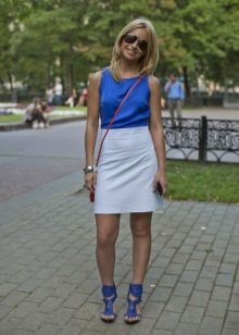
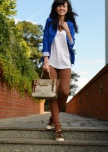
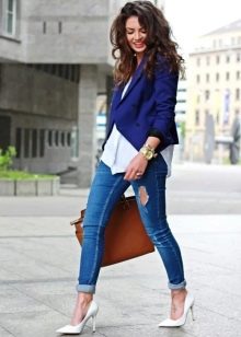
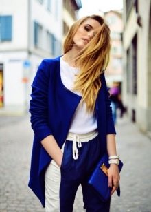
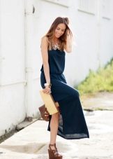
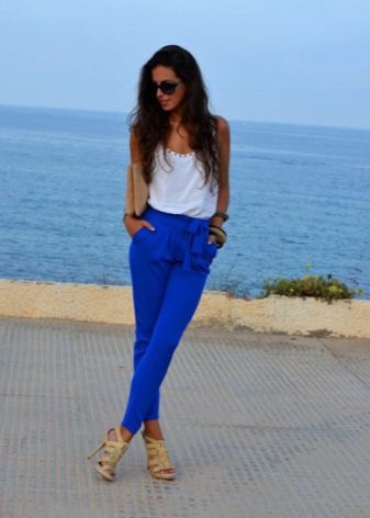
All shades of blue go well with pure white... Such a combination, depending on the chosen style of clothing and shade of blue, can be either an office classic or a walking-vacation option.
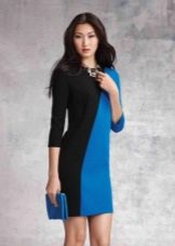
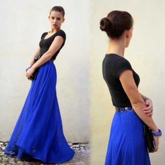
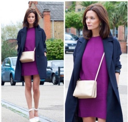
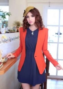
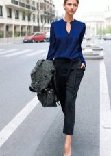
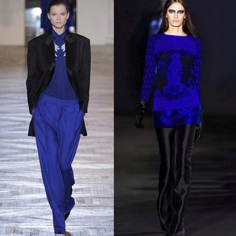
The combination of blue and black looks solemn and strict, which is quite suitable for official events. Black should not prevail, otherwise such a combination will look gloomy. An excellent color complement will be accessories and outerwear in beige or white.
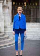
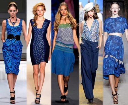
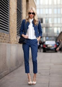
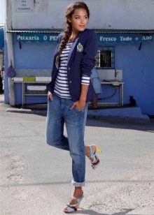
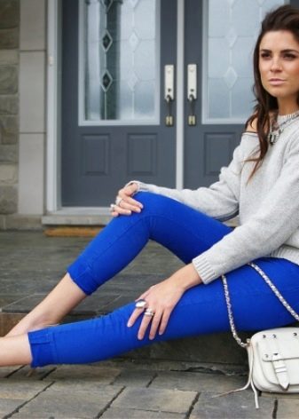
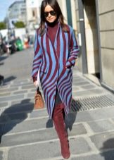
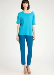
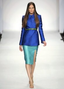
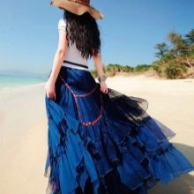
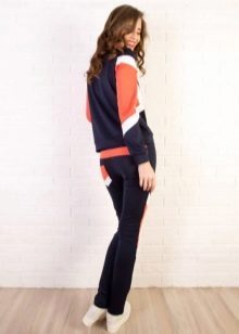
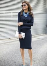
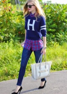
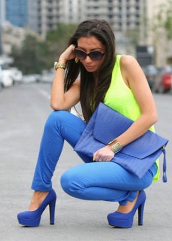
Different shades of blue can be successfully used in one ensemble, for example "navi" and light blue... Such monochrome combinations can be very widely used in different styles of clothing: such combinations are suitable both for the office and for an informal setting.


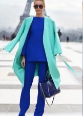
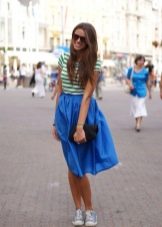
Blue and light blue are harmoniously combined, because these are neighboring colors. In the color wheel, they are located next to each other. In clothes, such a combination of colors will create a calm and pacifying image of a self-confident person. Matching colors adjacent to the color wheel is something that any fashionista can adopt.
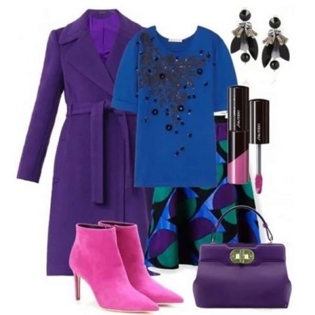
According to the same principle (neighborhood in the color wheel), a logical and win-win option is the combination of blue with violet or lilac (unsaturated violet).
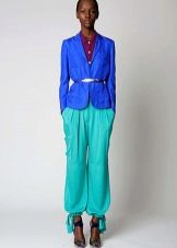
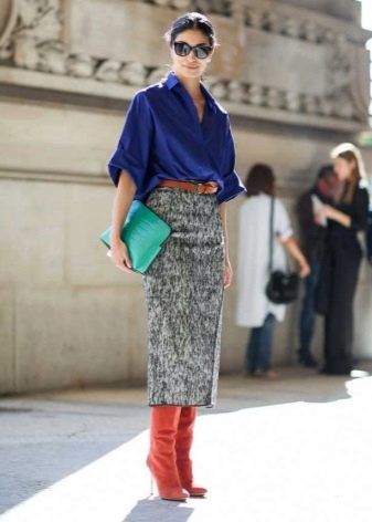
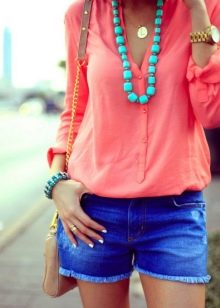
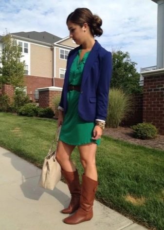
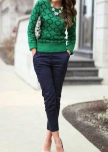
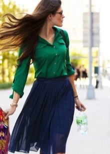
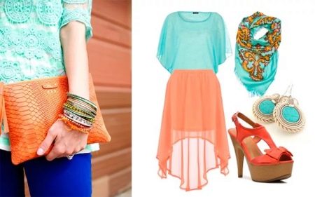
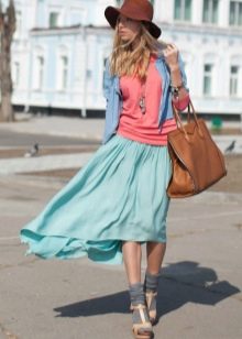
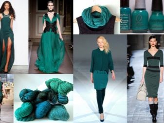
The "duet" of blue and green seems very natural to our eyes, because in nature this very neighborhood is very common.
Not only two, but also three adjacent colors / shades in the color wheel can be combined. For example, blue can be added to purple, lilac in combination with blue. Some people limit themselves to the choice of two colors, since such a solution is simpler and usually suitable for the office, but a set of three adjacent colors in the color wheel looks much more interesting. A third shade can be added in small amounts and will dramatically enliven the look. The outfit can be in blue and blue-green shades, and green is added to this ensemble in the form of small inclusions in the prints of one of the things, or it goes as the color of an accessory.
The choice of combinations of neighboring colors indicates that the scheme of combinations of similar colors in clothes is applied. The use of such a scheme for choosing clothes and drawing up sets does not exclude the addition of gray, white and black.
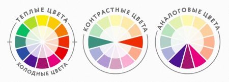
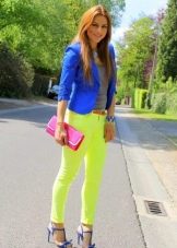
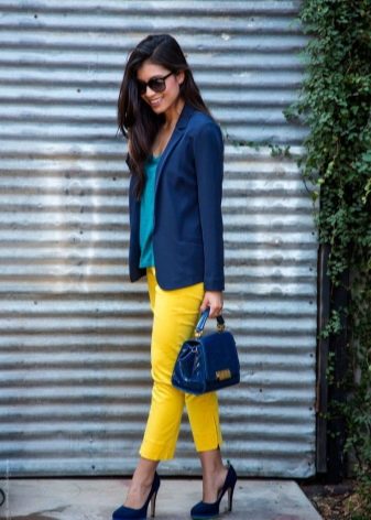
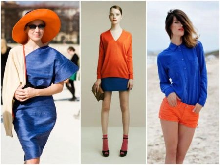
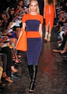
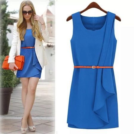
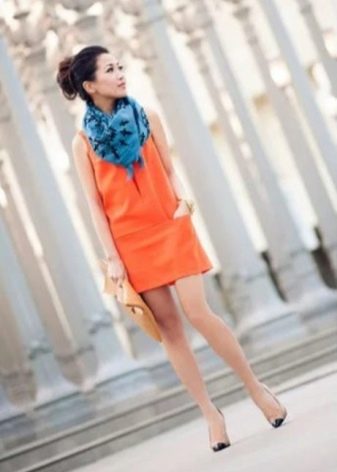
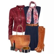
Any cold color has a complementary warm color. For blue, that color is orange. These contrasting colors are called complementary, or complementary. The colors that make up a complementary pair are opposite to each other in the color wheel. Opposite, complementary shades are orange-red and blue-green.
The combination of contrasting colors and shades is considered very noticeable, the most informal and youthful. On the basis of such a combination, you can create a catchy set of the simplest things.
Complementary color combinations are especially often used to create informal images, including those based on styles that include folk motives, such as boho.
A noticeable but less expressive image can be created by taking one of the complementary colors saturated, and choosing the second whitewashed or muted: for example, combine dark blue with pale orange. Opposite colors in their unsaturated shades give an interesting combination that can be applied much more widely in clothing than a combination of pure (saturated) colors.
In office wear, complementary combinations should be used very carefully, choosing the lightest or darkest shades of complementary colors as possible. The contrast between such colors attracts attention, but that is why it is necessary to embody such combinations, showing a sense of proportion.

The combination of blue and orange is acceptable for office wear, but you should be very careful when choosing the shades of these colors. In no case should they be pure colors. You can use shades of blue such as aquamarine, aquamarine, pale blue, dark turquoise, etc.
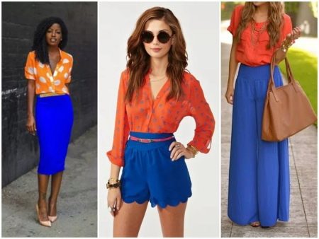
If, instead of orange, two adjacent colors are added to the blue ensemble - yellow-orange and orange-red, then such a combination of three colors will be called a separate complementary, or separate complementary, scheme. Women of fashion use such a scheme even more often with combinations of complementary colors, since it looks very positive, but not as contrasting as a pair of strictly opposite colors.
Dark blue, brown, and yellowish orange are examples of a split-complementary scheme for blue. This combination is suitable for outfits for walking; for things worn in the office, these colors are also good.
Sometimes the third color is removed from this scheme. By the same principle, turquoise is perfectly combined with orange or coffee.
If you combine complementary colors or colors in clothes based on a separate-additional scheme, then try to do without bright accessories: such combinations are self-sufficient and do not require flashy additions.
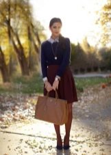
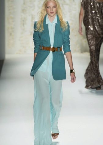
The blue / brown pair is also part of the natural landscape, and it's very common for us to see these shades side by side. Brown is commonly associated with practicality, frugality and sustainability and complements blue with its symbol of stability. The combination of these colors can give the look of formality and severity, and can emphasize respectability and elegance, it all depends on the chosen shades.
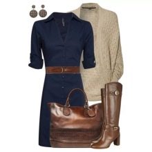
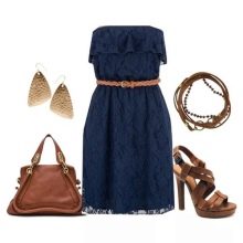
Shades of blue, such as turquoise or electric blue, make a great duet with shades of brown, beige or cream.

The combination of blue-violet and blue-green shades with shades of orange-red and orange-yellow is called a notebook combination. This is a combination of two adjacent colors / shades and two opposite to them, complementing them.
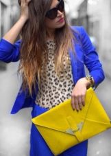
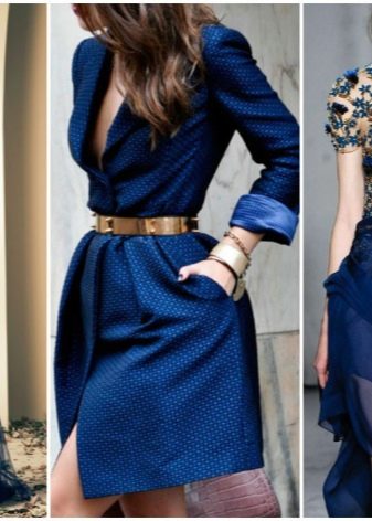
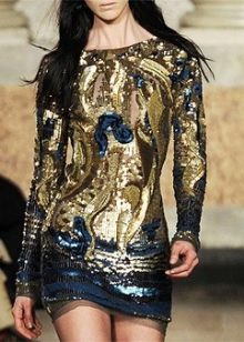
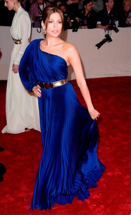
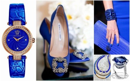
Austere blue in combination with gold acquires a special solemnity, which makes this combination suitable for significant occasions. The silver color will accentuate the coldness of the blue, but this combination is no less impressive. Gold and silver elements should complement the outfit, be its decoration, not being the main color, then the image will be elegant.
When combining colors, one should not forget about their meaning and features of the psychological impact.
Who is it for?
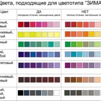
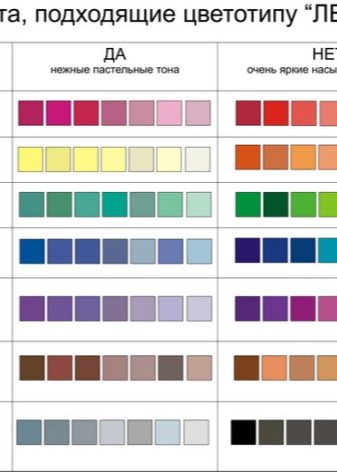
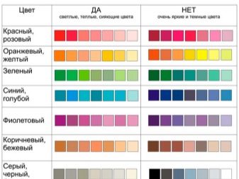
When choosing clothes and accessories in various shades of blue, first of all, you should focus on your own color type of appearance. Conventionally, there are "cold" color types ("winter" and "summer") and "warm" ("autumn" and "spring").
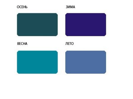
Pure blue in clothes will suit those women whose appearance type is conventionally referred to as "winter" and "summer" color types.
Shades of blue for the "winter" color type are all dark cold saturated shades, including:
- bright blue,
- indigo,
- azure,
- cobalt,
- electrician.
All light cold shades are suitable for the "summer" color type, including:
- smoky blue,
- royal blue,
- gray-blue.
For the "autumn" color type, you can use blue in the shades:
- petrol,
- aquamarine,
- "Moray eel".
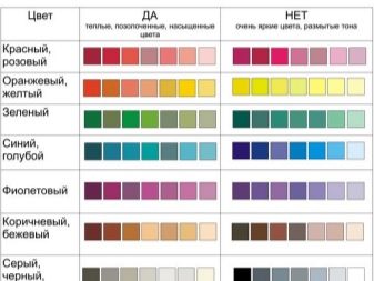
The following shades of blue are suitable for the "spring" color type:
- cornflower,
- turquoise,
- aquamarine,
- sky blue.
What is it combined with?
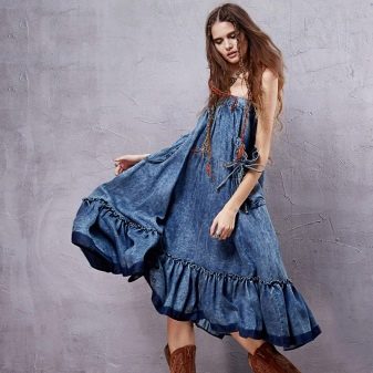
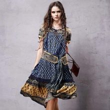
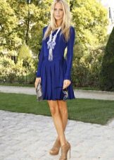
The color blue is considered one of the most versatile colors for its use in different styles of clothing. Blue is good both in things with a strict cut and in evening dresses.
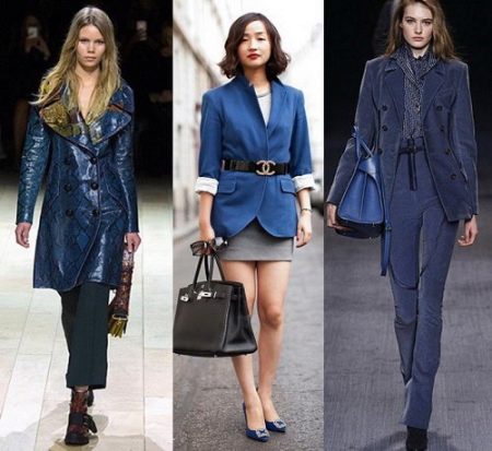
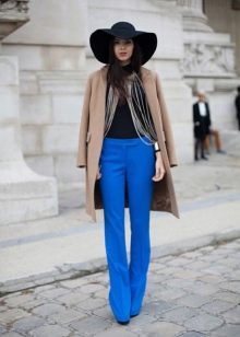
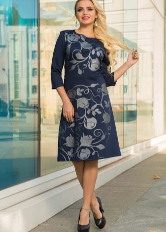
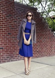
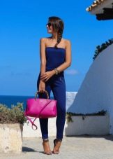
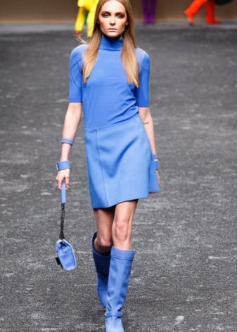
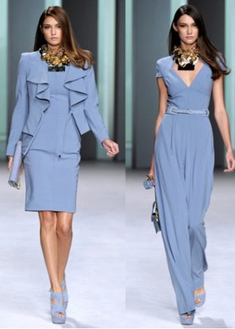
With the help of blue in clothes, you can create a business look. The base color in this case will be dark blue. The restraint and formality of the image suggest that accessories will be gray, brown or black. The blue color of your clothes will help you to give the impression of a successful and self-confident person.
Austere blue, surrounded by the primary colors with which it forms a triad (this is red and yellow), or in a “duet” with the opposite color (orange), allows you to create a vivid, memorable image. This can be done with accessories or by combining these colors in clothes. Blue in this version is perfect for an informal setting and a carefree pastime.
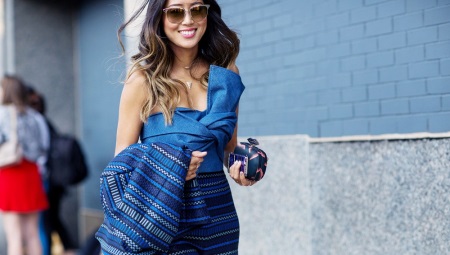
Ultramarine or electric blue shades are suitable for people who are not afraid to draw attention to their person.
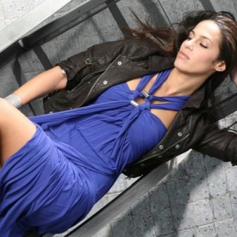
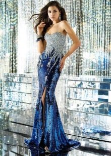
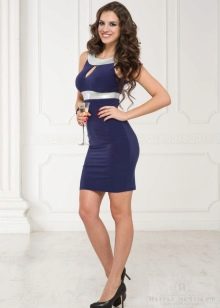
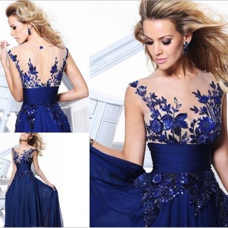
Blue combined with gold or silver decorative elements or accessories is very appropriate for special occasions or an evening out. This option is often chosen by famous people to walk the red carpet. Some shades of blue are simply associated with luxury and elegance - these are indigo, lavender, sapphire.
Blue can be the basis of a color image, chosen for a suit, dress, skirt, outerwear, etc., or can be used in accessories. Clothes in rich and bright blue shades are not suitable for every color type of appearance. But for accessories, jewelry and shoes, there are no such restrictions: the same ultramarine or electrician are able to refresh and decorate clothes of restrained tones, and the wardrobe owner does not risk getting lost in the bright blue splendor of the surrounding things.
Beautiful images
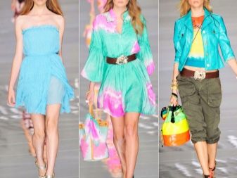
With the help of blue in clothes, you can create bright and beautiful images.
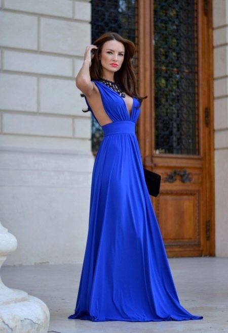
The color blue is almost universal: it is suitable for uniforms, and for everyday wear, and for a chic evening dress. In blue, you can look strict or formal, or you can look flirty or romantic. What your image will be depends on the cut and material of things, on the choice of a shade of blue, on those colors that will accompany blue, accompany it.
If your color type of appearance is "winter" or "summer", you can use "cold" shades and pure color, making blue the main one in clothes: choosing it for a dress, jacket, coat, jacket. If your color type of appearance is "autumn" or "spring", choose clothes of "warm" shades of blue, leave all other options for shoes, jewelry and accessories.
Austere and restrained images are obtained by combining blue with black or gray. A neutral option would be the neighborhood of blue with white or beige, brown. To create an elegant look, add blue, lilac, purple to blue. An impressive effect can be achieved by combining yellow, red or orange with blue. There are many options for any occasion and mood.
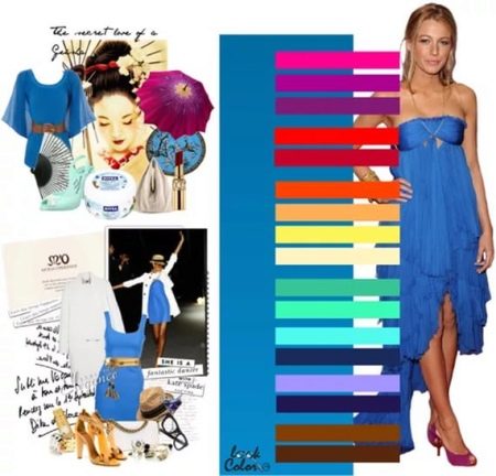
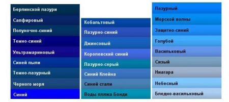
Blue shade chart


Great article!
You have to be more careful with these colors, because bright blue in combination with other shades looks extremely tasteless on some.