The combination of colors in the interior of the living room
The combination of colors in the interior plays a huge role not only from a design point of view, but also from a psychological one. Often, the living room reflects the character of the inhabitants of the house and becomes a kind of island for relaxation and communication. To create an original, beautiful and stylish interior, to refresh the atmosphere, it is not at all necessary to operate with bright, flashy colors or to make repairs anew.
It is enough to drag furniture, change textiles, change decorative elements. The room will sparkle with completely different colors.
Basic rules for choosing colors
Basically, when choosing decorative details, colors and textures of materials, furniture in the interior of the living room, everyone is guided exclusively by their own taste and practicality. However, intuition is not always the best advisor. So that the walls, floor, ceiling, furniture, decor and lighting look like a single harmonious picture, you need to know some basic color rules. Color solutions are extremely varied and are of great importance in shaping the mood of the interior.
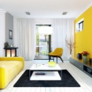
Color, according to psychologists, evokes in people this or that emotional response, reaction. Each palette works in a different direction. Shades of orange, yellow give mood, tone up, positive, cheerful. And the blue scale pacifies, calms, promotes rapid falling asleep and sound sleep. And the combination of shades also works, provoking a person to positive or negative emotions.
Many combinations tire, depress the psyche, others, on the contrary, contribute to an increase in optimism and activity.
In addition to the psychological impact, color determines how people see space. Light shades expand it, dark ones narrow it, bright, flashy ones absorb light, require additional lighting. With the help of color, you can correct the imperfections of a room visually, stretch low ceilings, correct the proportions of a room that is too narrow. Competently chosen colors for decorating a living room help to cope with the following tasks:
- optically change the perception of the size of the room;
- zone space;
- to give the design cold or warmth;
- change the proportions of height and shape;
- add volume and depth to the composition.

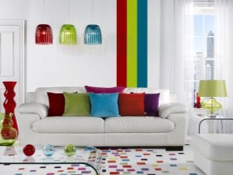
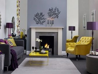
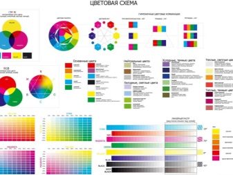
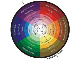
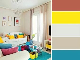
The most popular combination method is considered tricolor combination. In it, the designers recommend not to include more than three shades of the chromatic type in the composition of the room's interior. But you can combine them in different ways, but taking into account the color chart or color wheel. A color chart or color wheel is a necessary tool not only for artists and photographers, but also for designers.
These technical assistants are formed according to the principle of the rainbow spectrum, combining similar shades, transforming one into another as smoothly as possible. With their help, color combinations are created.
The technology is simple. Tones located opposite each other are of a complementary type, with their help they make contrasting combinations. In them, the shades actively contradict, but do not suppress each other, but emphasize, increase the juiciness. Shades, connected at the vertices of the triangle, form a harmonious triad of a bright type. Adjacent colors make up calm combinations. There are also combinations of a more complex type, for example, by the points of a square, a rectangle.
If this method seems too complicated, you can use color generator programs. It is enough to load a photo of wallpaper into it, for example, how it will generate the best color combinations for them.
How to combine neutral shades?
The range of neutral shades is the most restrained and laconic. It works well for elegant, calm interiors. These shades are also called achromatic. They can be combined in different variations. Neutral colors are good on their own, without adding flashy accents.... If you are afraid that the interior will turn out to be too prim and uncomfortable, then you need to operate with textures, decor, textiles, shiny surfaces, metal fittings.


And it is also important in such a design to think over the correct lighting system, choose a chandelier and lamps.
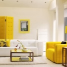
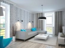
White
White scale is one of the main ones in the neutral group. It is universal in combination, it can be combined almost as you like and with what you want. But the excess of white will make the living room cold, uncomfortable, like an ice house. If you want to make the most of white, choose Scandinavian style, Provence and minimalism. In this case, there is no need to be afraid of an excess of snow-white.
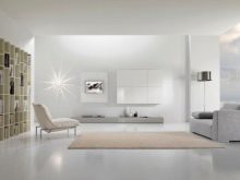
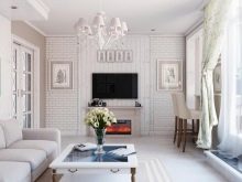
Anyway the white scale will be perfectly complemented by details of rich shades: red, orange, purple, blue, yellow. All the colors of natural wood ideally raise the degree in the snow-white living room.
If you still find boiling white impractical and uncomfortable, you can use warmer shades. There are a lot of variations here: ivory, cream, milk, vanilla. All these tones look great in the company of gold, chocolate, brown and coffee colors.
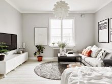
Gray
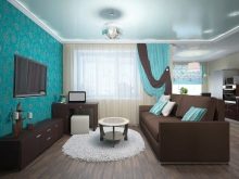
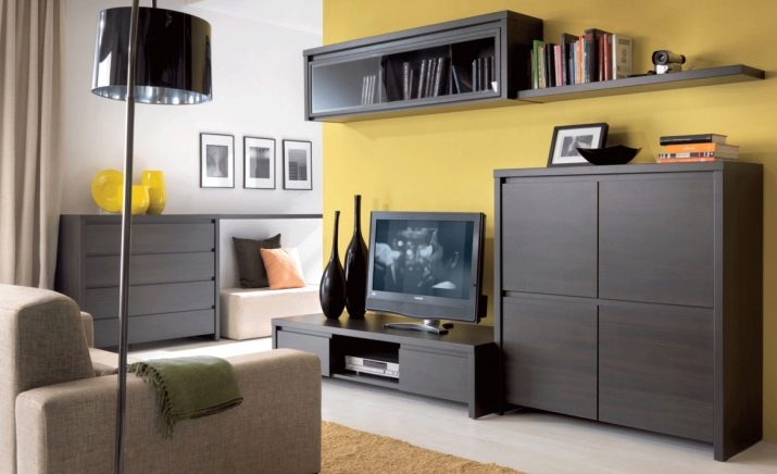
Another hit of the neutral scale is gray. This noble shade is an almost ideal backdrop for the embodiment of various color experiments. The gray base favorably demonstrates both bright, juicy shades and restrained combinations. In modern styles, gray is used very often in such directions as loft, high-tech, it is often dominant.
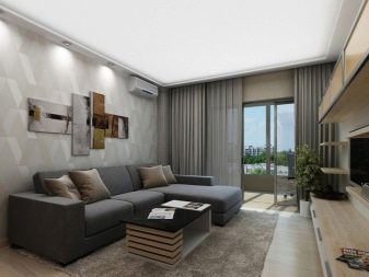
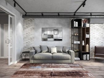
It is optimal to combine gray with shades such as:
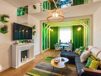
- greens;
- turquoise;
- yellow;
- Red;
- mint.
Important! It is better to give up red, terracotta and brown, these warm tones will lose their showiness in combination with gray.
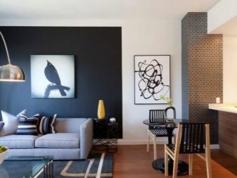
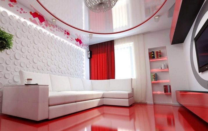
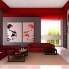
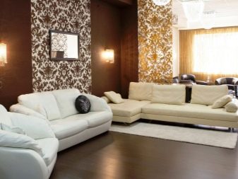
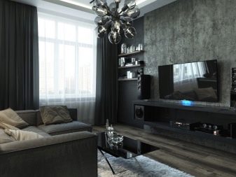
Black
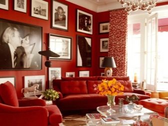
This neutral color is rarely seen in living room interiors, as its excess makes a too gloomy impression. Despite this perception, it is quite possible to play with textures and shades of black, use it as an accent. Glossy, leather black items and soft textiles look great. Such details will add status and elite to the design. The most beautiful and harmonious combinations with black are obtained with the following:
- White;
- Red;
- gold;
- live greens;
- backlights in blue tones;
- crystal;
- imitation of fire.
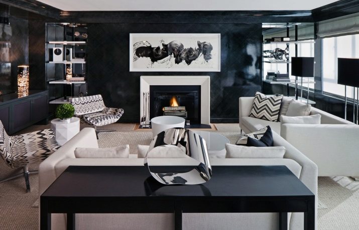
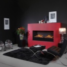
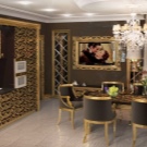
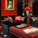
Black should be used with care, be sure to dilute the picture with more optimistic shades. It is not suitable for small rooms, as it significantly reduces the space.
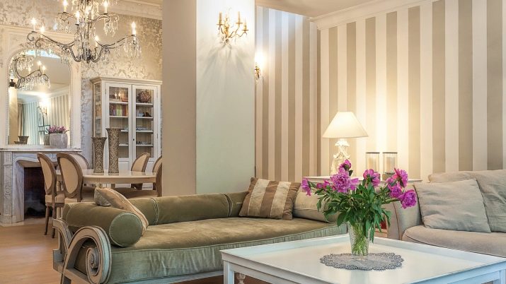
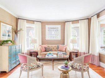
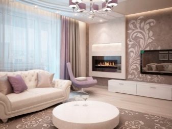
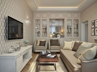
Beige
It is the leader among all neutral shades in living rooms. Beige is incredibly elegant, graceful, rather light and less soiled and cold than white. It is perfect for small rooms. In any style, beige brings coziness, habitability, warmth. This range is ideally combined with brown, coffee, chocolate of all variations. You can add expressiveness to the living room using the following colors:
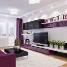
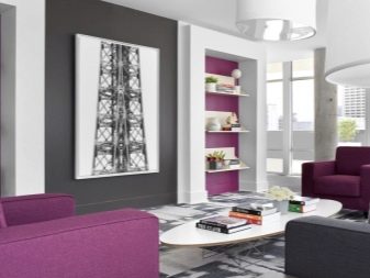
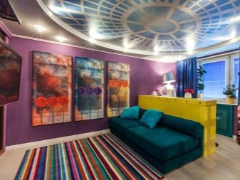
- purple, lilac;
- peach and rose;
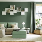
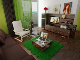
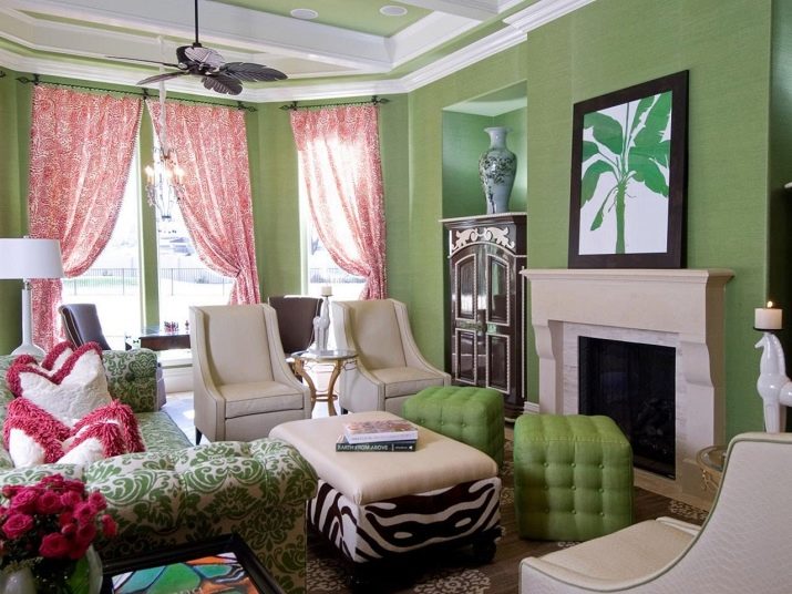
- greens;
- Orange.
Important! These shades can be introduced as small details: textiles, pillows, carpet.
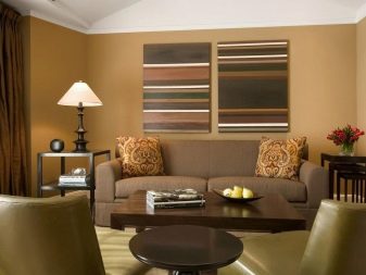
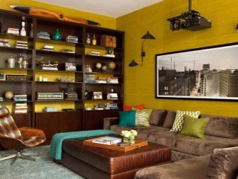
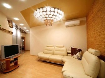
Brown
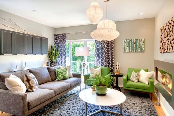
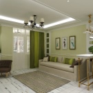
This color is very diverse in shades - from cappuccino to espresso and dark chocolate. This palette is considered classic in the interior and is ideal for the embodiment of ideas of many styles. It is better to consider the lightest tones as the main background, and the darkest and most expressive ones can be additional and accent. Brown goes well with greens, yellow, sand, all white and beige.
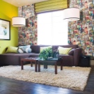
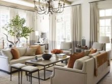
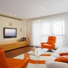
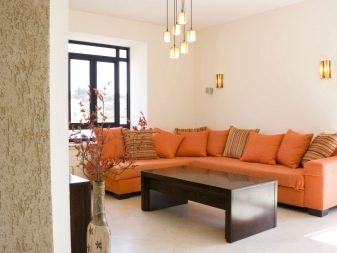
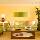
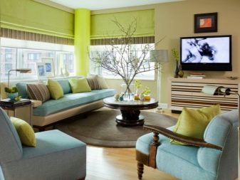
Combination of warm colors
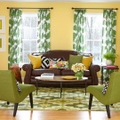
Warm shades are very popular in the design of living rooms, in such a room it is very cozy, comfortable to spend time, it is conducive to communication. Warm palettes are very optimistic, cheerful and create the appropriate mood for those who are in it. Juicy combinations perfectly warm in winter, set you in a positive mood, it is good to rest in them. Choosing a palette to pair with warm colors is pretty simple. One of the canonical ones is natural.


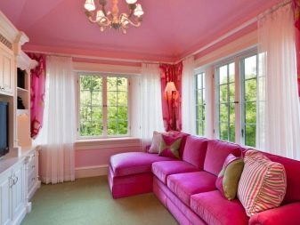
Get inspired by gorgeous scenery or spring colors. Combine light green and pink, brown and yellow, lemon and grassy, use colors of a sunny day, irises, cornflowers and bells, greenery. A summer day is no less inspiring than a spring day, but the shades are deeper and deeper. They approach neutral and cool, albeit interspersed with yellowness. The color of green grass in such combinations is intertwined with olive, maple, wood.

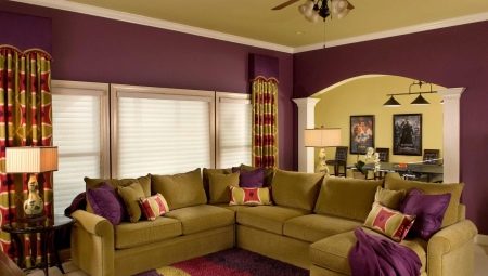
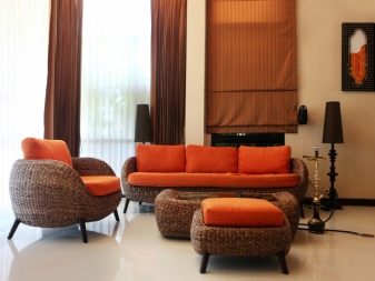
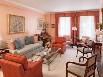
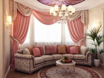
Heavenly beauty is also incredibly rich in warm shades: the colors of dusk and dawn, scarlet and orange, pink and purple - they all fit well into the overall composition. The colors of berries and fruits are a great idea for creating a luxurious warm interior. The autumn range is the warmest of all and very effective. Despite the expressiveness, the living room in such tones will turn out to be restrained and respectable. It combines shades of autumn leaves, soft orange, red, terracotta, the entire red-brown gamut.
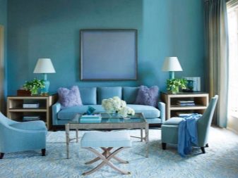
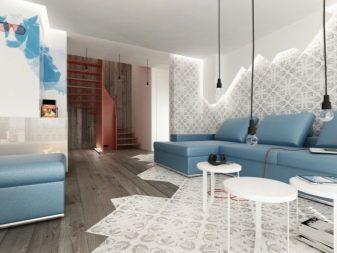
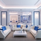
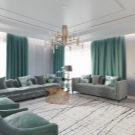
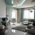
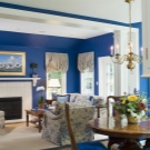
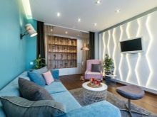
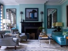
Range of cold colors
Many people choose cool tones for decorating the living room, since they are the ones who are able to bring freshness, a lot of air into the space, and create a soothing and flying design. This includes blue, purple, all shades of blue, light greens. Everything related to the shades of water bodies: rivers, lakes, seas - this is a cold scale. The heavenly palette is also cool and serene. You can easily combine all these tones - they feel very comfortable in each other's company.

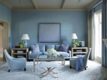
At the same time, it is very important to choose the correct surface textures and adhere to a uniform style.
Cool tones look best when surrounded by shades of a neutral spectrum. These include beige, black, gray, white. As for brown, this tandem is too controversial, with the exception of certain shades of wood: birch, beech, ash, and also bleached oak. Turquoise and aquamarine look good in tandem with wenge, chestnut and mahogany.
If you want to add sophistication and sophistication to the room, add some lemon shades to the composition. It makes cool shades more expressive. And also in small quantities, you can enter shades of rose and lettuce. Metal surfaces in silver, steel will accentuate the overall style of a cool room. If you are creating a cold Provence style interior, add vintage forging to blue or white ceramics.


Recommendations
Whatever style direction you choose to decorate the living room, the most important thing is to correctly combine the shades. The composition should look consistent. Designers suggest considering the basic techniques for creating the right combinations.
- Monochrome. This method restricts the application of tints to the frames of one palette. It is rarely chosen when decorating living rooms, although it is the most secure option. It is very difficult to make a mistake here, to choose the wrong, inharmonious combinations. Many people think this method is too boring, dull. In fact, almost any scale includes a huge number of tones and mid-tones.
For example, the violet range has about 50 shades.
- Polychrome. There are at least two shades, and more often three. An additional color helps to bring a variety of pleasing to the eye into the interior, to zone the room, and to accentuate the functional plan. It is important to use a color wheel or a color combination chart here. You should not combine more than three shades in one composition if you are not sure of the knowledge of color and design style.
- Lighting. Be sure to consider the degree of light in the room. If the room is small and lacks natural light, it is best to avoid saturated or dark tones.
- Distribution. The color should be evenly distributed in the room. Gradient transitions add a touch of grace to the room. If you hang curtains that combine all the shades used in the design of the room, they will magically combine all the elements into one picture. Transitions should be smooth.
- Tricolor composition... It is very important here to correctly place accents. Choose a light tone as a basic tone, an intermediate tone as an additional tone, and leave a dark tone for accents, that is, for decor.
How to combine colors in the interior, see below.


