Blue kitchens: choice of headsets, color combinations and interior examples
The blue kitchen always creates a feeling of freshness, grace and lightness. It has been proven that heavenly shades have the most beneficial effect on the psychological state of a person and his health, and in addition, this shade contributes to the visual expansion of the boundaries of space. Nevertheless, this design is not popular - in our climate, preference is entirely given to warm colors, while blue, on the contrary, makes the atmosphere quite cool.
Color features
In order to harmoniously apply all the advantages of the blue shade in the kitchen interior, you need to know its main characteristics.
- Impact on the psyche. The blues and blues refer to the shortwave range, that is, human organs of vision "rest" on them... In addition, blue has a mild calming effect, helps to reduce blood pressure and reduce appetite. The shade promotes the production of serotonin and improves concentration. It is obvious that the design of the room in blue tones will benefit emotional and unbalanced people, as well as hypertensive patients, men and women who watch their weight.
- Blue very harmoniously interacts with the perception of space. Unlike the related blue color scheme it does not make the interior heavier, on the contrary, it increases it, gives a feeling of weightlessness and airiness. That is why almost all tones of this color can be used in the decoration of the walls and the design of the kitchen set.
- The shades of the sky make up good combination with a wide variety of colors, this is not at all surprising, because in nature, shades of blue are found in combination with a variety of colors of the rainbow, especially often with blue, green, red and yellow, as well as with gray, black and snow-white.
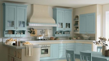
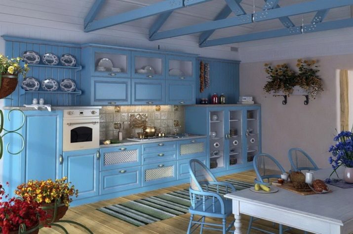
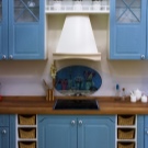
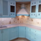
- Kitchen in blue color can be decorated in almost any style, but the most organic will look classics, Provence, as well as shabby chic and scandi, the kitchen, made in the Mediterranean style, looks spectacular.
All this determines the relevance of the use of blue in design, so it can be safely called universal.
Types and choice of blue headset
When choosing a blue set, the general rules for choosing kitchen furniture apply.
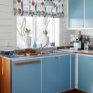
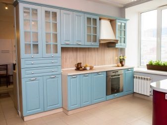
- For small spaces, it is better to give preference line headsets - in this case, all the main modules are located along one wall, as a rule, the lower cabinets are used to store household appliances, and the upper ones are used for cutlery and food supplies. If the house has a pantry, then it is better to replace the hanging modules with shelves - they look especially impressive in blue.
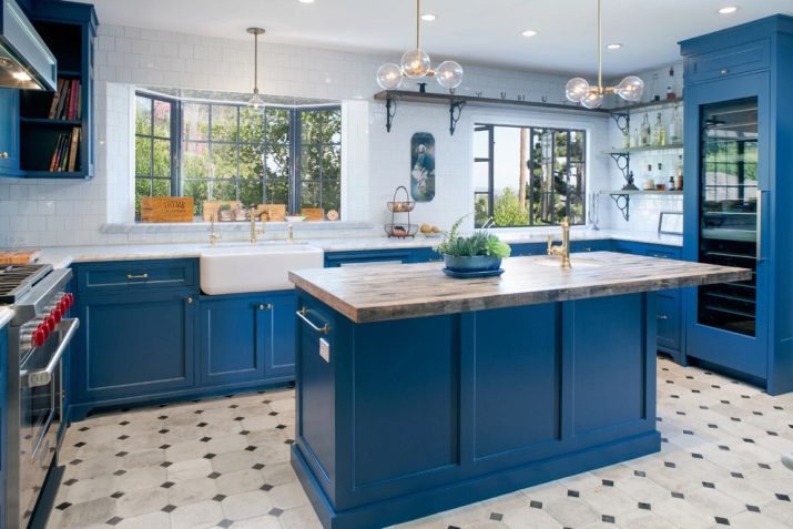
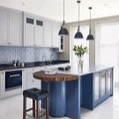
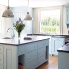
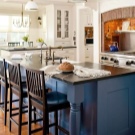
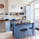
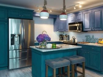
- For spacious rooms, a good solution would be island layout - in this case, the entire working area is located along the adjacent walls, and in the center of the room there is a dining area or a bar counter.
- Standard layouts suggest the use of corner sets, while the furniture is located along two perpendicular walls, and the dining area is arranged in the opposite corner - as a result, the space in the center of the kitchen is freed up without interfering with the movement of the hostess in the kitchen.


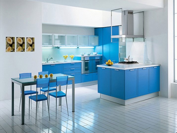
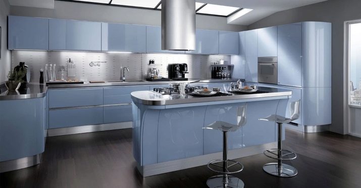
- When choosing a headset both glossy and matte surfaces can be used - they look equally impressive in a blue color scheme, while glossy ones are often used in modern styles, such as, for example, minimalism, and matte ones are harmonious in provence. If you are implementing the concept of shabby chic, then it is advisable to additionally age the furniture or cover it with a patina - then the style will be 100%.


Shades and combinations
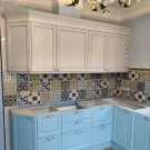
In most cases, the abundance of gray-blue and light blue shades can cause melancholy in a person - in order to prevent this from happening, it is imperative to dilute the shade with dynamic colors: red, yellow or orange and bright pink. It will not be superfluous to supplement the blue with the inclusion of warm shades: nude, cream and light brown. In combination with such colors, the kitchen becomes more "settled" and cozy, it retains its sophistication, but at the same time looks more "lively".
In combination with beige shades, celestial tones look neutral and very gentle, which is why designers often complement the blue wall decoration and furnishings with beige shades - they make the perception of the room softer and at the same time noble.
The gray-blue color scheme is very popular among designers, it looks especially impressive against the background of a purple apron, and paintings depicting sunflowers can create stylish accents in the interior. The heavenly color looks harmoniously in combination with all shades of brown, however, and poisonous lemon shades in moderation will make a good tandem for blue. These colors are used in the design of windows and some parts of the walls.
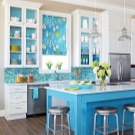
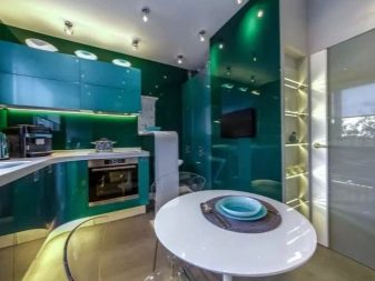
Despite the fact that decorators do not have a consensus on the use of green, nevertheless, in combination with blue tones, this color scheme is very harmonious, the blue set looks especially beautiful on a pistachio background, and deep grass or emerald patterns will be harmonious in aprons.
And, of course, in the kitchen, you can actively use the natural beauty of blue and yellow - this tandem is found in the form of paintings on the walls, images on aprons and in the form of vases with sunflower flowers.
Styles
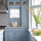
With the right choice of shade of blue, it will look good in any style, but most often the shade is used in classic designs, provence and scandi.
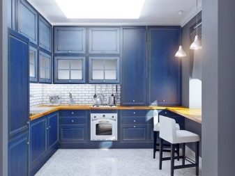
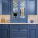
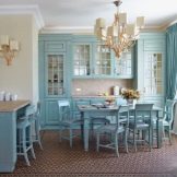
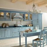
- Classic style was formed in the countries of the Old World in the 18th century; it was especially popular in France and England. The classics do not recognize cheap materials: the floor is usually laid with tiles, moreover, patterned or expensive painted, and the ceiling is decorated with stucco. However, if such a solution seems too pompous to you, then you can make an unobtrusive floral ornament around the perimeter - it will become a stylish addition to the overall design concept of the interior. Natural materials of restrained shades are used in the design of the walls; flashy tones are unacceptable here.
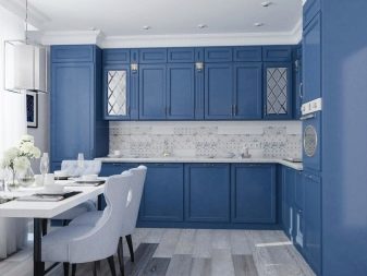
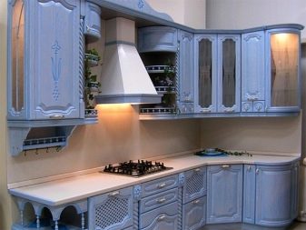
Blue is allowed in a muted version, furniture set only from solid wood and only of the highest quality. An important place in the design of classic interiors is given to lighting - a large beautiful chandelier under the ceiling and a small lamp with a lampshade on the table are relevant here. Considering that the general color scheme is made in blue, the spectrum should be white - the use of lamps with a yellow glow will greatly reduce the cost of the look of the kitchen.
Decor elements should be discreet, but expensive, with some claim to historical value. Porcelain figurines, painted plates and paintings by famous artists look harmonious.
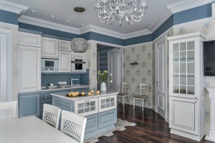
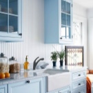
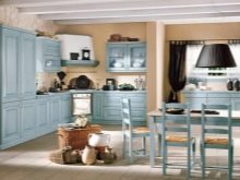
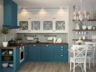
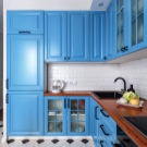
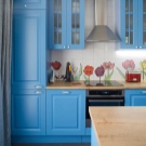
- Provence. This style came into vogue in France in the 17th century, at that time it became a contrast to the pompous interiors adopted at that time. The main characteristic of Provence is lightness and airiness, so the blue color fits into this style as relevant as possible. For finishing the floor, tiles are used here, preferably rough and artificially aged. For the walls, lining, wallpaper and other materials that imitate the natural texture are desirable, while patterns in blue shades are allowed - they not only do not burden the interior, but also make it more interesting.
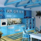
When finishing the ceiling, stretch canvases and drywall are not allowed - only paint and plaster, in general, such an interior should create the feeling of a village house. All decor elements should have traces of time - if you wish, you can always apply them yourself. The furniture set should be made of wood; a natural wood-colored dining table will be a good complement to the blue-blue kitchen modules.
In Provence, you can't do without decor items. Jars of spices, a cage with a bird and, of course, flowers give a special atmosphere - they will be especially harmonious against the background of the blue interior.
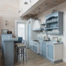
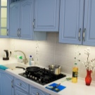
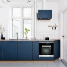
- Scandinavian. This style came to us from the Nordic countries, it is distinguished by a large amount of sunny color. For finishing the floor, it is allowed to use laminate, and it should not be blue, but an imitation of light wood. The walls are covered with clapboard, as an option, painted or plastered, but it's better to forget about plastic panels - the Scandinavian style does not accept synthetic materials. It is better to plaster the ceiling - this is how it was trimmed back in those years when the style was just beginning to gain popularity. However, stretch ceilings can also look very impressive, but only if the seams are invisible. It is better to replace kitchen cabinets with shelves - the Nordic style assumes an open space.
It is advisable to take a chandelier of wood to match the floor, and the curtains can not be hung at all so that they do not obstruct the flow of sunlight.
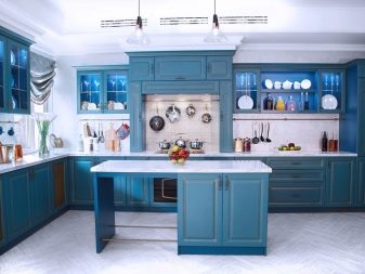
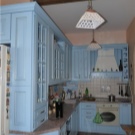
Features of monochrome design
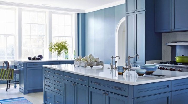
Blue kitchens are often finished in a monochrome color palette, in which case the color scheme combines blue with its related colors - turquoise, azure, as well as mint, smoky, blue and purple.Most often, no more than 3 shades are used, while blue should cover about 60% of the design of the premises, about 30% are allocated to the share of an additional tone, and the third color is used rather as an accent color, no more than 10% is allocated to it.
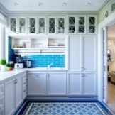
When decorating your kitchen in a blue shade, try to use more natural materials: it is advisable that table textiles, curtains and rugs are made only of natural linens, and furniture is made of wood. A blue tone in a monochrome interior can be both the main background and accent. For example, if the kitchen is small, then the best color scheme for the walls will be gray and white-blue, such colors do not "drown out" natural lighting and, moreover, visually expand the space.
If the windows in your kitchen face the north side, it is better to take blue as an accent, for example, in dishes, decor elements and kitchen textiles. A little tip: do not use entirely blue curtains - such a design will make the kitchen space uncomfortable.
If you use bright shades of blue for decorating and furnishing a room - turquoise, lapis lazuli or bright sky - then you must definitely equalize them with an abundance of white and milky colors in the interior. If the kitchen is too high, then the ceiling should be made a couple of tones darker than the background blue, and if the kitchen, on the contrary, is low, the top should be lighter. If the kitchen is too large (yes, it happens), then this often causes slight discomfort for the hostesses, in such a case, dark shades of blue are the best fit - they visually move the walls and thereby reduce the perception of the room. Keep in mind that it is important not to overdo it, otherwise the impression of your room may turn out to be quite gloomy.
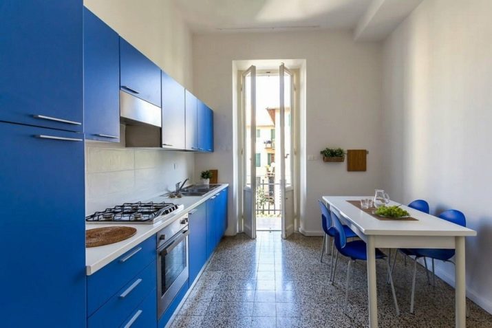
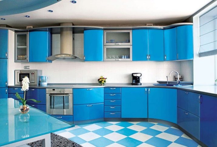
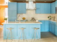
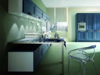
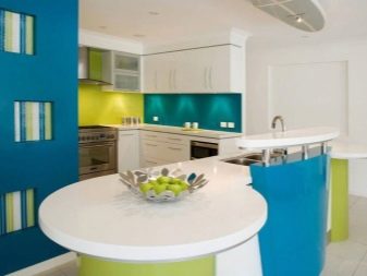
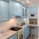
Interesting interior examples
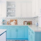
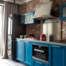
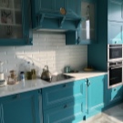
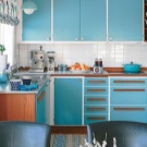
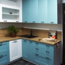
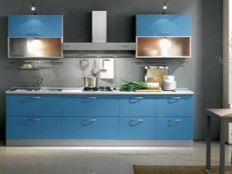
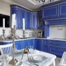
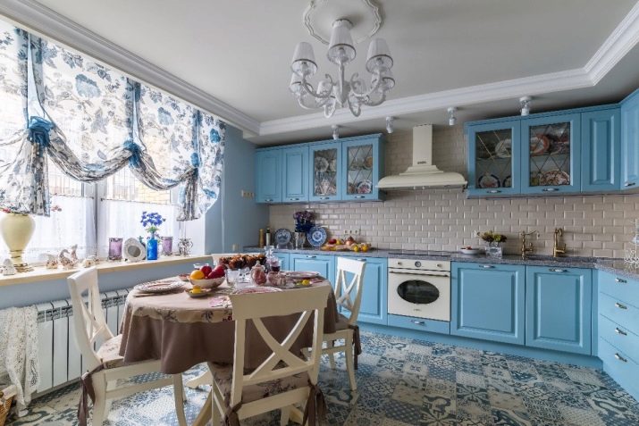
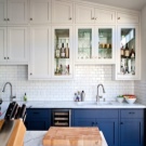
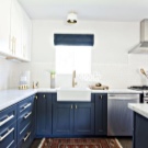
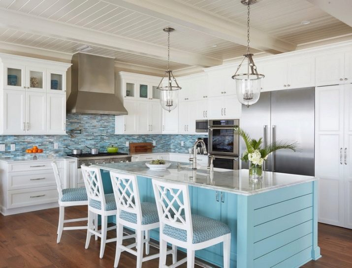
The blue and white interior looks invariably relevant - such a color scheme never goes out of fashion, because this tandem is as relevant as the sea with foam or the sky with clouds. White looks especially harmonious when ethnic motifs are used in interior decor, such as Russian Gzhel, Chinese porcelain or Spanish tiles.
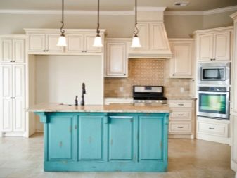
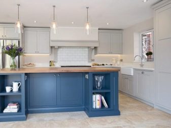
The combination of blue and beige is no less harmonious, this is another union borrowed from Mother Nature: the sky with wheat fields and azure waters with a sandy beach.
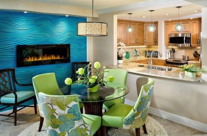
Blue and green have always been shades close to each other in the color spectrum, in nature the union of these colors is represented mainly by flowers (bells, as well as cornflowers and hyacinths), which is why, in combination with blue, plant shades of green look most successful.
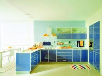
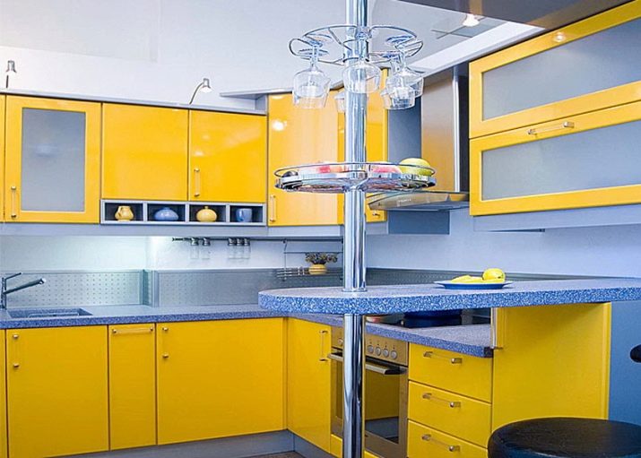
It is generally accepted that yellow is a tone completely opposite to blue, therefore, such a scale with its warmth and dynamics will balance the stiffness of blue.
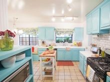
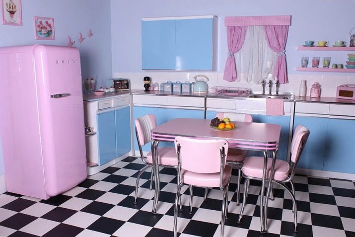
The combination of blue with light pink looks good, the kitchen in such a solution looks more dynamic.
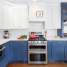
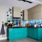
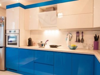
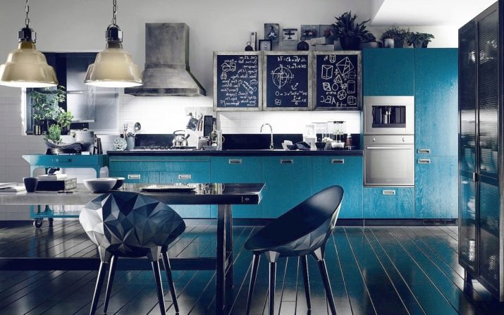
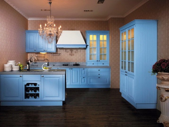
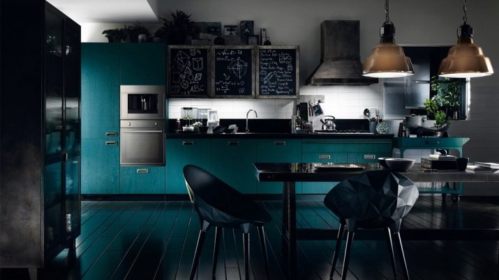
The blue kitchen with black motifs and metallic shades looks spectacular - this solution can be called bold and unbroken, therefore it is especially in demand in modern styles.
For information on how to properly decorate a kitchen in blue, see the next video.


