Kitchen-living room design 25 sq. m: the best projects and design options
Nowadays, a studio apartment is often perceived as an example of progressive planning and design - this solution will surely appeal to everyone who loves large unlimited spaces and an abundance of natural light. Removing the partition between the living room and the kitchen can help your apartment meet the stated requirements, but do not think that the banal demolition of the wall will immediately make the design exquisite and stunning.
Before deciding on a global redevelopment, it is worth carefully considering all aspects of the future transformation.
Peculiarities
Like any other layout option, a combined kitchen-living room can be both a positive and a negative experience. Many owners decide to take such a step purely in order to get rid of the eternal crampedness of small apartments, but if the result is a kitchen-living room of 25 sq. m, then this, of course, is already a result for an amateur, because claustrophobia has the opposite - the fear of large open spaces and the inability to hide from prying eyes.
Nevertheless, this layout option has quite a few advantages:
- the concept of crampedness is different for everyone, and someone needs exactly 25 squares so as not to feel constrained by four walls;
- the lack of natural lighting is the scourge of many modern apartments, especially on the lower floors, and all methods to fix the problem are good;
- inviting companies of any size will no longer be a problem for you - everyone will be able to comfortably accommodate and communicate without dividing into groups.
In fairness, there are also some drawbacks. If the kitchen-living room occupies 25 square meters, then such a one-room apartment cannot be called too small - it would surely fit two, and if necessary, then three people. If you do not live alone, one of the household members' culinary exercises can interfere with the rest of the rest, especially if they are sleeping - both noise and smell will contribute to this.

You can refer to the fact that the area of the room is significant, but let's be objective - in the absence of a partition, you will still make noise too close to the rest.
Layout options
Despite the fact that a room with a potential size of 5x5 m can hardly be called small, too many owners make a common mistake, expecting that it will turn out to be almost dimensionless. Instead of the naive hope that all furniture and utensils will fit into the combined space, it is necessary to plan the studio in a timely manner in such a way as to highlight at least two main areas: the kitchen, where food will be prepared, and the living room, where you can relax.
Discerning people also leave space for a separate dining area, which is especially important if you live as a family or often host guests.
Do not be lazy to outline a full-fledged project, which will show the location of furniture in compliance with its exact dimensions. - this is the only way you can understand what will fit and what will not. Practice shows that even 25 squares can be littered, and then even the absence of a wall will not solve the problem.
If initially the future room looks like the main part (the former living room) and the adjoining branch of the former kitchen, then we can assume that the project was completed for you. It makes no sense to transfer communications and basic equipment - at least you will have to obtain permits from numerous authorities, which is very expensive both in terms of money and time. The same can be said about the strongly elongated connected room - it is most reasonable to allocate one of the ends of the "branch" for the kitchen, ideally the one where it was originally located.
Objectively, moving the kitchen is appropriate only if your room turned out to be square or almost so, and the narrow kitchen was located along one of the current walls. For compactness, it is usually taken out into a corner, so that its main organs are located in the form of the letter "G". This allows the owners to have convenient access to the refrigerator, stove and sink without leaving their place, and those who are not currently busy with culinary issues can comfortably occupy the maximum of the remaining space.
Zoning methods
Very often, the unification of a 25-meter room into one whole is performed by the owners only due to a lack of natural light - the wall is removed so as not to impede the full penetration of light from the windows. In all other respects, this may seem illogical from the point of view of comfort - it is common for a person to visually separate rooms to solve different problems.
Considering all this, even a combined studio should have clear signs of functional zoning.
The simplest way to visually separate the hall from the kitchen is to choose different finishes for these two parts of the room - this is also logical in the sense that the conditions, and, therefore, the requirements for the quality of finishing materials at opposite corners are different.
However, often this is not enough, so let's highlight the alternative options.
- False wall. The most popular option if you planned not so much to remove the wall altogether as to thoroughly expand the opening. The drywall-based construction solves the problem of the crumbled edge of a broken wall - the old partition is removed entirely, and a new one is mounted instead.The advantage of drywall is that it allows for much more creativity - you can make its edges curved to flow into an arch, embed niches for a TV or decorative lighting.
- Dining area. Another extremely practical solution that allows the two opposites - the kitchen and the living room - to be away from each other. At the same time, diners do not interfere with further culinary operations (as well as vice versa) and can sit comfortably. Depending on the potential number of diners, the dining area can be full-fledged - in the form of a large table, or reduced - in the form of a bar counter.
The latter is relevant if you live alone, do not cook for yourself, and friends who have come to the light completely share your beliefs.
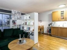
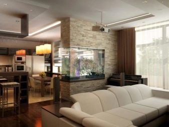
- Other solutions. Objectively, you can fence off the kitchen from the hall with anything - even just a sofa with its back turned to the conditional border. A popular move is to place a double-sided rack along the "joint line", where you can store both beautiful knick-knacks that decorate the interior and useful things like books and necessary utensils. Real aesthetes and lovers of wildlife mount an aquarium in the thickness of the false wall or completely replace it with a number of pots with live plants.
Especially for those who want to be able to constantly change their minds, various sliding partitions and curtains have been invented.
How to choose a style?
In most cases, the studio assumes the presence of some common stylistic solution for all functional areas, but in general, 25 squares of area already leave room for experiments with a combination of two directions at once. Experimenting in an apartment should be done carefully - even among professionals, not everyone decides to combine with confidence, and most designers advise buying furniture from one collection.
If you do decide to go your own way, remember that it is easiest to combine similar styles - for example, Art Nouveau resembles classics, and Rococo is similar to Provence, therefore, together they look harmonious.
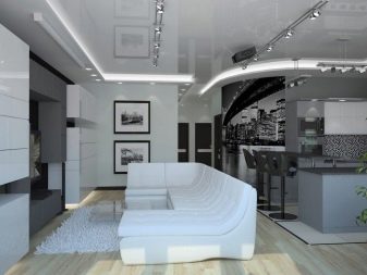
With an abundance of free space, the high-tech style based on a large number of straight lines, metal and glass reveals its advantages. Remember: no matter how you chase the stylistic features of the design, in fact, you will still change the style if your kitchen appliances are not the latest in terms of the technologies used. A striking example of such delights is the touch tabletop, which many owners have not even heard of until now.
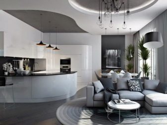
Focusing on the color scale, be prepared for a shiny metallic gray, but a deviation into the lighter part of the range is also allowed.
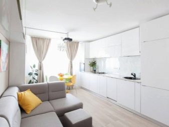
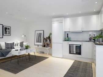
For those who are afraid of the coldness of high-tech, an excellent alternative will be Scandinavian style, which at the same time will solve the problem of lack of lighting. It offers a very light design revolving around a predominantly white design around it. Comfort is achieved not only due to the absence of unnecessary details, but also due to the intensive use of natural materials, warm in their essence.
How to choose a color scheme?
An area of 25 squares is a fairly large space to leave the owners some freedom to choose shades and tones. It all depends on what goal you are pursuing: if, indeed, you need more light, you should pay special attention to the light gamut of design; to narrow the space, on the contrary, you should choose the option with darker tones.
If you do not plan to visually reshape the room in any way, you can experiment.
note that many design styles require, if not strict adherence to a certain color, then at least its prevalence in the color scheme. Of the styles proposed above as finishing options for the kitchen-living room, both had specific requirements for this: high-tech is obsessed with gray and metallic shades, and the Scandinavian style is inconceivable without a predominant white component, although it allows for "extraneous" inclusions.
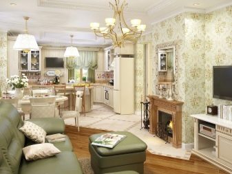
From other solutions, Provence is immediately remembered, which is repelled by pastel colors and does not accept too contrasting accents or prominent dark spots.
When deciding on the colors, start from the features of natural lighting. If you demolished the wall precisely because there is not enough of it, then it will be wise to use light colors, and especially white, since they greatly contribute to the visual expansion of the room.
With the already abundant penetration of sunlight from the street, such a design will only blind and create the illusion of heat, even when it is objectively not there. The same will do and vice versa - the dark design allows you to rest your eyes in bright light conditions and "cool" the room, but this should not be done if its windows already face north.
Furnishing tips
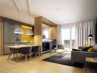
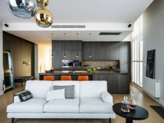
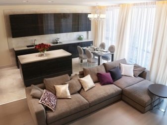
In a fairly large room, occupying as much as 25 square meters, it is not always advisable to arrange furniture only along the existing walls - it may turn out that there is too much free space in the middle. Equipping the island in this situation is definitely a reasonable solution that will eliminate the problem of excessive emptiness of the room and allow you to place more furniture.
What exactly will be part of the island, each owner decides for himself - for some it is an element of a recreation area with a sofa, others arrange a work area there with a dishwasher and a table top.
Whatever furniture you choose for your combined kitchen-living room, it should be remembered that it must adequately fit into the interior design. This applies to everything, including shape, style and color - if you are claiming good taste and conformity to a certain set style, then you simply have to pay attention to such details.
If you decide to use the abundance of free space as productively as possible and bought a lot of furnishings, restricting the aisles, choose cabinets so that their doors do not interfere with free movement around the studio. In such a situation, preference is given to sliding doors or even their complete absence, as is the case with shelving.
Interesting examples
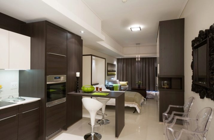
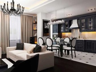
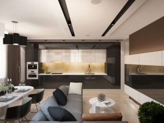
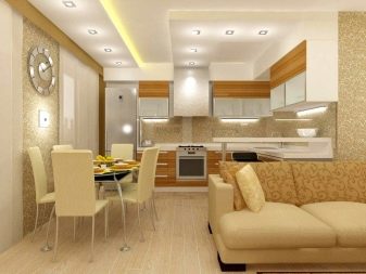
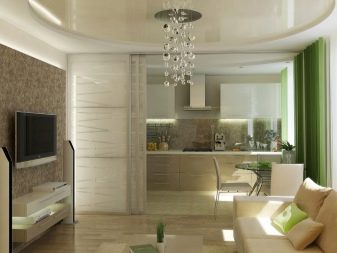
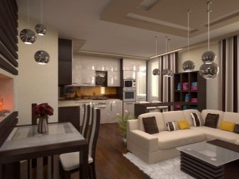
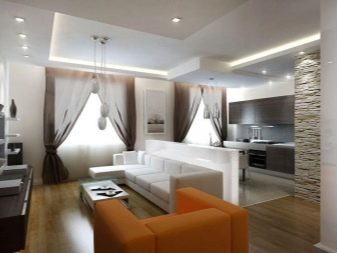
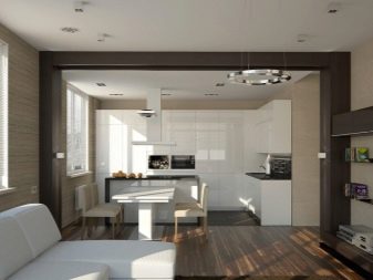
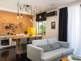
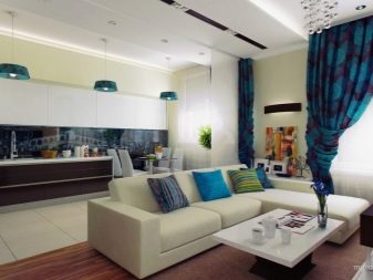
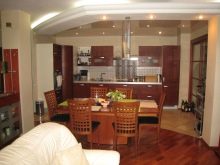
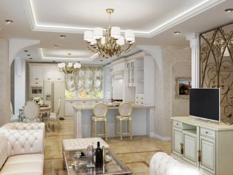
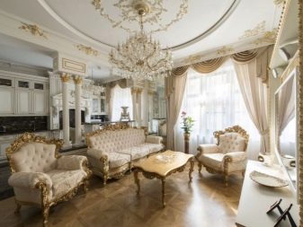
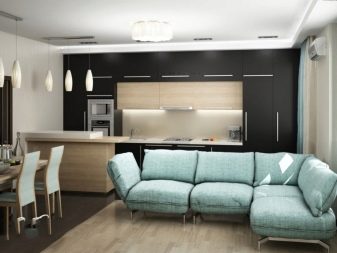
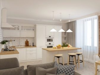
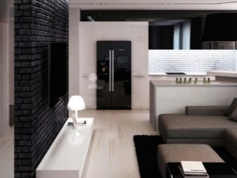
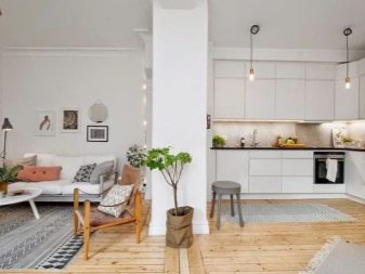
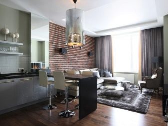
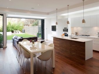
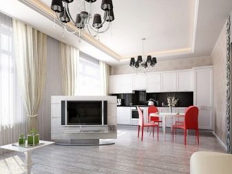
In this example, we see a classic studio - it is so united that there is practically no difference even in terms of the color scheme of the finish. The designer who was implementing the project did not see an urgent need for a clear zoning of the space, therefore objectively the kitchen is separated from the living room only by a sofa and a table moved to it from the back side.
It is impossible to isolate oneself from smells and noise here, but claustrophobia certainly does not threaten you either.
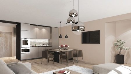
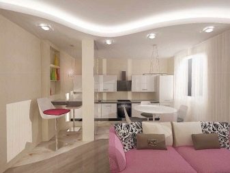
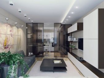
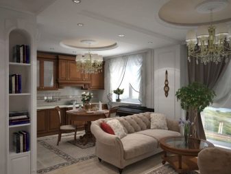
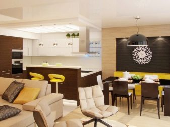
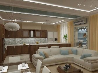
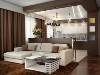
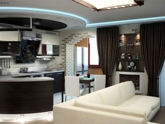
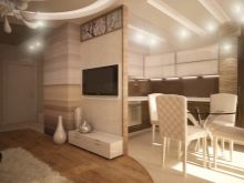
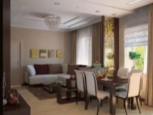
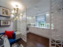
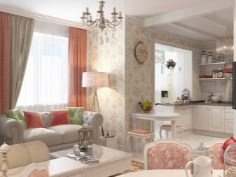
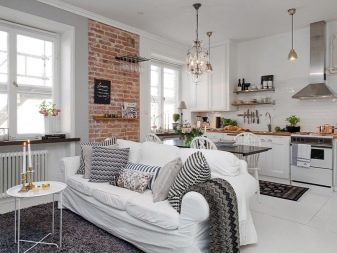
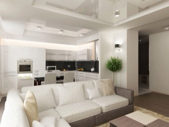
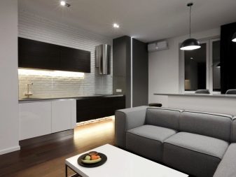
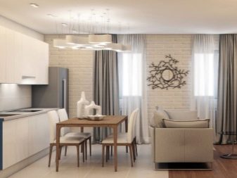
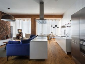
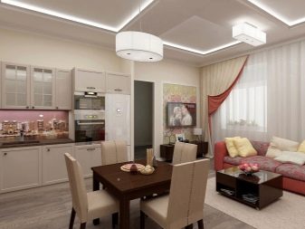
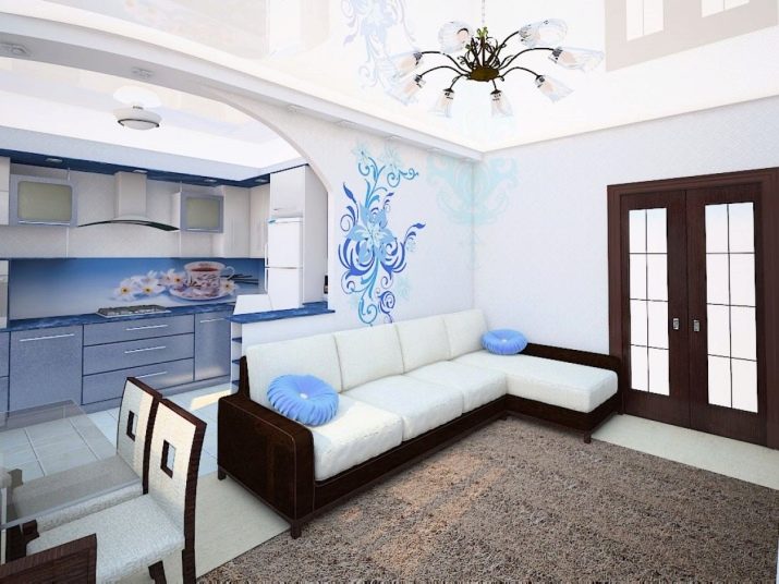
Here the owners considered that complete fusion is still too much, and a false wall was installed, which smoothly flows into a kind of arch. The designer involved in this project is not devoid of aesthetic taste, he very competently combined white with blue and beautifully decorated both the apron and the false wall. The specialist did not forget about the dining area - it is taken out separately here.
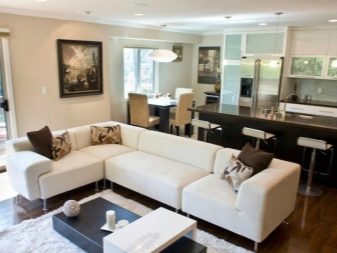
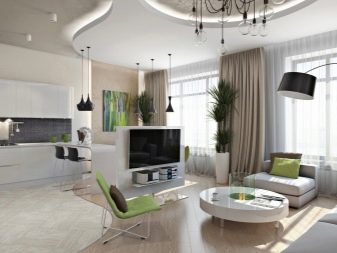
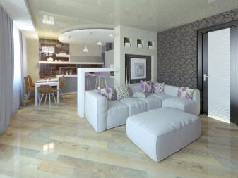
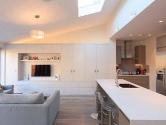
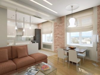
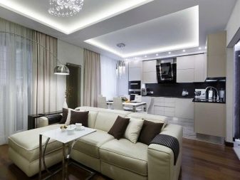
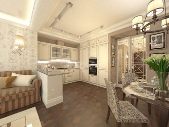
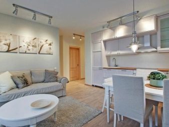
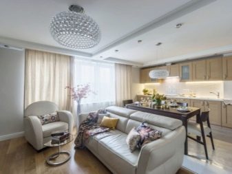
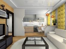
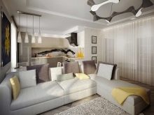
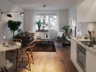
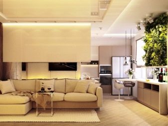
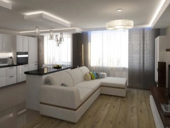
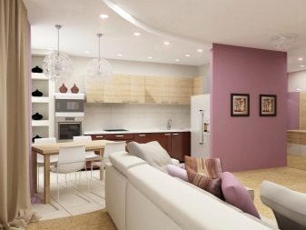
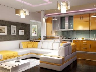
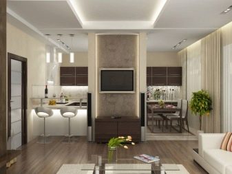
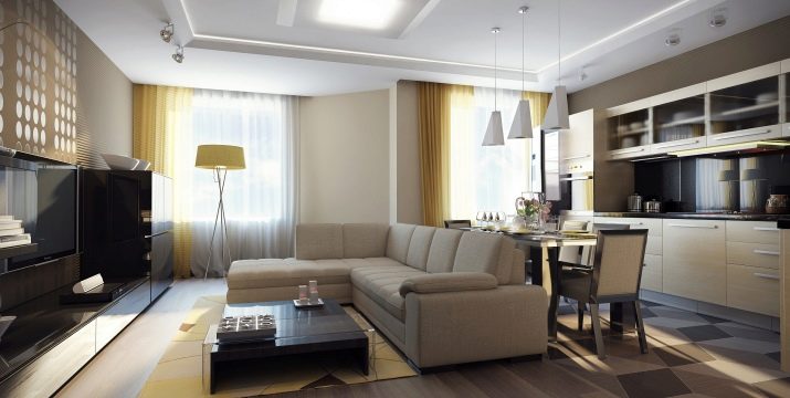
If you are not really chasing natural lighting, but just love unlimited space, you can and should experiment with dark tones. The combination of white and dark brown turned out to be very stylish, and light green accents help to eliminate the blandness. The studio's shape proves it isn't necessarily square.