Kitchen-living room design 16 sq. m
A typical sign of the times is “odnushka” or “kopeck piece” apartments, where the kitchen is occupied by the footage of a full-fledged room. Such a spacious kitchen is definitely a joy for the owners. And they often admit that on 15-18 squares it is possible to equip not only the kitchen area. So, often a kitchen-living room of 16 sq. m (+/- meter), and in place of the living room, a bedroom, nursery or study is formed in the layout. The decision is sensible, but it will not be superfluous to consider it comprehensively.
Combined territory: pros and cons
There can be two options for redevelopment. In the first case, a small "Soviet" kitchen is combined with a hall, as a result of which a more spacious room without a wall with two zones is obtained. Or vice versa - in the large kitchen there is a place for a recreation area, that is, a living room. Both ideas are actively disseminated.
The obvious advantages of combining:
- open space;
- unity of style and harmony;
- a lot of light in the room;
- the ability to cook food by communicating with household members;
- small children playing in the living room will be in full view of their parents in the kitchen;
- fresh and still original solution.
There will be fewer cons, but for some they will seem significant. With such a layout, it is almost impossible to be alone in the kitchen or to retire. The second disadvantage is that textiles absorb food odors, so you have to immediately take care of a powerful hood.
As a rule, those who go to the project of combining two rooms into one are ready for possible drawbacks. But when it comes to that by transferring the living room to the kitchen, a whole room is freed up, the cons really seem insignificant.
When tired of living in a cramped kitchen, expanding the space is perceived as salvation.
What are the layouts?
If you design a studio correctly (the combined space is called a studio), then the room will look solid and harmonious. Layout options are different, but the most advantageous are linear, angular, peninsular, and C-shaped.
Features of layouts
- Linear. This means that everything in the interior is clear along the lines - the kitchen unit is along one particular wall, and the recreation sector is along the opposite one. This option is considered to be the simplest and least expensive one.

- Corner. Assumes the placement of an L-shaped headset, as a result of which the working area occupies one corner. The principle of the working triangle is maintained - a sink, a stove, a refrigerator. The center and the remaining corners of the room become places of rest and eating.
- Ostrovnaya... The kitchen set is placed along the wall. There is also a separate extension of some of the sections closer to the center. The interior is suitable for arranging a square room. With this option, the number of functional surfaces, as well as seats, increases.
- Peninsular... The headset is placed along the wall. Part of the furniture is taken out in a T-shape. The working surfaces are increased, the space is visually divided.
- C-shape. Helps to smooth out corners in the room. The set is placed along the perpendicular walls in a semicircle.
Any choice can be successful, but it is also important to "make friends" the layout with the design. It is necessary not only to competently furnish the room, but also to visually arrange, to find the harmony of all elements.
Color and light
The color palette in a large space assumes softness, organicity, even when using bright colors and variegated prints. Therefore, designers advise do not use more than 3 colors in one space, other shades should be in tune with these colors, be slightly lighter or slightly darker than the main ones.

By the way, color is an excellent zoner. It can divide 16 square meters into two zones. At the same time, some roll-overs in the zones are permissible. For example, your kitchen sector is made in beige colors, and the living room is in warm caramel-amber. But on the kitchen side there may be something that repeats the colors of the living room (for example, caramel-amber upholstery of chairs), and in the living room - a beige table by the sofa.
A good design also requires competent lighting. By zones, an educated studio should be well lit. Lamps, chandeliers and spotlights serve as the main lighting, while wall sconces and lights create a cozy and lyrical atmosphere at the right time.
Bright spotlights are usually placed around the perimeter of work cabinets.
Zoning furniture
Very often, furniture visually separates one area from another. Usually this is either a bar counter, or a sofa, or a rack. Let's describe them.
- Bar counter. Look for options that don't involve a thick metal leg. Many modern bar counters resemble small island designs that can be more functional. In some cases, bar counters are transformed into a full-fledged dining table. Above the counter you need local lighting.
- Sofa. It would seem that this is the easiest option - to put the sofa at the intersection of the zones. But here there are problems regarding the preservation of the appearance and cleanliness of the sofa in such conditions. There are fears of its rapid contamination and absorption of odors from the kitchen. The fears are understandable, but they are not paramount. Rather, it is a matter of psychological comfort - is it comfortable for the person sitting on the couch to feel and be distracted by everything that happens behind his back.
You can try this option, although usually the sofa zones the space in the kitchen-living room in more than 20 squares.
- Rack. Usually, a lightweight, through structure is chosen that will not burden the room.The rack serves as a base for decoration: there you can arrange your favorite figurines, boxes, cute trinkets, flowers, and so on. In this case, the rack does not have to be large, high.
In addition to furniture, decorative elements are used: false walls, textured through partitions, curtains, Japanese canvases and more, which will lead to fantasy.
Where to put the dining table?
It is this question that most often puzzles the owners. They cannot figure out where to put the table - in the kitchen part of the room or in the living room area. The solution can literally be a compromise: the table is placed on the intersection of two zones, against the wall. It turns out that one half of it is in the kitchen, and the other is in the living room. If the family is small, you can put a small table, which is a transformable structure.
If you decide to divide 16 squares in half, then a small table will fit in the kitchen. Then there will be room in the living room not only for a sofa and a side table, but also for a wall-slide, for example, a wardrobe or a chest of drawers.
Sometimes the owners completely abandon the classic dining table. They eat at the bar, for example. A comfortable table for this can also stand next to the sofa. And for the occasions of receiving guests, you can purchase a modern book-table, which, when folded, serves as a console in the living area and an ironing board in combination.
It's great if you pay a little attention to the theme of dining table decor. For example, the upholstery of chairs can be removable (covers), but it will be made of the same fabric as the curtains. You can make a seasonal division: in the warm season, one type of curtains and covers, in winter - another, with a frosty, Nordic print. Thus, the premises will be changed at least twice a year, which serves as an excellent and inexpensive way to update the interior.
Beautiful examples
Below are 10 examples of the arrangement of kitchen-living rooms on 16 square meters.
Top 10 beautiful rooms:
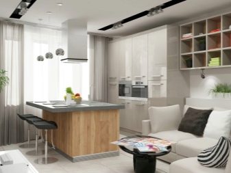
- The option is simple, the main decoration of which is light and space. The room looks vacant and still has room for decoration. The owner can complement such a room with small but stylistically accurate accents (for example, carpet, paintings or murals on the walls). The zonator is the protruding part of the headset, as well as the difference in floor coverings.
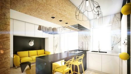
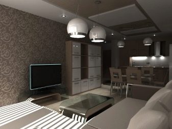
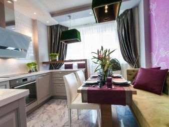
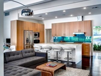
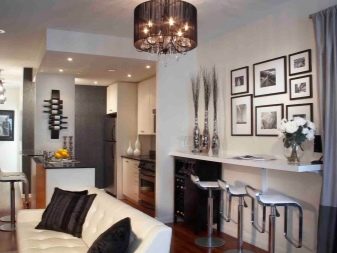
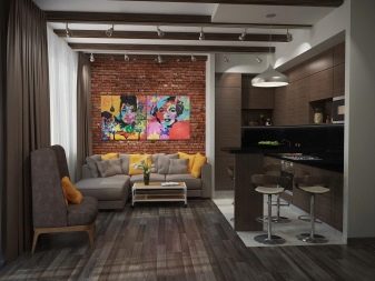
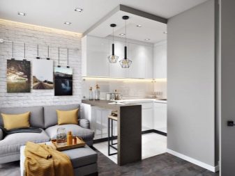
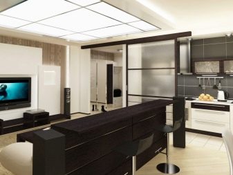
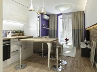
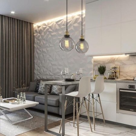
- A very interesting graphical solution. The bar counter is elegant, it seems almost weightless against the background of the wall decoration in the living room. Stunningly beautiful lamps above the bar control the eye without becoming a foreign element in the interior. The flooring is one, but each area has its own rug.
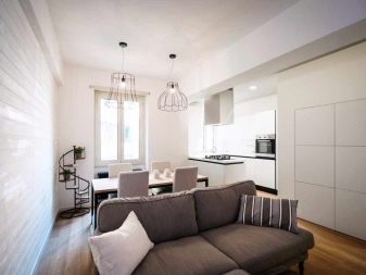
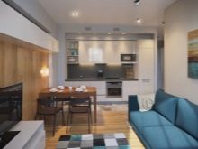
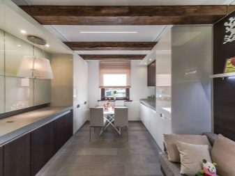
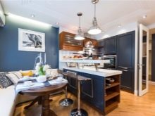
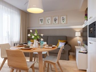
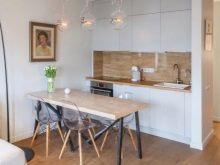
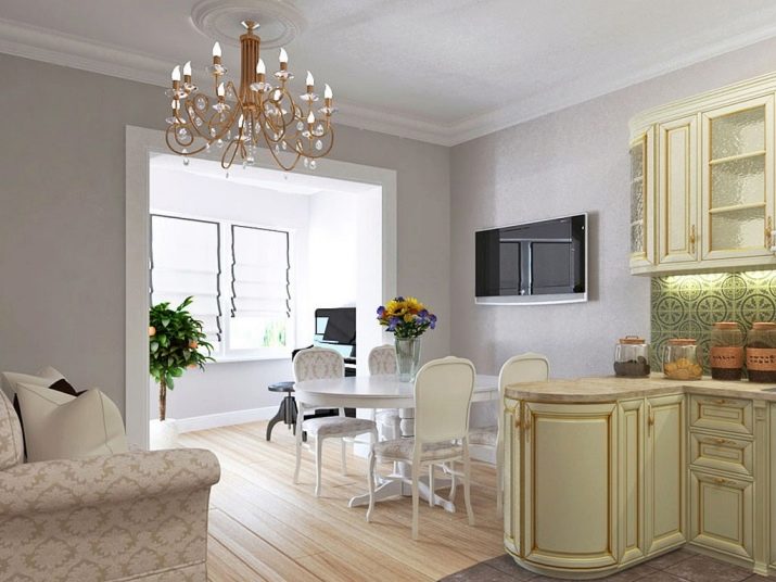
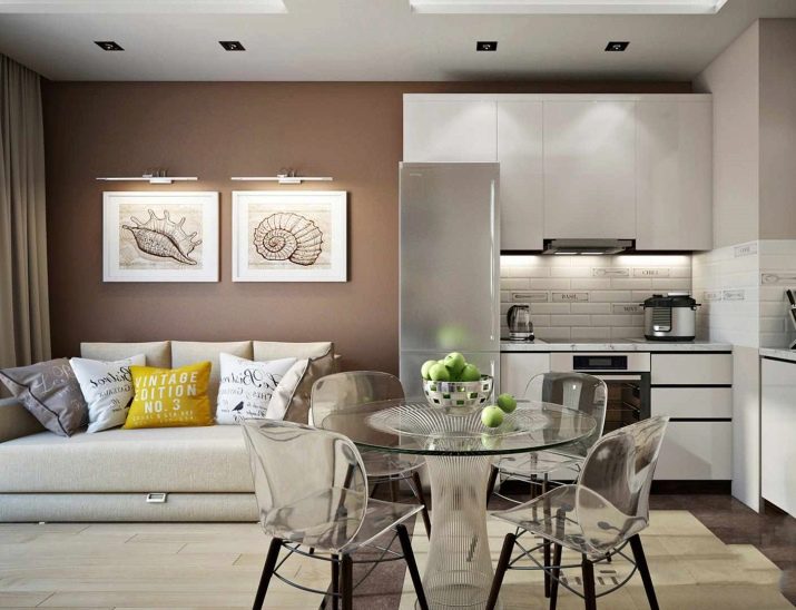
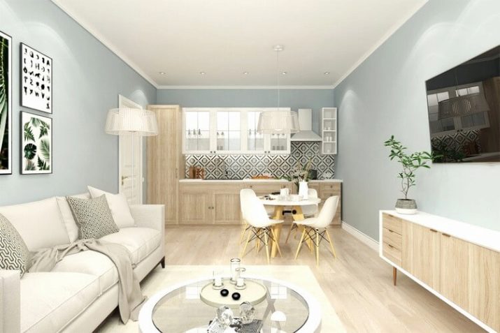
- The same case when the dining table stands at the intersection of the zones. The hosts chose a glass table and transparent chairs so as not to burden the room. And this is a really smart solution for a 16-meter room. The design is laconic, soft, not overloaded with details.
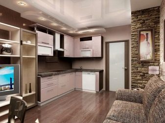
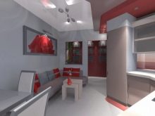
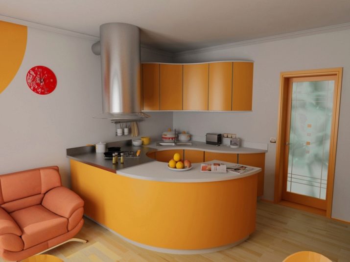
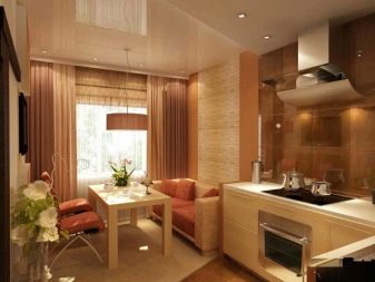
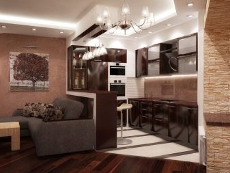
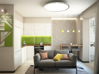
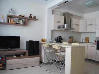
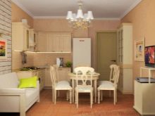
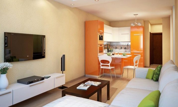
- The orange kitchen stands as a striking mansion, occupying one corner of the room. The bar counter serves as a dining table, at which 2-3 people can sit at the same time. The living area is designed in more soothing colors. There is free space in the space that can be occupied by a rack, chest of drawers or something else.
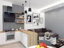
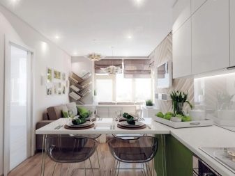
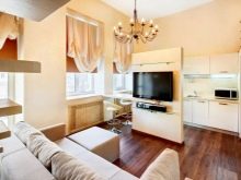
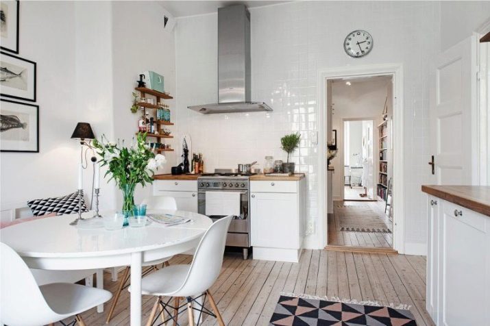
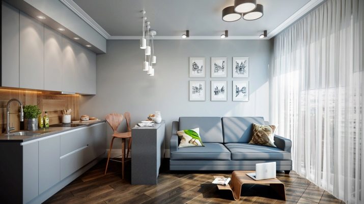
- Minimalistic Scandinavian style. The working area is located along one wall, without upper cabinets. The module located in the recreation area repeats the material and color of the headset. There is also a simple and pretty dining area, as well as a sofa.
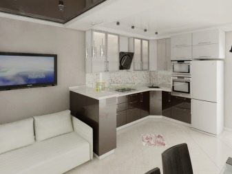
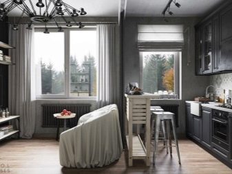
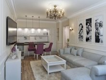
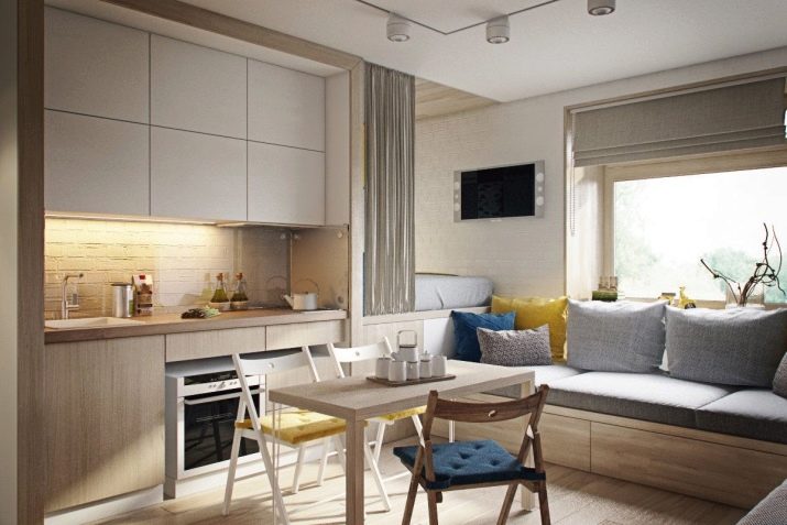
- Quite a bold option, because in the recreation area there is not only a large sofa, but also a sleeping place, which is masked by a curtain. At first glance, there are too many things, but if each item is functional, and the space is bright and filled with fresh air, this is a rather practical solution.
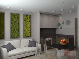
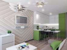
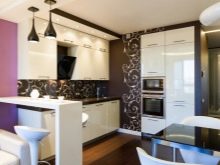
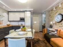
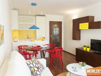
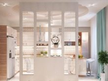
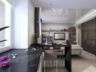
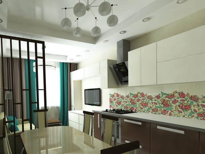
- The decorative zoner clearly divides the room into two parts.The color change of the elements is very interesting, and due to the considerable presence of white, the narrow kitchen-living room does not turn out to be darkened (although there is a risk).
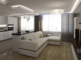
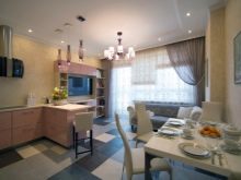
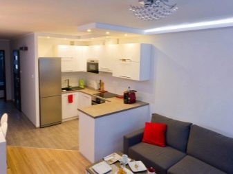
- In this case, the large dining table was abandoned in favor of the bar counter. But a large corner sofa leaves the opportunity for crowded gatherings in the living area. The lighting is very accurate.
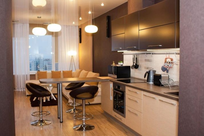
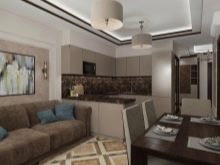
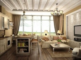
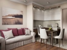
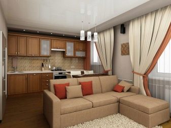
The brown and beige color scheme will appeal to conservatives.
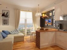
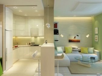
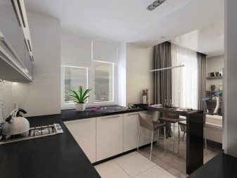
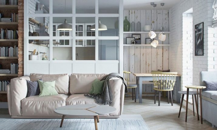
- The kitchen itself in this example takes up a minimum of space. And there is no clear zoning in this space - it is not needed. Everything looks one, kindred, natural. Light, space and comfort remain in the room.
- Small and light - that's what I want to call this room. The dynamics of the interior is given by the floor covering laid at an angle. If your kitchen has the same beautiful panoramic window, you shouldn't block it with anything. Everything in this interior is as simple as possible, laconic, but stylish at the same time.


In such a kitchen-living room, we put a corner sofa with a sleeping place.