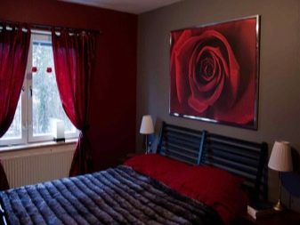
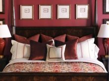
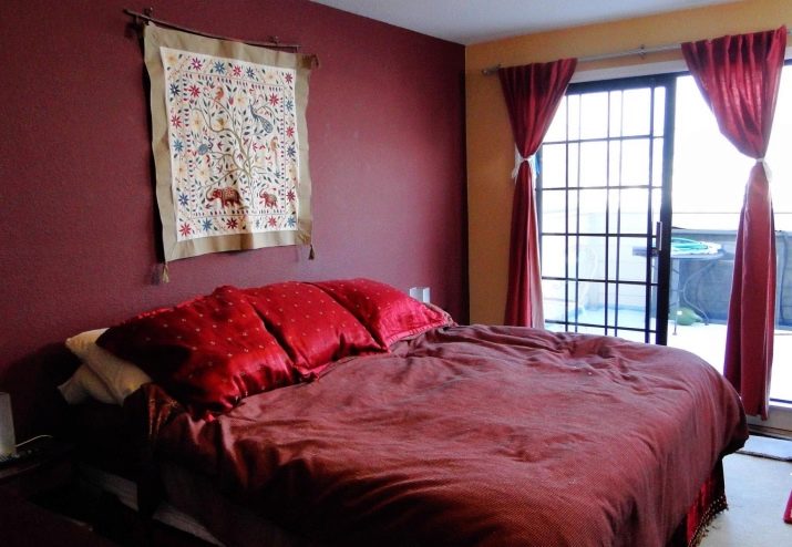
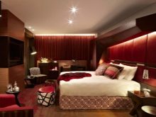
Burgundy bedroom: a variety of shades and design recommendations
Sleeping rooms can look very different. And it is not at all necessary to be limited to the simplest decorative solutions. The burgundy bedroom will look very original.
Features and varieties of materials
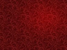
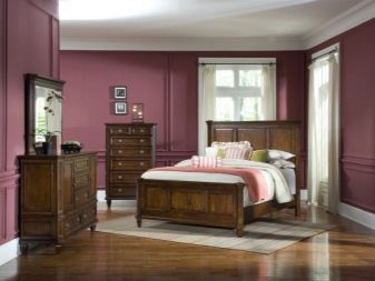
Using wallpaper of this color, you can easily achieve an exquisite, chic look. Bordeaux color brings a sense of mystery and mystery. It harmoniously intertwines black and red colors.
Important: wallpaper of this color is preferable in rooms with good natural light. This helps to eliminate the feeling of a closed place, overloaded with decoration details.
To lighten the room, it is recommended to use material with various patterns in wall decoration. If the space is small, it is advisable to cover only isolated areas with it.
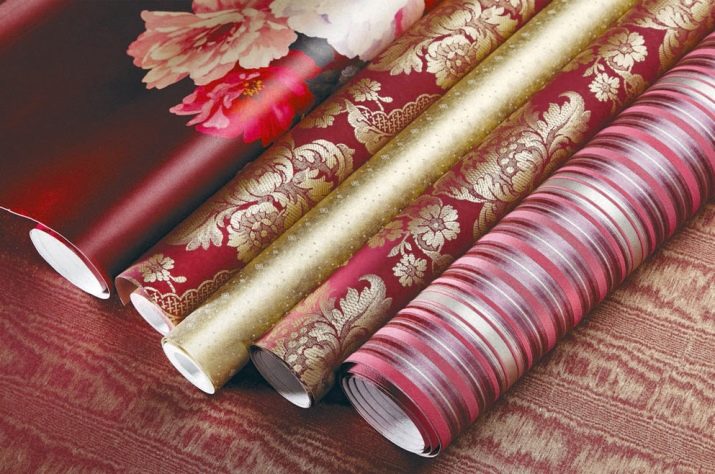
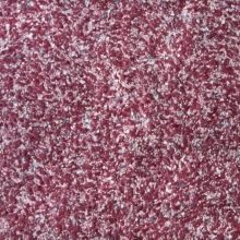
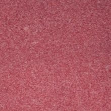
Burgundy wallpaper can be from a variety of materials. Often, coverings are used that are wholly or partially composed of non-woven fabric. The first type is intended for subsequent coloring and has a pronounced texture.
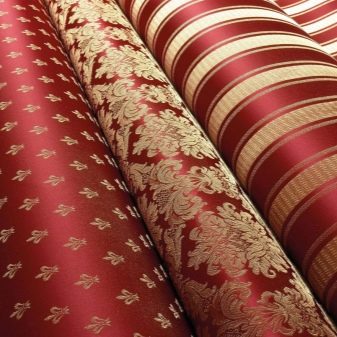
If the non-woven material serves only as a base, the outer layer is made of acrylic or vinyl. Pure vinyl wallpapers are made using a variety of technologies, which is why the textures are extremely diverse. To save money, you can also use ordinary paper wallpaper in the bedroom interior. Thanks to the efforts of technologists, the paper web can look very interesting. However, neither these advantages nor good ventilation mean that this is an ideal choice.
Serious disadvantages of paper are:
- low durability;
- fragility;
- fast fading;
- almost complete impossibility of cleaning.
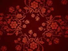
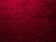
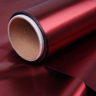
Burgundy wallpaper can be liquid.A characteristic feature is that the coating will have to be applied in one layer at a time. An attractive property of the material is the complete absence of seams. The use of photowall-paper is also allowed. They can be applied to a variety of substrates. The choice of image is limited only by the imagination of buyers and designers.
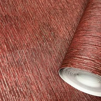
There are also textile wallpaper. For their manufacture, use:
- linen;
- silk;
- velor and some other fabrics.
Specific color versions
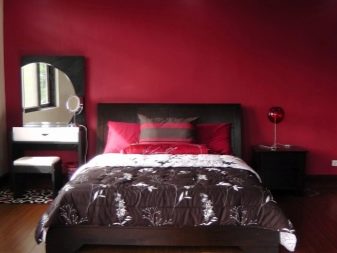
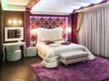
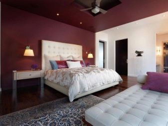
Often, the bedroom is decorated in a wine color. This is not surprising to those who know the world of modern design. Wine shades are often used as accent elements. The newest variety is the Marsala color, known since 2015. It was immediately announced as the color of the year, and leading designers began vying with each other to give recommendations on how to combine this tone with others.
In the color of Marsala, red and brown motifs are intertwined in an original way. Together they form a warm, elegant looking color. He is equally appreciated by both extravagant youth and balanced mature people. Skillful use of this tone creates an interior in the spirit of the 1970s.
Important: Marsala looks more velvety when used on a surface with its original texture.
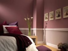
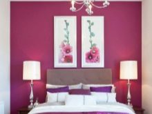
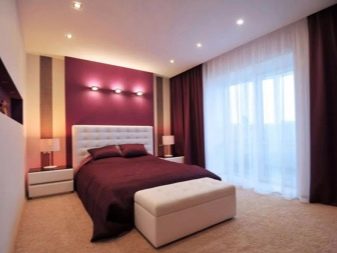
The raspberry tone looks bright and adds energy to the room. Used correctly, it can improve mood and deal with negative emotions. However, in combination with individual shades, the crimson color can emotionally crush and even provoke the onset of a headache. This color is unacceptable in medium-sized rooms with a low ceiling. Because of it, then there is a feeling of too cramped and narrow space.
Important: in the bedroom, the raspberry tone is used only in accents and individual accessories. It can be combined with light design elements.
By combining crimson with dark areas, you may find that the room looks unpleasant. Curtains and even more so whole walls of this color are completely inappropriate in any environment.
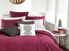
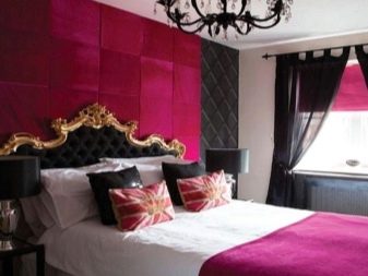
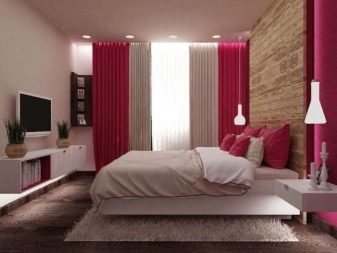
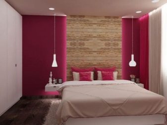
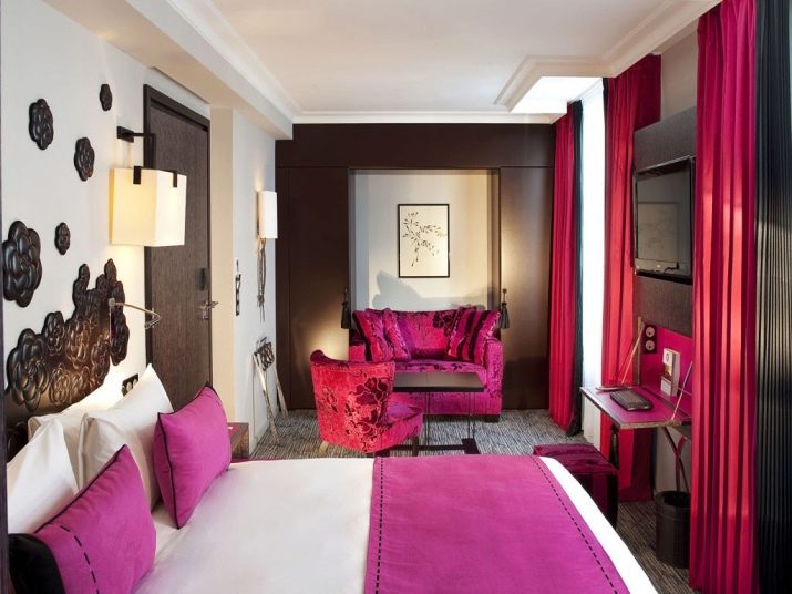
Fuchsia can be a good alternative. True, in bedrooms it can also be used only with great care, in dosage. The designers came up with a number of moves that still allow you to use this tonality. One is to use an accent wall (assuming all others are neutral). Another option is to add minor in size and brightly colored interior details.
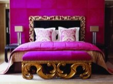
You can do it differently: make the whole room neutral by using facades or upholstery in fuchsia tone. Judging by the reviews of people, it turns out that at the same time it is a fun and not overloaded with color space. It is permissible to mix the main color with green and brown tones. And the last way to use fuchsia is with accessories:
- curtains;
- cover;
- pillowcases (it is better when all of these items are painted in the same color).
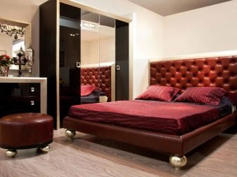
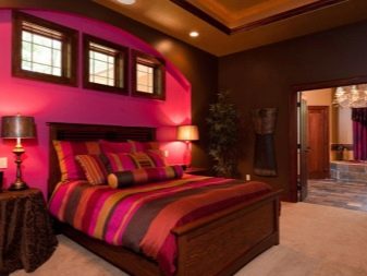
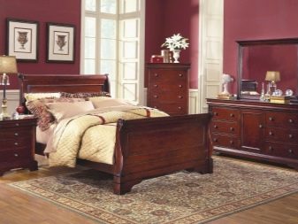
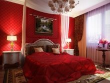
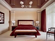
In the design of the bedroom, cherry color is also sometimes used. It is customary to understand the color of a ripe cherry under it. An interior with a similar tonality will look elegant and solemn. The sensation that cherry color creates is determined by its concentration in the room. Equally practical can be:
- dominance;
- highlighting other colors;
- the formation of modest accents.
Lighting
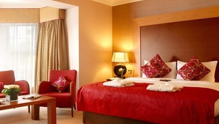
The use of burgundy does not mean that the bedroom lighting scheme should be built in any special way. The need to combine general and local light does not depend on color. For local illumination, you can use both table lamps and sconces.
The light intensity should be higher than in a white or light gray room. Otherwise, the space will be unjustifiably narrowed.
Luminaires should have the warmest possible spectrum. Bluish tints are strictly unacceptable. Experts recommend taking care of multi-level lighting from floor to ceiling.Then the negative sides of the burgundy color will be brightened up. In a burgundy-green room, it is advisable to put a traditional floor lamp with a light green shade.
The interior of the bedroom in red is presented in the video below.


