Balcony color: shades, choices, examples
The atmosphere of any room depends on the choice of the shade of the walls. Color creates style and mood. This also applies to the balcony, which today is increasingly becoming a full-fledged residential area. The basis of a successful interior is a harmonious combination of personal tastes of residents, matching style, taking into account the size and purpose of the premises. The article will tell you about the nuances of choosing a color scheme.
Basic principles
A balcony or loggia is usually not large in size. However, a competent approach allows you to turn the territory into an attractive cozy corner. In order for the result of the repair to please all household members, it is worth considering several basic rules for the color design of such premises.
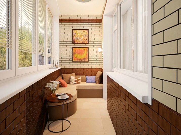
- The best choice for finishing a balcony would be light shades, as they visually expand the space. Dark tones are acceptable in a spacious area. And you can also combine colors to achieve the optimal effect.
- Warm colors it is worth choosing for those who do not have enough sun and comfort. Cool shades create a feeling of coolness and freshness.
- Bright shades are too "active"... It is better not to take them as basic ones, otherwise the territory will seem even more cramped. If you want brightness, it is better to choose interesting, but muted colors. Another option is to add rich touches to a neutral interior (in the form of accessories, furniture).
- Try to avoid being too variegated. Let at least one wall be monochromatic if others are decorated with printed material. In addition, in this case, it is better to choose monochrome furnishings and decor.
- Solid color design is the other extreme... It is advisable to combine pastel colors with each other or dilute them with spectacular contrasting or bright strokes. Otherwise, the room will seem impersonal.
- remember, that glass does not protect surfaces from ultraviolet radiation. Therefore, it is worth giving preference to materials that are resistant to fading.
Feng Shui color selection
If the philosophy of this teaching is close to you, you can arrange a balcony in accordance with these principles. It is believed that only when choosing the right shade will the room promote relaxation, restore inner harmony, and energize.
- If the windows face south, red, green and brown are considered suitable.
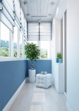
- For the northern part of the world, grays, blues and blues are recommended.
- For the western side, the preferred colors are gray, white, yellow. Gold elements are welcome.
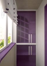
- On the balcony facing east, blue, green and purple tones will create harmony.
If the direction is mixed (for example, southeast), you can consider design options in white, beige, yellow, pink, brown-red.
It is advisable not to make sharp color transitions between the finishing of the balcony and the adjacent room. Shades should softly and smoothly "flow" into one another.
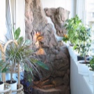
The decor should also be chosen taking into account the side that the windows face. If the element of water corresponds to it, you can install a mini-fountain or an artificial waterfall in the room. Paintings or photographs with landscapes of the corresponding subject can be a good addition. If the side is south or east, living plants will increase the energy of well-being and prosperity.
Do not stack old items on the balcony. On the contrary, place here objects that are dear to your heart, evoking good memories and associations. In this case, the rest in the room will be complete.

Psychology of shades
If you are more guided by how this or that color affects a person's mood, you can choose the tone of the finish based on this.
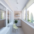
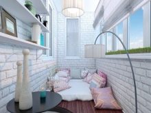
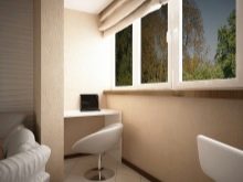
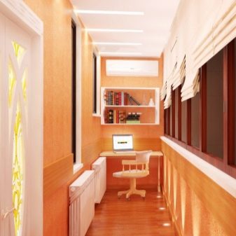
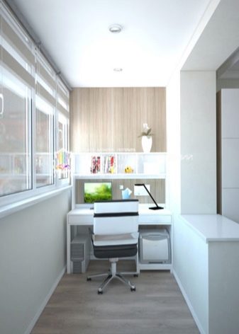
White is associated with purity, freshness, and novelty. It calms you down, but at the same time allows you to focus if needed. This finish will be an excellent choice for decorating both a study and a relaxation corner.
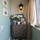
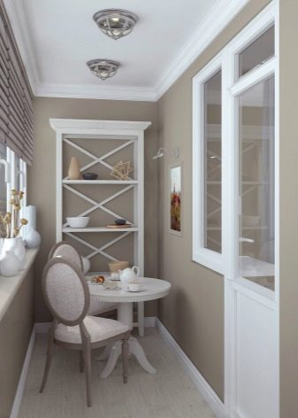
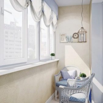
Beige creates a feeling of warmth, comfort, harmony. If there is little sun on the loggia, this color compensates for its lack. This is a great neutral tone for a relaxing time.
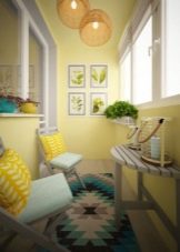
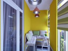
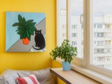
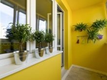
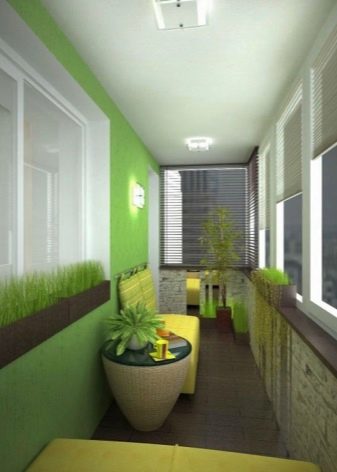
Yellow invigorates, energizes and positive. It is also associated with sunlight.
Elements of yellow should be included in the interior of the balcony if you are going to have fun gatherings here with friends or play sports.
Orange is similar to the previous version... It is a cheerful, creative, invigorating color. However, you should be careful to include it in your setting.
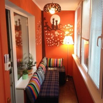
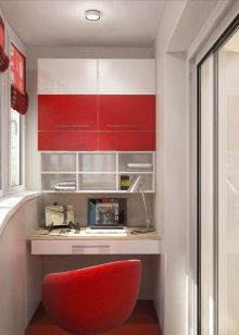
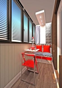
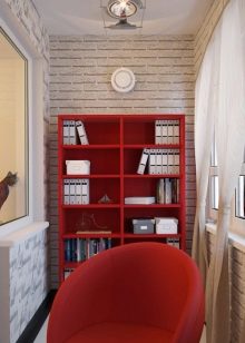
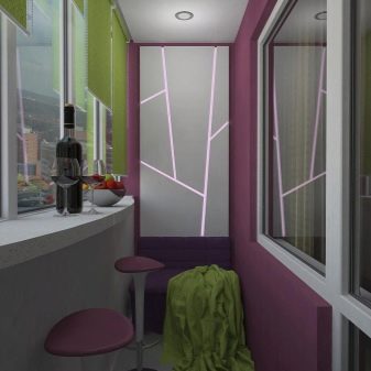
Red is the color of energy and passion. It sharpens attention, excites. In a limited area, a pair of small red accessories will suffice. An abundance of color can cause excessive activity and nervousness.
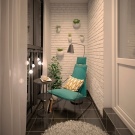
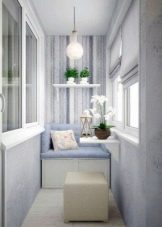
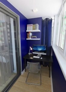
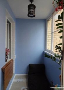
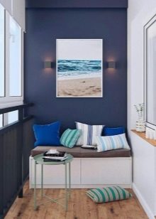
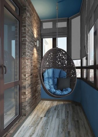
Blue and blue are mysterious shades associated with sea water, clear skies, coolness. In such a room, a person feels calm and confident, can relax.
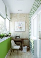
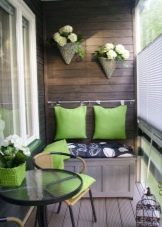
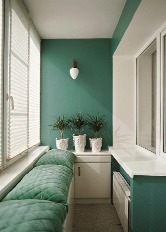
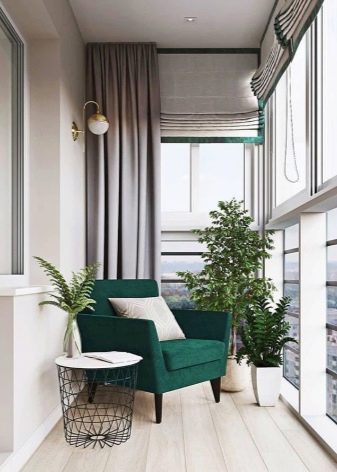
Green unites people with nature. It soothes, evokes a sense of stability and security.
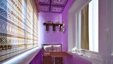
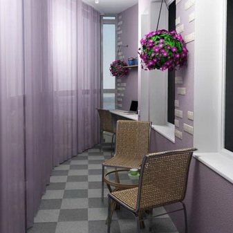
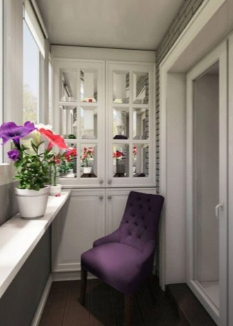
Purple (lilac) is an ambiguous color. For some, it causes a dreamy mood, while for others it depresses. Therefore, such shades should be handled carefully.
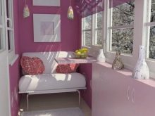
Pink is the embodiment of tenderness. Bright shades of pink seem festive and cheerful. Light colors are conducive to cozy relaxation and create a romantic mood.
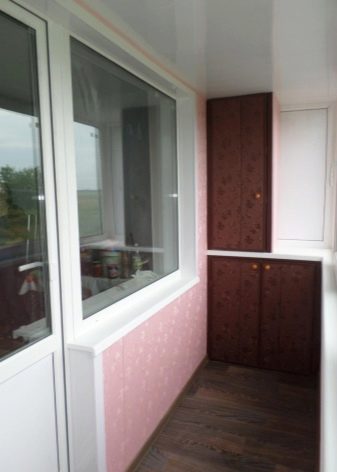

Brown tones are associated with order and reliability. Combined with beige, they create a cozy, harmonious atmosphere.
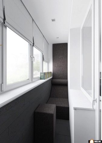
Black is the neutral opposite of white. In small quantities (against a light background), it looks strict and stylish. In abundance, it can seem gloomy and depressing.
Relationship of color to style
If creating a stylish environment is your main concern, choose a shade for the walls inside the balcony according to the design direction you like.
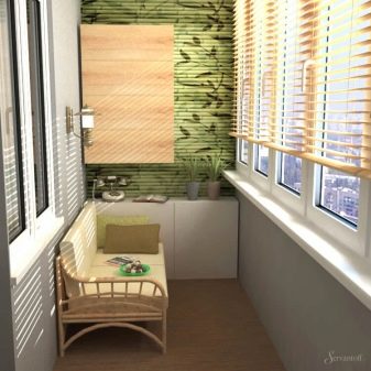
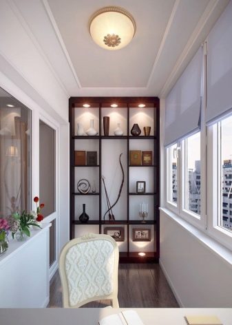
The classic assumes calm, noble tones. These are usually beige and brown. You can add freshness to the interior by adding white to the finish. An unusual solution would be to choose a pale olive tone. Burgundy, blue, dark green strokes are acceptable (in the form of furniture, accessories).
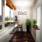
If you like the neoclassical direction, you can combine white with pale peach, light purple or muted yellow. The décor can be turquoise, pink or lavender. Decorating these styles is usually done with decorative plaster. And also stone, artificial white brick, soft leather panels can be used. If the balcony is properly insulated, it is permissible to decorate the walls with wallpaper.
In this case, it is better to choose plain fabrics or options with a discreet stylized print (damask, floral motifs).
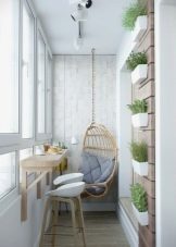
Provence and shabby chic - delicate vintage styles. An abundance of white is appropriate here, the addition of pale, as if burnt-out, tones (pink, blue, mint). You can combine whiteness with blue or purple. Sandy tones are also appropriate. Wall decoration is done with plaster, white or gray artificial brick, painted wood.
If the textiles are selected in a single color, you can make the walls or floor from material with a floral print.
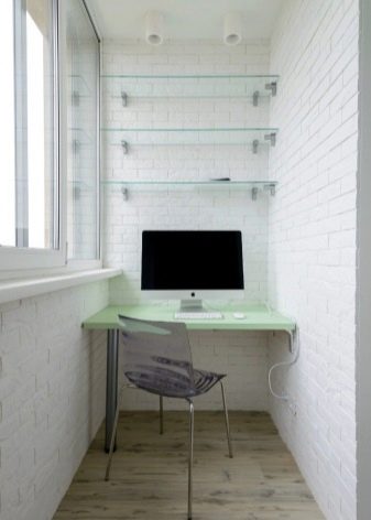
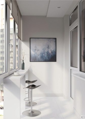
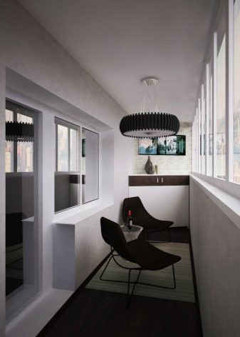
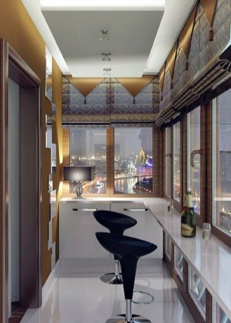
Minimalism and hi-tech created for lovers of cool, clean shades and spectacular contrasts. Usually such rooms are decorated in white and gray tones. Often black accessories are included in the interior, which look very expressive on a white background. If you want brightness, you can decorate the area with red or bright yellow chairs. Walls in these styles are almost always monochromatic.
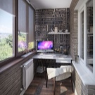
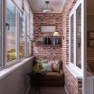
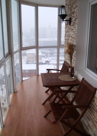
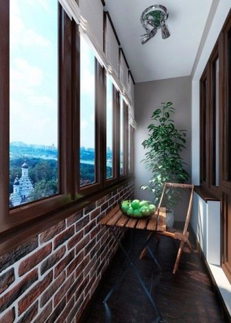
Loft - "brutal" direction... It is dominated by gray and brown tones. Brown brick and concrete fit perfectly into the aesthetics of the style. However, dark shades can be diluted with white or beige strokes. Bright spots in the form of chairs or decor are also acceptable here. This is usually orange, yellow, red, or green.
Delicate tones (pink, blue, purple) will not work here.
Modern is a free style. It allows you to paint the walls in pink, peach, salad or any other tone. The main thing is to avoid excessive brightness. The wall material can be anything. It is here that you can save money and decorate the room with plastic - the modern assortment includes many variations of shades.
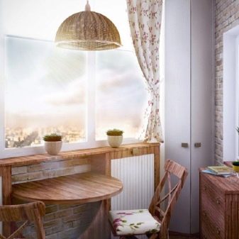
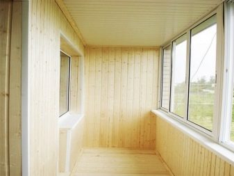
Atmosphere chalet can be created using wooden lining. In this case, the entire room is decorated in neutral sandy and brown tones.
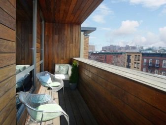
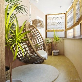
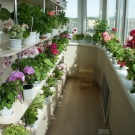
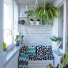
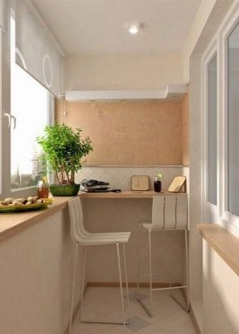
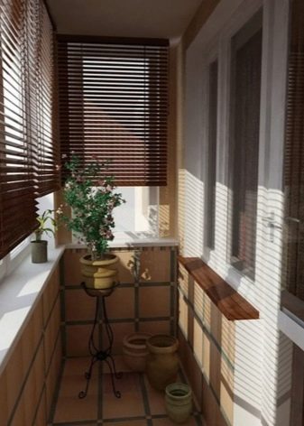
Ecostyle also welcomes natural materials. Wood or cork on the walls is complemented by wicker furniture and living plants. All colors of the furnishings must be natural. This includes all shades of green, beige, brown, gray tones. Refresh the interior with the inclusion of white and sunny yellow colors.