Kitchen design 9 sq. m: useful recommendations and interesting examples
The nine-meter kitchen for many modern housewives only causes a broken head shake - they say, it's too cramped, you can't fit with all modern appliances, and you still need to pay attention to the comfort of the room, because this is where many people like to receive guests.
Practice shows that in fact, even such a small room can be turned into a reason for family pride, if you are smart about the design and arrangement of furnishings. Having carefully thought out the project, you can install all the necessary equipment even in a confined space.
Fundamental rules
Kitchen design 9 sq. m must inevitably take into account the harsh fact that the room is small, and it must accommodate a huge number of items, one of the owners, or even one or two guests. No one says that this is unrealistic, just an adequate designer, before listening to the wishes of the client, is obliged to immediately inform him that there are certain rules that should be followed.
Of course, it is not necessary to follow all of them, especially if you do not have a lot of furniture and appliances, but if you want to at least visually enlarge your kitchenette, it is worth paying attention to the following points.
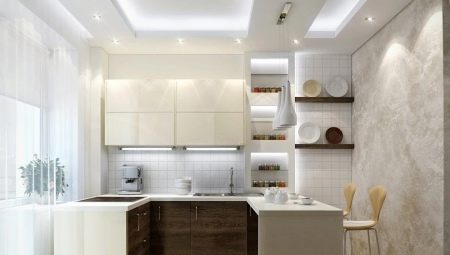
- It is desirable to build in the technique. There are several reasons for this, and the first of them is that the same dishwasher does not necessarily "waste" space - if a tabletop is mounted on top of it, then the same square meter can also be useful as a working area.Moreover, many owners sew up all their kitchen appliances in a special stand, where, if possible, they are located on several levels.
In addition to saving space, this also provides a second advantage - all your technological filling from the outside looks like, albeit bulky, but only one piece of furniture, which allows you not to make the kitchen cluttered.

- Gloss reflects light. It is no secret that a light room visually seems more spacious, therefore it makes sense to use lighter shades in the design. However, at 9 squares, this optical illusion will not work to its fullest unless you enhance it with shiny glossy surfaces. In a kitchen, it will not be difficult to do this, because a stretch ceiling, a glazed tile of an apron, and a polished surface of a headset can also shine.
Even the air seems cleaner due to the surrounding shine on all sides, which is important both in an industrial city and in a smoky kitchen.
- Contour lines selection. A nine-meter kitchen in a geometric sense almost always turns out to be square, and, given the abundance of furniture, this further aggravates the situation: wherever you look, there are corners on all sides. In this context, many owners of the square would prefer it to have a different, slightly more elongated shape.
Without redevelopment and serious construction work, what you want can be achieved only with the help of psychology - for this, the decoration of those walls that need to be lengthened has a pronouncedly stretched horizontal color. The specifics of the design, by the way, does not necessarily apply only to the walls - the furniture can also meet the stated requirements.

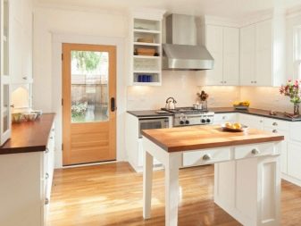
- The windowsill should not be idle. The place at the windowsill in kitchens is often left free so that the window can be approached, and it itself is not used in any way. When there is not enough space, not a single centimeter should be scattered - it is worth expanding the window sill, replacing it with a full-fledged tabletop and turning it into a working area. Some owners even build in such a sink, having previously protected the glass from constant splashes and thought over the internal design of the box in favor of embedding additional boxes into it for storing something.
- Transparent furniture does not block light. At its core, crampedness is an abundance of obstacles that prevent light from passing through you. From the fact that you buy a table with a glass top and transparent acrylic chairs, in fact, there will not be more space, but the psyche will tell you something completely different - that the room does not look cluttered.
In our minds, objects that do not seem bulky are not able to clutter up the room, and this is their great advantage for cramped rooms.
- Take advantage of modern photo printing. The problem with tight spaces is that they are strictly limited by four walls and do not even allow you to really turn around. Claustrophobia develops on a subconscious level when the psyche says that if something happens, you will not be able to leave the room so easily. Most people don't get psychotic, but if you don't like the tight space of your kitchenette, then you need to remove one of the walls at least visually.
For this, modern wallpaper and photo panels are used, but not any, but corresponding to certain conditions: they must depict a panoramic landscape and faithfully convey the play of light. Having decorated an entire wall, an apron, or at least a separate door with such a picture, you acquire the ability to psychologically expand the framework of a small kitchen.
Layout options
In order to properly equip the kitchen, first you need to understand what shape it has and whether all of its walls have remained "in place", or is it an integral part of the studio, combined with the living room. Objectively, everything is clear only with a rectangular kitchen, where all the necessary equipment can be built along one wall, although even there options are allowed.
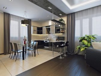
Recently, it has become increasingly popular corner arrangement of the kitchen, which is directly related to the popularization of studios. When 9 square meters of space on the side of the living room is limited only symbolically, you can arrange the kitchen set so that most of it runs along one wall, and a small piece "folds" along the adjacent one.
This is true when you finally decide to furnish a functional kitchen with the latest technology, and it just does not fit along one wall. With room to retreat, you can afford to occupy two walls at once.
Square kitchenthat you decide to equip with the latest technology is very often organized so that its entire work environment is located along two walls, one of which has a door in the far corner. At the same time, it is impossible to distinguish the main wall, since in fact none of the parts is significantly longer than the second. This option for organizing space is good because you can confidently place any amount of equipment along two walls, but there will not be much space left for the table.
To at least slightly neutralize this drawback, pay special attention to built-in appliances, even if it is an air conditioner.
Regardless of what kind of furnishings you have chosen - corner or square, the opposite corner, if it is not occupied by the front door, you can take a sofa or a soft corner... He, without taking up much space, will "hug" the dining table, allowing household members to be accommodated with maximum comfort, and if there are a large number of guests, it can be supplemented with chairs that allow you to sit on all sides.
An additional advantage of such an acquisition is the fact that, if necessary, it can become an additional bed if guests decide to stay overnight.
Particular difficulties involve the design of a narrow kitchen, in which both the window and the door are located on opposite short walls, which does not allow them to be occupied by a set. In such a situation, the only reasonable solution would be to decorate the central aisle with two headsets at once, each of which is located along a long wall. During the cooking process, this may seem inconvenient to an unusual person, because in some cases you will have to turn 90 degrees all the time, but there is practically no alternative.
For the same reason, it is reasonable to take the dining table out of the kitchen altogether, but if this is not possible, you will have to limit yourself to a long and narrow bar counter. Many owners who live in an apartment alone and are not fond of cooking, consider it to be a sufficient substitute for a full-fledged table, because even a small company can accommodate at it if the menu is not so diverse.

Headset location
When choosing a typeface and its location, you must give yourself a clear answer as to why it has exactly this shape. In fact, the form factor of a headset is influenced not only by the specific shape of the room, but also by some other factors.
- Straight or in-line headsets are not so common today. They are relevant for elongated rooms, where even a refrigerator cannot be placed against another wall, since it will block either a window or a door. The disadvantages of such an arrangement of furniture are that the hostess will inevitably have to go from end to end, as well as the fact that you need to more carefully choose the technique so that it is all on par with each other. However, sometimes this is the only option.
- L-shaped headset good because the owners can comfortably, without leaving their place, reach for a large number of lockers and appliances, staying in the so-called functional triangle.This configuration option is also good because not all equipment should have similar dimensions - the same oversized refrigerator can be taken out into the shorter part of the headset so that it does not spoil the overall symmetry.
- U-shaped the headset option will be appropriate if your kitchen has a logical continuation in the form of a combination with a living room or at least a loggia. This is another location option for a large number of equipment and cabinets, but it is advisable to allocate one of the sides for a bar counter, which could be both a worktop and a dining table at the same time. A similar layout option is often used in square kitchens without a window (which, therefore, does not interfere with this arrangement).

- Island set is a relatively new, but already very popular solution, and helps to expand the working area if there is not enough space for it among the cabinets and equipment. The island is a free-standing worktop, but in a nine-meter kitchen, a small width is a mandatory requirement for it. The advantage of such an organization is that an independent bar counter can also be used as a snack area, but then it is better to buy folding bar stools for it, which, when not being used, take up much less space when folded.

Color spectrum
In fact, nine squares for the kitchen are not so bad, and therefore, theoretically, you can even decide on bright contrasts. At the same time, professional designers usually advise not to chase parrot-style colors - it is desirable that the gamut is repelled by two, maximum three colors.
On an area of 9 sq. m, it makes sense to give preference to a monochromatic surface so as not to overload the interior, however, a discreet pattern on an apron can diversify a design of the same type, and an appropriate photo printing will turn out to be a real masterpiece in a decent frame.
If it seems to you that the room is still cramped due to the abundance of furniture, it makes sense to visually expand it, and for this use white or any range, consisting mainly of light shades. White is also good because, like gray or black, it belongs to achromatic tones (neither warm nor cold), therefore it goes well with any other tone. Thanks to this, a double effect can be achieved, when a white background helps to visually expand the space, and bright accents make the design of the room more interesting.
Chroma, by the way, is shown for the kitchen: psychologists believe that cheerful warm colors have a positive effect on appetite. Popular tones include all varieties of red, as well as orange and yellow, plus light green.
Cold colors have the opposite effect - they suppress appetite and are subconsciously associated with the bathroom, therefore lilac, blue and turquoise are not welcome.
Style solutions
When deciding on the style of the interior, you should choose not just the design that you have always dreamed of, but also the one that will be appropriate in the conditions of your room. A good design renovation involves the use of ideas that turn out to be not only beautiful, but also practical.
So, to visually expand the space, you must use the style of light shades, since they reflect light well and make the room more spacious. Several directions meet the specified requirements at once, but they all have special specifics, thanks to which you can choose the design according to your own taste.
A striking example of such a solution can be called Scandinavian style, which, in principle, is focused on the white design of everything, and only individual accents can have a different tone. At the same time, it is very practical and does not imply an abundance of jewelry, so you shouldn't overdo it with "highlights".
Provence is similar to Scandinavian style in palettebecause it uses pastel colors, and also because of its special penchant for natural materials. Provence is a French rustic style, and this always involves the use of both simple and non-trivial things at the same time that decorate the house, looking like homemade, not factory production.
While the overall colors appear to be washed out, you can dilute the overall lack of contrast with accentuated yellow chairs.
Minimalism - a special style that can contribute to both the entrainment of the amount of light, and vice versa, to reduce it. The fact is that the main "trick" of minimalism is the maximum functionality of all items without any cute trinkets, its beauty lies in the utmost simplicity of the interior. By adding a maximum of technological innovations that will be very appropriate in the kitchen, we get a modern high-tech.
True, minimalism allows any color, as long as the finish is monochromatic, and hi-tech prefers gray, black and metallic shades.
Classics are eternal - it is relevant for those people who can afford to decorate a small kitchen expensively, with chic elements. Classicism always emphasizes the richness of the decoration, it does not even consider the interiors of the poor, which were at all times, therefore you should be ready to fork out for a chic chandelier, a lot of interesting trinkets, works of art in the form of paintings on the walls, and even such chic elements as stucco molding. The classics love bright colors, while the presence of gold should be in the air.


Modern is a relatively rarely used style that will forever win the hearts of people who are not devoid of creative ideas. He exploits the idea of creativity with all his might, but at the same time does not consider it necessary to drive art into any frame - so, even the picture will be painted right on the wall, and not hang in any frame. The complexity of such a design lies in the fact that for its implementation it is necessary to fully think over a holistic image, and this task is not within the power of every designer, but only the most gifted.
Finally, one cannot ignore and loft, considering that it is quite popular among modern youth. In the kitchen, it is most appropriate because it does not require any exquisite materials that cannot cope with the typical kitchen tests. At the same time, initially the style arose due to the fact that old factory premises of abandoned enterprises were massively rented out for housing, and some of the new inhabitants managed to furnish the unsightly interior so picturesquely that it became fashionable.
Accordingly, you must first give away a piece of comfort, and then bring it in with renewed vigor, which is quite difficult in an ordinary apartment.
Tips for decoration and decor
In a typical apartment, when decorating a kitchen, much more often they pay attention not so much to the stylistic integrity of the interior as to the practicality of the finished materials. In general, this prioritization is also acceptable, because there is no point in making expensive and beautiful repairs if at least one of its parts does not last long.
Most of the questions are caused by the decoration of the walls, since most of the dirt is best visible on them. From the point of view of maximum practicality, the best option looks like banal wall paintingbecause it is the easiest to renovate and also works well with other types of wall decoration.
For more comfort, many owners insist on wallpapering, but you need to understand that not any are suitable, but only high-quality washable ones, ideally of an obscure iridescent shade in order to mask possible stains. If the choice fell on wallpaper, they are often chosen for the sake of photo printing, which allows you to add another landscape instead of the gloom that opens from a typical Russian window.
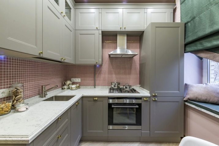
The apron is a separate big topic for discussion, traditionally tiles or decorative brickwork are chosen for it, but modern styles can offer absolutely any alternatives, up to metal or glass plates.
In second place in terms of pollution is the floor. Various splashes of water and grease can drip on it, it is exposed to aggressive chemicals that try to wash away the traces of drops, and it is also intensively wiped off, since the kitchen is one of the most popular places in the entire apartment. The average owner cannot afford to often change the floor covering, since such an operation actually destroys the kitchen, which means that you need to choose wisely - so that it will last forever.
Not so many materials meet the declared requirements - these are the best types of linoleum, as well as different types of tiles and porcelain stoneware.
With the ceiling, it is still easier - for most dirt it is not available, but still, ease of cleaning is desirable in order to wipe the surface from soot. Painted ceilings are not very popular lately, so most owners expect to solve the problem. installation of a powerful hood and installation of a false ceiling, as an option - multi-level and with built-in lighting.
Stretch ceilings in the kitchen are possible, but do not look like the first option, since their care is not so easy.
What should be mentioned separately is the curtains. In an elongated room, in which the window is located along a long wall, they can occupy one of the central places in the project, and therefore cannot be ignored. Theoretically, the designer can experiment with them as he wishes and as the style requires, but it is important that the curtain is not too long - from this it gets dirty on the floor and collects a maximum of splashes, and also, developing in the wind, can get into fire or block the view of the TV.
To effectively control the degree of lighting without having problems with maintenance, various options without a cornice are often used - for example, roman blinds or blinds.
Lighting
The choice of luminaires is highly dependent on two factors: the actual level of need for light and the style requirements. For example, a classic inevitably needs a huge chandelier that looks expensive; without it, the design of the room will seem incomplete, even if you really do not need so much light.
The requirements of practicality actually tell many owners that too bright light in the kitchen is generally not needed - it is enough to effectively illuminate the work area, leaving a slightly dim light for everything else. To do this, light bulbs or LED strips are mounted in the lower surface of the upper row of cabinets, which allow you to maintain a romantic atmosphere at the table, as long as there is a lot of light where it is really needed.
Despite the relatively small size of 9 sq. m, usually it is the kitchen that needs a wide variety of lighting methods. For this reason, the owners, in addition to the central chandelier and the already mentioned lighting devices for the working area, can also install additional sconces or floor lamps, which make the kitchen a comfortable multifunctional area.
Beautiful examples
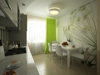
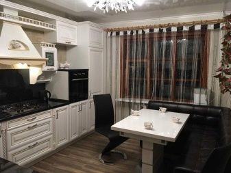
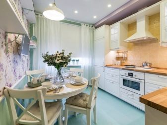
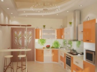
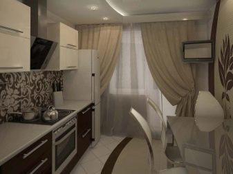
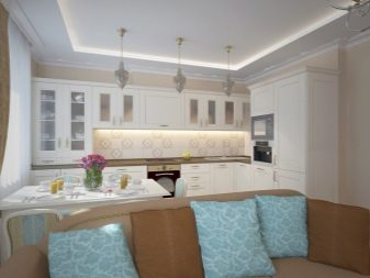
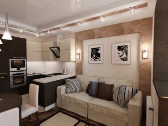
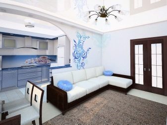
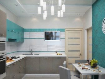
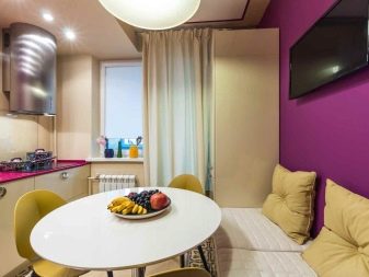
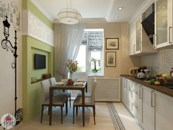
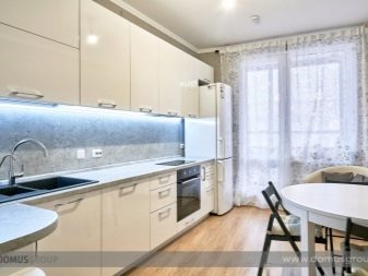
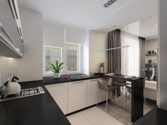
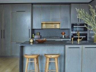
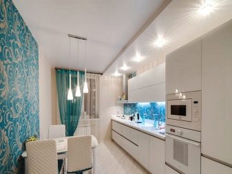
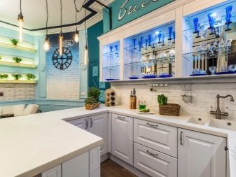
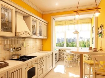
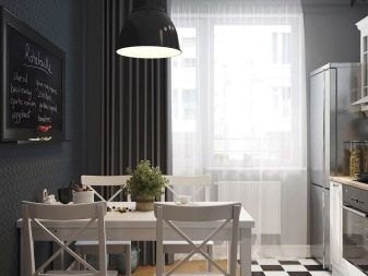
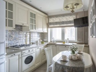
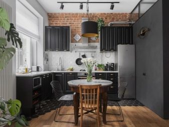
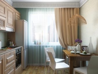
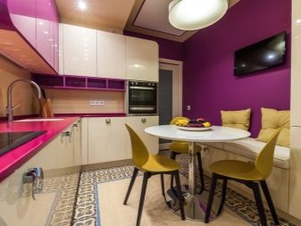
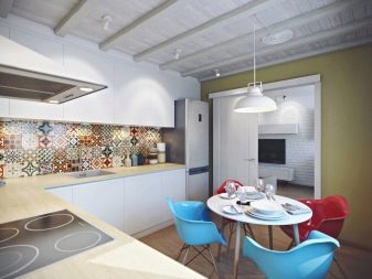
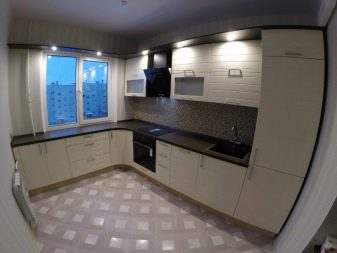
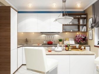
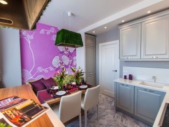
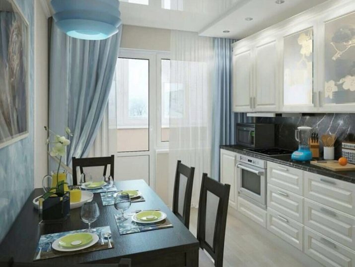
The first photo is a good example of how breaking the rules can be a successful solution. For the kitchen, it is considered undesirable to use cold tones, and yet the light blue makes the room in the photo example very stylish, and it still remains cozy. The organization of lighting here is indicative, when the bulbs for the working area were mounted directly into the ceiling, but next to the headset. At the same time, the table is illuminated by a beautiful lamp that creates the atmosphere of a cafe.
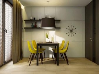
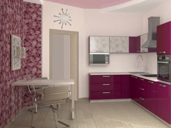
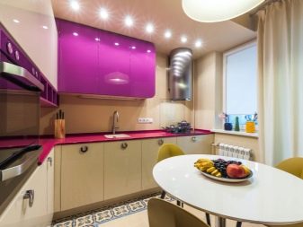
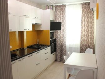
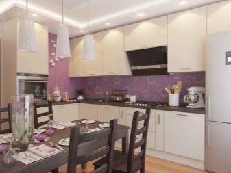
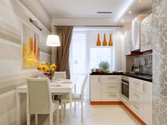
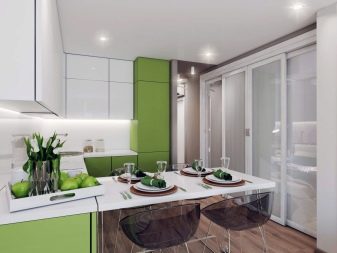
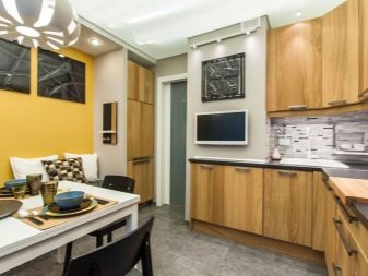
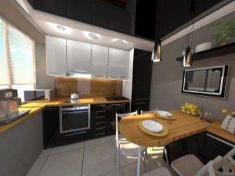
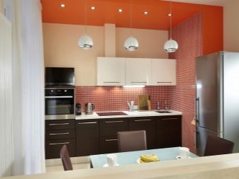
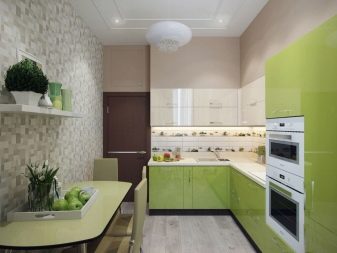
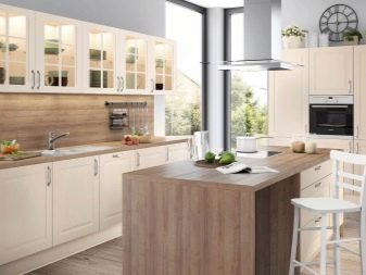
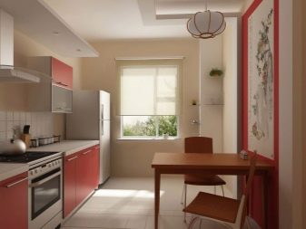
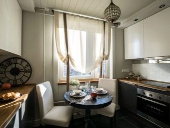
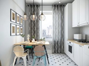
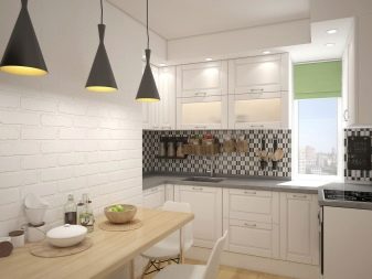
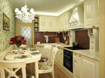
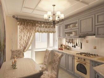
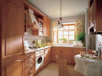
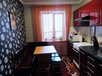
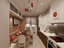
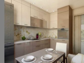
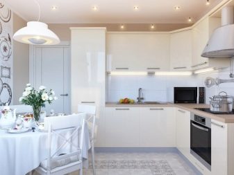
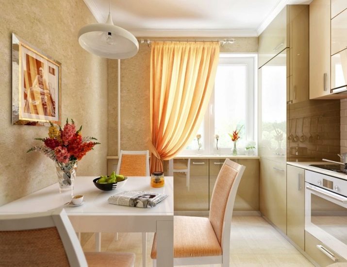
And this is how a pleasant kitchen in warm colors can look like, whose style decently resembles Provence, although it is not in its pure form.The designers did without excessively bright colors, but the abundance of orange, even muted, inevitably awakens the appetite and raises the mood.
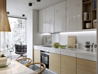
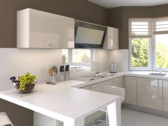
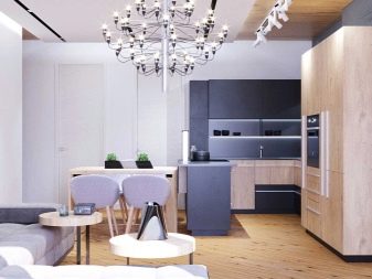
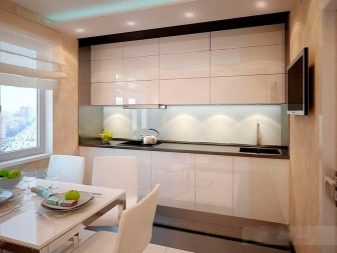
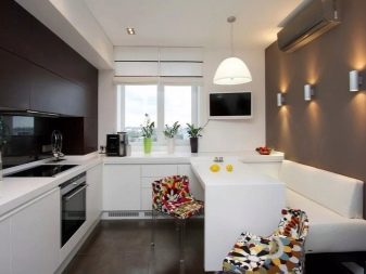
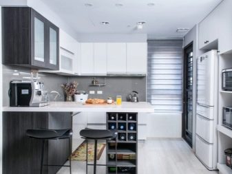
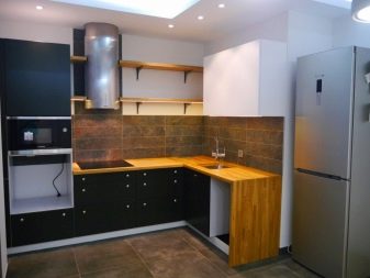
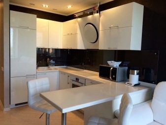
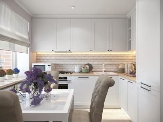
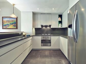
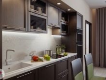
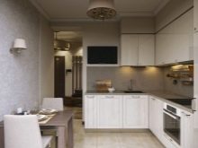
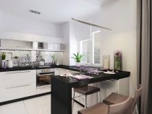
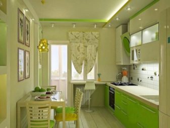
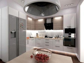
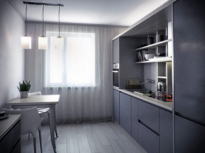
For lovers of minimalism, all these decorations in the form of bouquets of flowers and even just bright colors seem superfluous, for them beauty lies in the maximum simplicity and practicality of the interior. If you consider yourself one of such people, then even a completely gray kitchen will not associate you with something bad, but it will delight you with its convenience.
Next, see an overview of the kitchen 9 sq. m.


